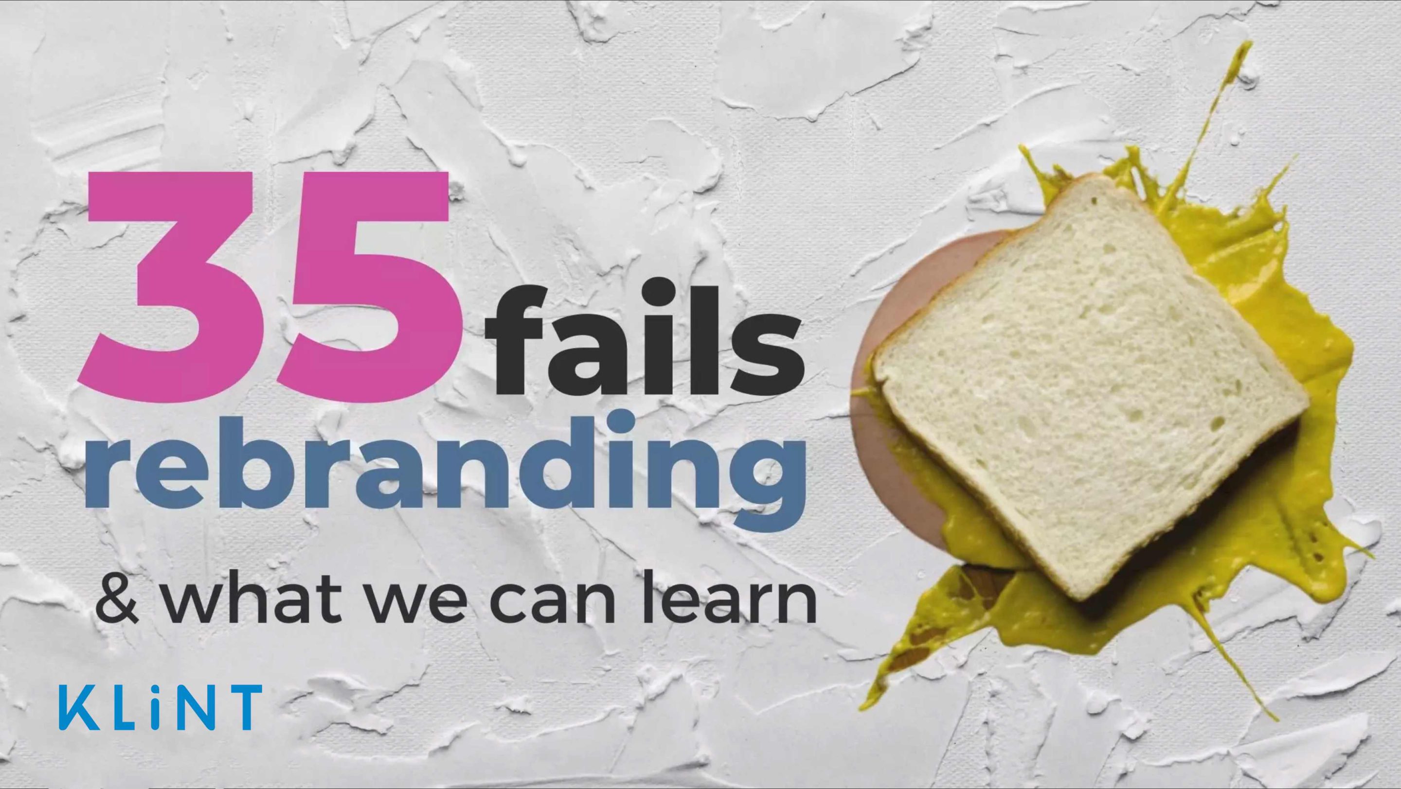

Bad branding is the worst nightmare for every company. And yet, a failed rebranding examples are more common than you might think.
In fact, brand disasters happen all the time.
When rebranding is done right, the company will see an increase in sales from new and existing customers, have a chance to stand out among competitors, and increase product value.
However, rebranding logo unsuccessfully can lead to the complete opposite – losing customers, facing negative criticism, etc.
Consistent presentation of a brand has seen to increase revenue by 33%. Hence, if you are thinking of rebranding, think twice and try to learn from others’ mistakes.
Keep on reading to find out which 35 companies fell victim to bad branding and why!
Let’s start things off right.
Table of Contents
What is the impact of bad branding?
No matter the reason for a company’s rebranding initiative, you should always make sure to align your new brand voice and tone with the following:
- Your customers’ expectations
- The past campaigns
- The future potential outcomes
If you have decided on re branding company, then you should also be aware of how others have navigated their journey.
In this article, we focus on well-known brands that decided to rebrand and showed us what bad branding with unexpected outcomes feels like.
Do not worry, we also added some advice on how to avoid making the same mistakes.
However, before we dive into some of the rebranding examples, let’s check out one that may not necessarily be bad, but is definitely a funny one.
Below is an example of a rebranding of a company taking itself too seriously: Staples logo change.
Staples is the office supply and back-to-school retailer that went all-out Michael Bay / Hollywood to unveil a logo that looks (drum-roll please) – pretty much the same.
35 bad branding examples and what we can learn from others’ mistakes
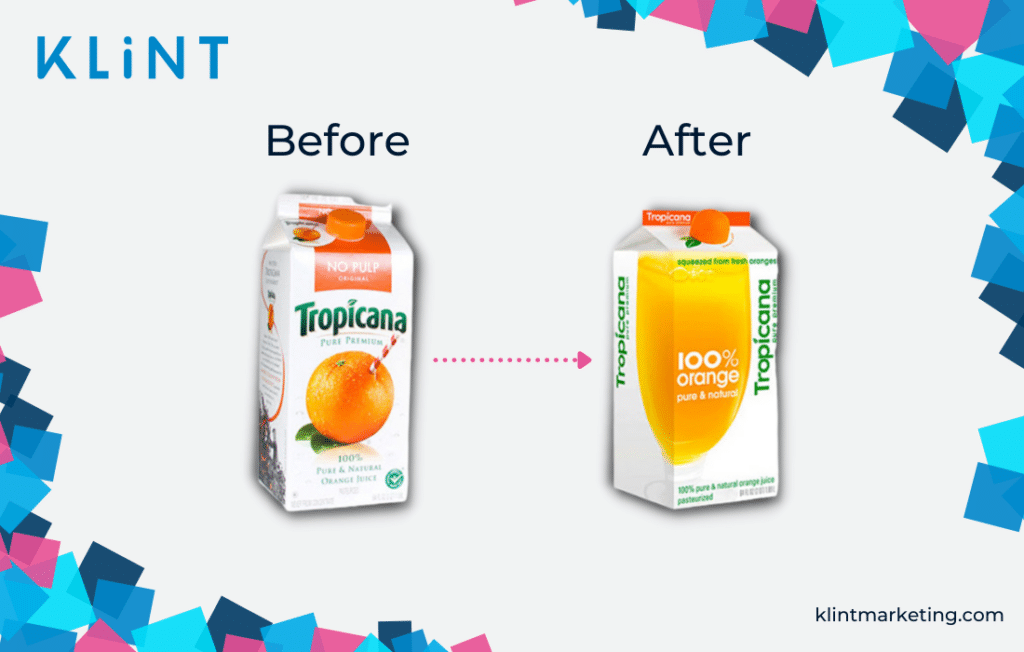
Tropicana Branding Mistake
Orange juice has had an interesting ride through the years.
It started off as classic steeple of the American market and developed into a global operator in the beverage landscape.
Back in 2009, the beverage company, Tropicana, decided to try rebranding all elements of their well-known product and packaging at once. Tropicana went for:
- Simpler Packaging
- Logo design and new color pallet
- New marketing campaigns
The result: bad branding and ultimate logo fail. Rebranding turned into a debacle for the Tropicana which led to disastrous consequences for farmers and the company.
What Happened?
Care to guess what happened? Consumers failed to recognize the product on the shelves which led to a loss in sales.
Rebranded Tropicana looked like any other inexpensive and generic brand that was too far from the recognizable product consumers regularly purchased.
Tropicana unleashed their white packaging without the well-known orange on it. Instead, the fruit was replaced with an orange-colored liquid in a glass.
Consequently, Tropicana’s estimated sales dropped as much as 20% before they decided to revert back to their familiar design.
What can we learn from this bad branding example?
Ask your customers about your brand.
Investigate what they expect and what they find appealing from your brand design.
Moreover, changing too many brand elements at one time can scare your most loyal customers away. Therefore, make sure not to make drastic changes.
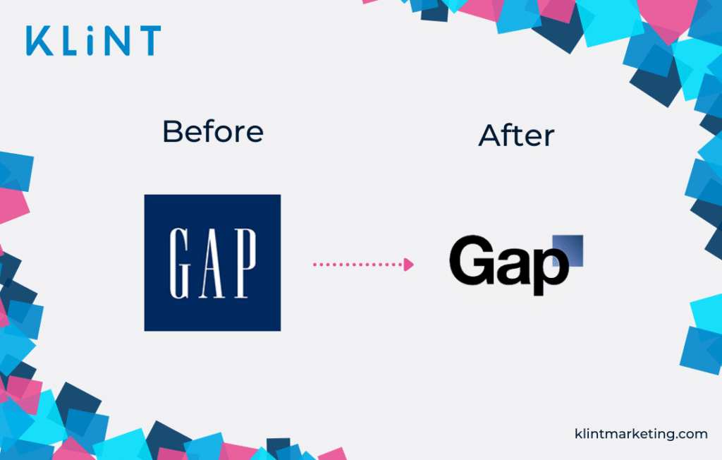
GAP Rebranding Fail
GAP is an international clothing retailer with department stores all over the world. Yet, in 2010, GAP decided to change the iconic logo that every customer recognized and loved.
What’s more, some have even speculated that GAP rebranding was a PR stunt. From all the brands that need rebranding, GAP was definitely on the bottom of the list.
However, rebranding happened and GAP’s new logo included only the brand name and a little blue box on top of the last letter.
This change created outrage among loyal customers. Not even 6 days later the company decided to go back to the old logo design.
What can we learn from GAP’s logo fail?
In GAP’s case, there is one and only tip: Design a new logo that doesn’t throw out a long positive history.
Always keep in mind the emotional bond that customers have towards your logo.
Be also aware that sometimes changing a logo too much could result in losing the brand identity and even protesting customers.
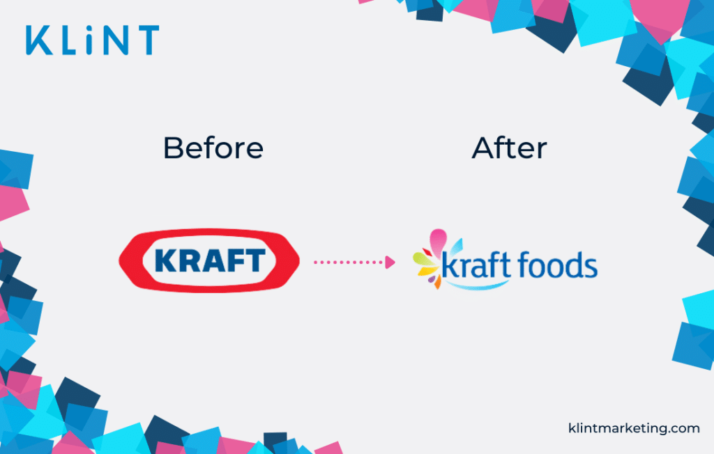
Kraft Marketing Fail
In 2009, the grocery manufacturer company, Kraft, changed its logo to give the company a new fresh look that will better point out its brand values.
However, to everyone’s surprise, Kraft designed a logo that completely failed to explain its brand identity.
Adding unnecessary elements to the Kraft logo, including different font and colors, proved that an already bad branding initiative can become even worse.
After only 6 months, Kraft decided to go back and simply make some small changes to their old classic logo.
What can we learn from Kraft’s rebranding fail?
When starting designing a new logo for a big company; don’t change it completely.
Why reinvent something that works?
It’s sometimes better to only simplify or improve an existing logo.
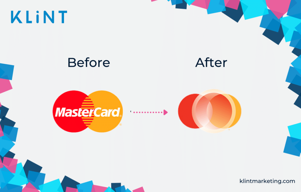
Mastercard Ultimate Logo Fail
In 2015, Mastercard decided to try and improve its logo design.
Although Mastercard has had one of the most globally recognized corporate logos in history, the company felt they needed rebranding.
Their justification: people associated Mastercard with the two colored circles. By adding new elements to these circles, the recognition would still stick.
Historically, the corporate name was prominently placed in the front and center of the logo. After rebranding, Mastercard dropped its name from the logo altogether.
Apart from it being an example of bad branding, the new Mastercard logo also confused consumers.
Eventually, the company came up with a new logo but kept the 2015 design for corporate communications.
What can we learn from this example of bad company logos?
Sometimes there is no need to change a logo if it works. Old companies have iconic logos that everyone can recognize.
Moreover, adding extra elements feels unnecessary and often leads to bad logo design.
If you are looking to refresh your logo, opt for small alterations and little tweaks. Making it more messy and unrecognizable to your customers can only destroy your reputation.
Mastercard realized what disastrous mistake they have made and quickly went back to their old logo design.
Hence, they opted to keep the intersecting circles and focus only removed the company name.
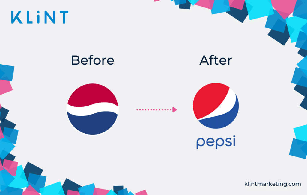
Pepsi’s Bad Branding Example
In the world of cola drinks, there are two names everybody recognizes immediately. One has long stayed with the familiar logo, while the other makes a case of not one but many rebranding examples!
You probably already know which company we are talking about. Pepsi has been changing its logo many times throughout its history. Some changes were great, while others proved to be very bad branding decisions.
In 2014, after 5 months of “hard” work and $1 million spent, Pepsi’s designers came up with a new logo. This rebrand logo resulted in a strong negative criticism.
The famous Pepsi globe was now turned to the side, in an unsuccessful attempt to evoke smiles on people’s faces. Moreover, the white part of the logo was changing in size depending on the product type.
Not only was the rebranded logo uncreative, but it was also inconsistent!
Pepsi’s customers were not happy and their rebranding attempt resulted in a failed marketing.
However, Pepsi decided to go with their new logo (not surprising, considering the amount of money spent on it!).
What can we learn from Pepsi’s rebrand failure?
Trying to reinvent a logo that already speaks to the customers is not always the best idea. Making a logo inconsistent and too posh can result in a lot of negative feedback and damage the brand image.
Always investigate what your loyal customers think about your rebranding strategy and adapt to their expectations and your brand’s tone and values.
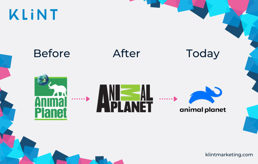
Animal Planet
When the television network Animal Planet decided to change its logo in 2018, its viewers were not exactly thrilled.
The famous green logo with an elephant and the globe now became a simplified version with all black letters, except for the “M” standing upside down and in green. Many claimed that this was the biggest logo fail of the early 2000s.
As a result, the rebranding logo had nothing in common with the old one nor did it represent any of the company’s values and themes.
Furthermore, the animal channel’s explanation of the rebranded logo and the values it should represent wasn’t very clear and did not speak to the audience.
Therefore, in 2018, Animal Planet decided to go back to its roots, however, adding a modern touch. Today’s logo is a leaping blue elephant with black bolded “Animal Planet” in the bottom.
What can we learn from the Animal Planet brand identity change?
Looking at both logos, the old one was easy to understand and consisted of elements that were easily relatable to the brand name. The new logo only led to confusion.
Thus, logos need to provide a clear link to the industry the company is in, with relatable elements to the brand.
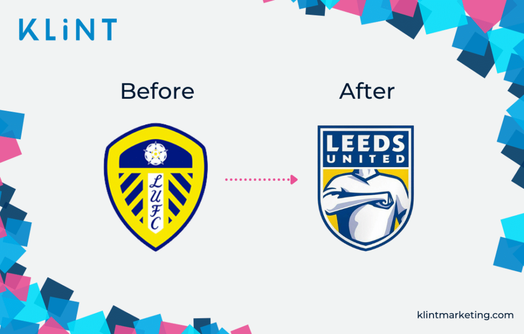
Leeds United Misses the Mark
Among all the football teams in England, Leeds United is one worth mentioning since their logo change created a huge negative online backlash.
Sadly for them, their rebranding efforts secured them a place among bad branding examples on this list.
No one can argue that in the football world, tradition and identity are two crucial factors in loyalty.
Football clubs have a special connection with their fans. Therefore, rebranding and changing a logo thousands of people relate to deeply, may not be the best marketing move.
Leeds failed to recognize that and their bad logo design even prompted their fans to make a petition to change back to the old logo.
Thankfully, fans won this game! Leeds United got back their old colors and symbols to the satisfaction of many.
What can we learn from this rebranding example?
Tradition is essential when designing a logo for a football team.
Every team’s crest has a classic design. These usually only slightly evolve over the years.
But a completely new logo doesn’t appear to match the expectations with the team’s historical claims.
Listen to your loyal fans and avoid unnecessary changes.
Syfy Logo Changes
Next in line of bad branding examples is another popular TV channel that showed how lack of information can hurt your brand image. Yes, we are talking about Sci-Fi (SyFy).
The biggest problem with the 2009 new logo for the TV channel Sci-Fi was not exactly about the bad logo design nor the color.
Apparently, Syfy, the new name for the sci-fi TV channel, is also a synonym for sexual disease in Poland (and a bunch of other countries). Ups!
Not the best marketing for a long-lasting company.
Nevertheless, SyFy decided to stick with their new spelling and logo even though to this day viewers ridicule them for it.
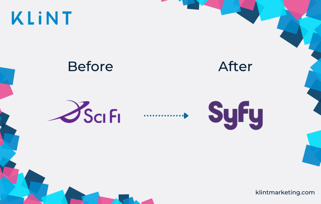
What can we learn from the failed SyFy logo evolution?
Always ask your target group about a change of name. It can have different meanings in other cultures or languages, of which some may be hidden meanings for the new generations.
That being said, the many claims they have gotten did turn into one of their favorite sources of entertainment.
In 2017, they redesigned their logo again, however, the company persisted in still being called SyFy.
Guess some people never learn from their mistakes…
Comcast Logo Change
Comcast was an American cable operator company, which turned into one of the most hated customer services in the United States.
Therefore, in 2010 Comcast made the decision to change their name, hoping to show the customers that they had overcome their customer service issues.
However…
A logo swap usually doesn’t result in people forgetting a history of bad practices.
By changing the brand identity Comcast’s hope was that people would quickly forget their previous negative experiences with the brand. Sadly, bad branding cannot be fixed only by changing the surface.
Instead, the brand could also have put more time and energy into improving customer support, company structure, or internal practices.
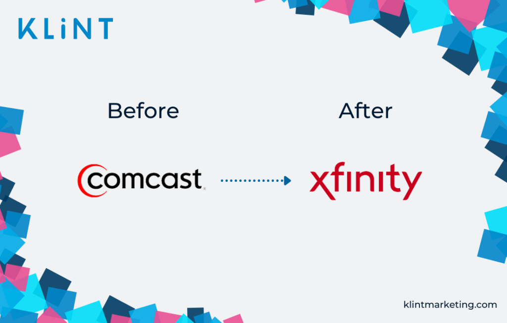
What can we learn from Comcast’s corporate visual identity change?
Restore your reputation alongside spending money on changing a brand design.
Or, simply focus on listening to your customers. Trying to get away from a bad reputation by making drastic changes in your visual identity has never worked out!
Royal Mail Logo Change
In 2001 the Royal Mail in the UK came up with the idea to change its name and logo.
While sometimes a new design can be seen as a good option, in this case, it turned into a leap into the void.
Although Royal Mail’s attention was to step up and compete with popular mail companies such as UPS and FedEx, their new brand identity resulted in a mass confusion rather than anything else.
What was this company: the Internet provider or the mail delivery service?
Even Consignia, the new name, was difficult to pronounce.
Lack of Digital PR and clear explanation regarding this risky rebranding decision did not make the transition any easier.
It didn’t take long before Royal Mail decided to go back to their old name and logo design, and leave their bad branding effort in the past.
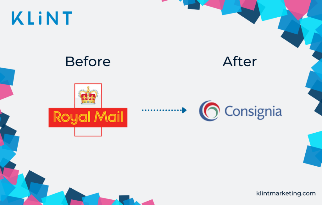
What are the takeaways from the Royal Mail rebranding fail?
Even though Royal Mail though they chose an appealing and modern way of re branding company, it turned into a challenge for both the company and the customers.
Especially when it regards an important company that has a diverse clientele, it is of even bigger importance to use simple, explanatory words.
It should be clear to customers what the company is about, so the brand identity should always attempt to clearly resemble the products and services.
British Petroleum
After having had the same logo for 70 years, the oil company British petroleum decided to change its logo in 2000.
The price tag of this move?
It has been estimated that the development of the new logo cost BP $211M.
Besides the enormous amount of money spent on rebranding, there are some other reasons why British Petroleum is an example of bad branding.
Firstly, the new logo completely differs from the old one – the only consistent element is the color palette.
Secondly, British Petroleum chose to incorporate the symbol of Helios, the Greek god of the sun as the main element in its new logo. With this move, the company wanted to portrait a renewed green growth mission.
But… BP is everything but environmentally friendly. Just as a reminder: in 2010 they were responsible for the largest marine oil spilling in history. Ups!
A good rebranding and a new logo should always aim at representing a company’s vision and strategy.
Therefore, a petrol company should be very careful when aligning its rebranding strategy with its industry.
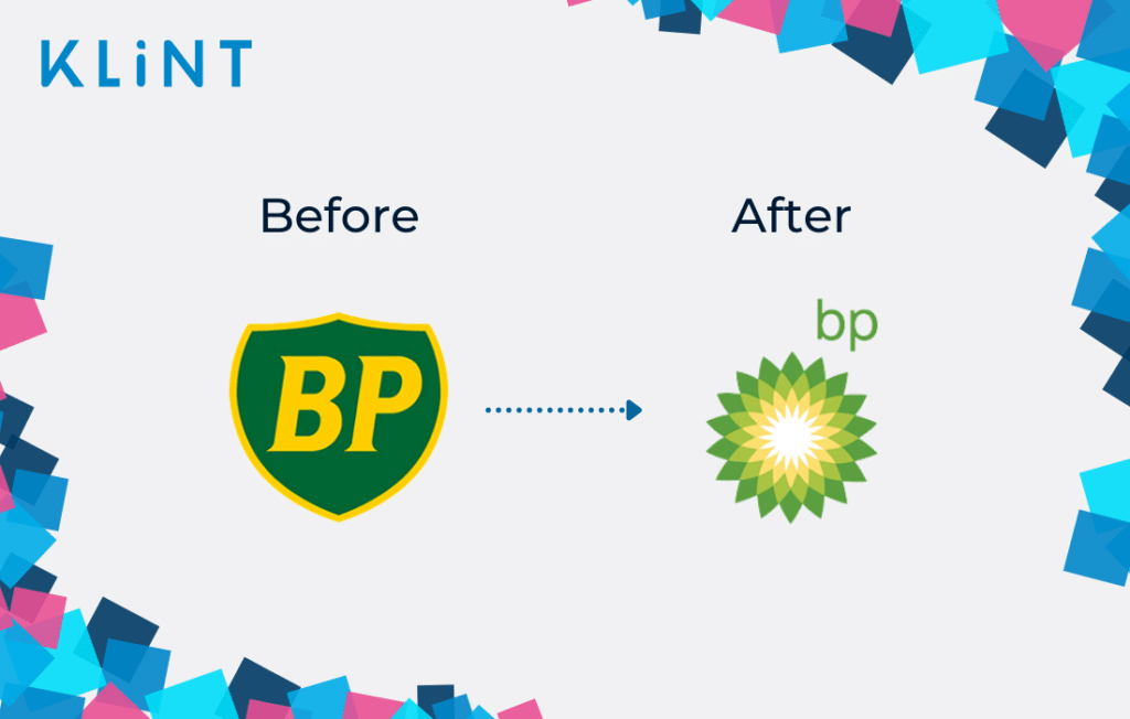
What can we learn BP’s rebranded identity?
If your company is in the oil industry and produces the majority of pollution in the world, it is a tough shot to make the design resemble an environmentally conscious brand.
BP could have found a better message to deliver to their customers, that would not appear too far-fetched from reality.
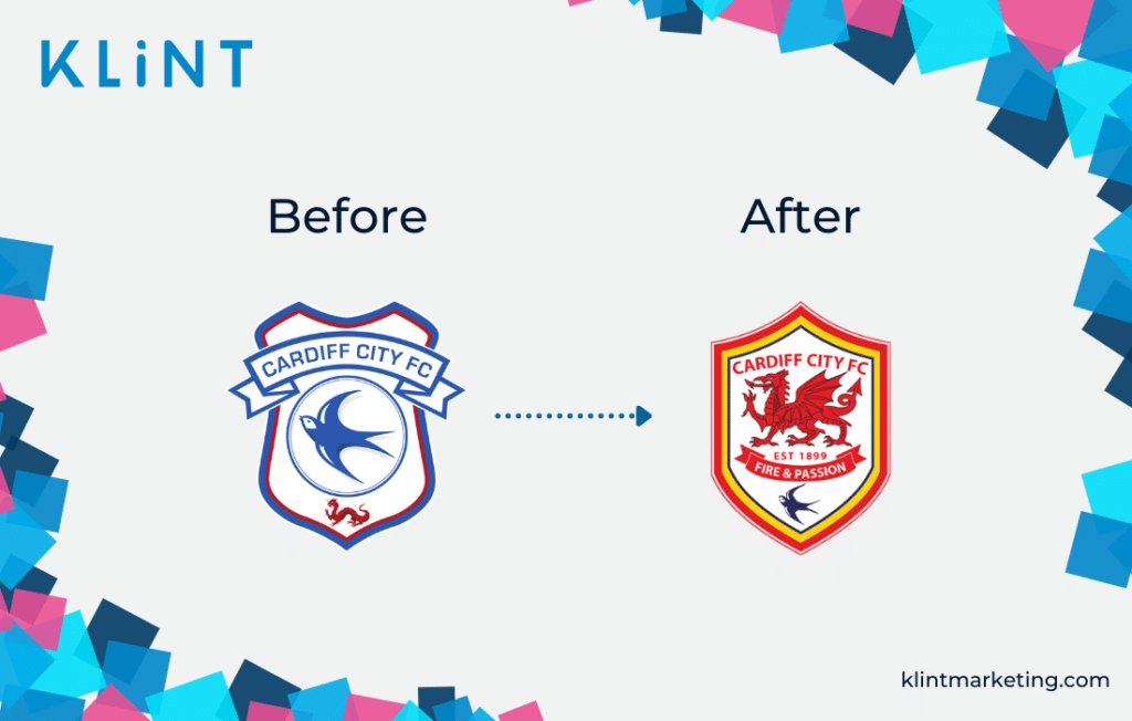
Cardiff City FC
In 2012 Vincent Tan bought the Cardiff City Football Club.
In an effort to give the company an international look, Tan decided to change the logo from its traditional bluebird to a more appealing red dragon that refers to the Welsh heritage.
It resulted in a logo fail 101 – but, let’s back up a little!
Upon rebranding logo of people’s beloved club, the Internet became a place of a huge discussion, with other football clubs mocking the new crest on Twitter.
As fans persisted in singing “we will always be blue” during every home game, the club eventually went back to their traditional 1927 bluebird crest.
However, Tan decided not to make a complete return of the logo, by leaving a small figure of the red dragon at the bottom of the old logo.
What can we learn from this bad branding example?
As already said in the Leeds United crest, football fans are emotionally bonded to the team colors.
Changing these elements is therefore one of the biggest bad re branding examples.
Maintain your color palette, and only improve the quality logo if needed.
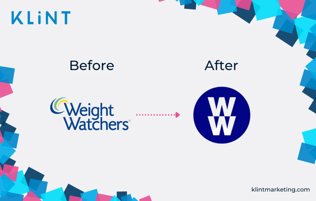
Weight Watchers
Weight Watchers is a globally renowned wellness company.
After having the same name for 55 years, Weight Watchers decided to change its name in 2018 to “WW”. And there would be nothing pointing to bad branding here if the company hasn’t decided to completely change the name too!
Today, WW stands for “Wellness that Works”.
The company has been focusing on weight-loss as its main motto, which they tried to make clearer with rebranding.
However, WW’s rebranding campaign left its customers confused. Current customers were uncertain of how to call them, and new customers were wondering what kind of services they now offer.
Nevertheless, WW decided to keep its new name until today and it stands as an example of one of the big companies that failed to deliver the right message.
What can we learn from WW rebranding example?
The name of your company must be explanatory of your company’s area of expertise.
If you change your company name, try to keep it easy to understand for both your current and new customers.
But also, refrain from changing your name unless truly necessary.
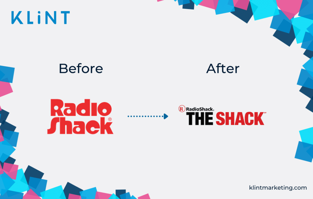
RadioShack
During 2008, RadioShack felt the need to change in order to become more appealing to younger customers.
With the 2008 recession, RadioShack, like many others, was struggling to survive. Many of them even had to close down their stores.
Therefore, to stay up-and-running, RadioShack decided to change its name from RadioShack to “The Shack”.
Surprisingly enough, however, RadioShack decided to keep both names on the logo. If you’d ask us this is one of the most horrific bad branding examples possible, as “Radio Shack The shack” does not make any sense.
In its attempt to attract a more diverse clientele with this rebranding move, RadioShack completely missed the mark.
Luckily, after some time, RadioShack decided to go back to its old name.
What can we learn this instance of bad logo redesigns?
Try to avoid being too pushy on an image that does not entirely fit your company and may make you seem desperate.
In an attempt to attract different audiences, Radio Shack ended up experiencing a rebranded logo fail that people will hardly ever forget.
The truth is, customers just want to perceive a brand as it is, and it is always a smart move to appeal to the existing customers than hopelessly pursuing the new ones.
[Related Article – 44 Companies started in a Recession ]
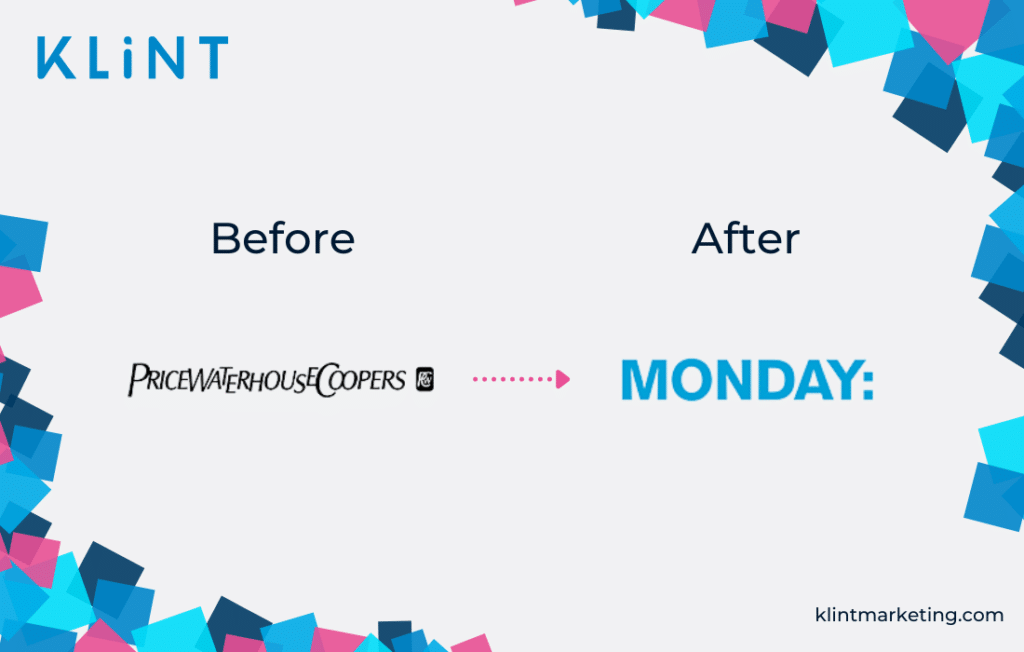
PricewaterhouseCoopers
Next is the example of big companies that failed number… We lost track!
PwC is a company that offers professional accounting and tax services, and they are among the biggest firms in their field, including Deloitte, Tohmatsu, Ernst & Young, and KPMG.
In 2002 PricewaterhouseCoopers decided to change its name and logo to ”Monday”, which should resemble new and fresh starts.
However, PwC used to operate based on a long tradition and a loyal customer base. Even if you haven’t been using their services, you have definitely heard of PwC, right?
Thus, the rebranding campaign was met with a lot of confusion among the existing customers. This new name did not resemble the area of expertise at all.
Moreover, it did not have anything in common with the previous brand image.
Thankfully, after some time the company decided to change its name back to ”PwC” which was easier to remember, and still had a clear link to the company’s history.
What can we learn from PwC’s example of a rebranding fail?
People are creatures of habit that easily create emotional bonds to brands. Therefore, although it may sound like a good idea, rebranding will more likely lead to bad branding than a successful one.
Do not change your name to something that may alienate your customers.
It is best to involve their opinions if you are opting for the change, else only just try to simplify it.
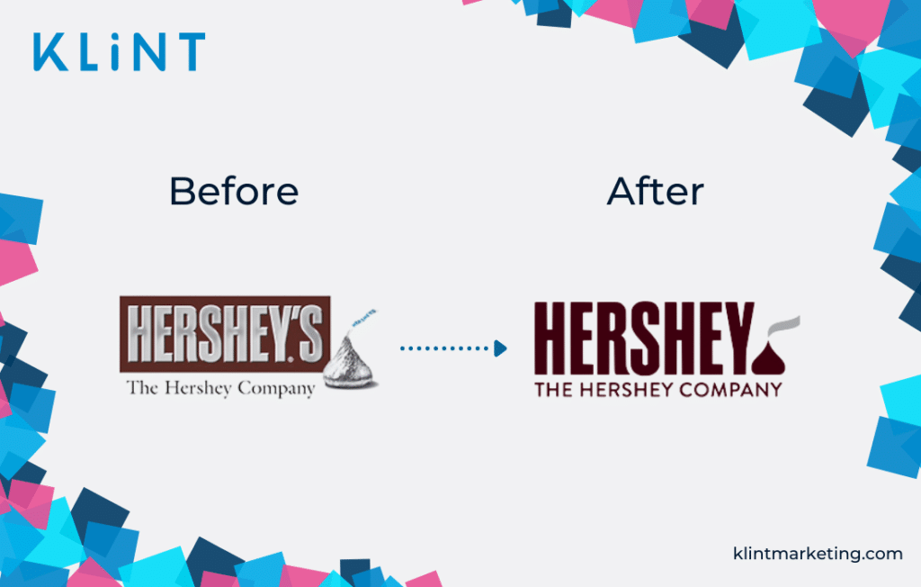
Hershey’s
When thinking about Hershey’s, would you assume that it is one of the brands that need rebranding? Neither would we.
Yet in 2009, the sweet chocolate confections company Hershey’s (or more formal: The Hershey Company) decided to rebrand.
Unfortunately, Its new fail logo was perceived with quite the amount of critique and jokes on the Internet.
The main criticism given was: why change? As a well-renowned chocolate company with a long tradition, they had been doing good for over 120 years.
They ended up with a logo that could look like a smoking poop. Not the first thing you want to think about when you buy chocolate.
Hence, Hershey’s failed with their rebranding.
What can we learn from Hershey’s rebranding fail?
Try to look at your logo from different perspectives.
Sometimes the things you think are a cool design, could have different meanings for others…
Always make sure to consult others when rebranding logo and avoid a mistake similar to Hershey’s.
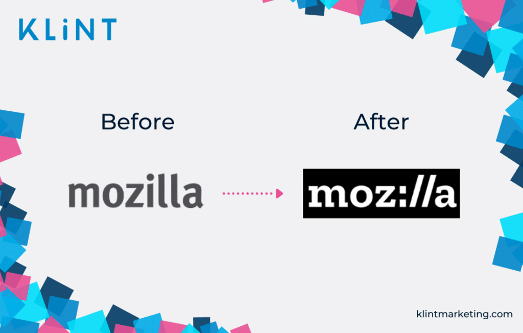
Mozilla

Firefox is among the most popular and used web browsers.
Back in 2017, its mother company, Mozilla, decided to change the Firefox logo.
The rebranded logo read “Moz://a” which creative director Tim Murray commented with: “Because it has a portion of URL embedded in the middle of the logo, you know this must be some kind of internet company.”
A poor explanation for a well-known company that did not really need to explain its industry.
What can we learn from Mozilla Firefox’s rebranding fail?
Always ask yourself if your company even needs a rebrand.
Do not complicate your logo just for the sake of change.
Because more likely than not, it will end up on one of the lists of bad branding examples!
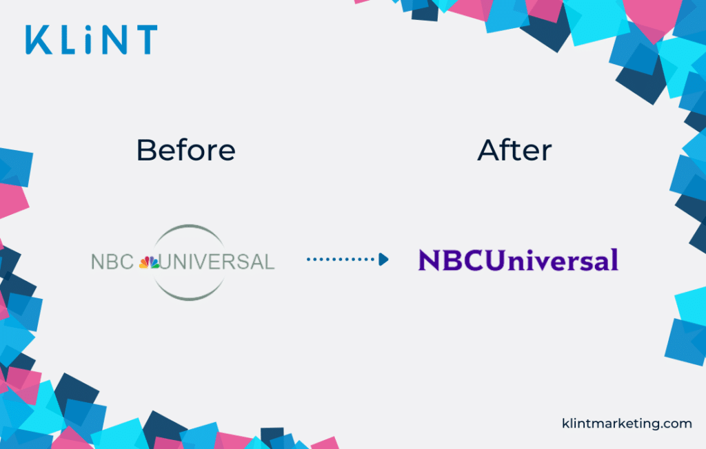
NBC Universal
NBC Universal is a mass media entertainment company.
It is worldwide renowned for its iconic peacock look-alike colorful logo.
However, in 2011 the company decided to move along with a new logo that completely erased the iconic elements, leaving only the written name of the company.
Some perceived it as difficult to read, some as a logo fail, others thought that it was considered too simple in its design.
At the moment, the new logo is only being used for internal purposes.
What can we learn from this rebranding failure of NBC?
As already said, erasing iconic elements when rebranding logo may confuse your customers.
Maintain your iconic elements, and only try to make your new logo easy to read and understand if you choose to change it.
Yahoo!
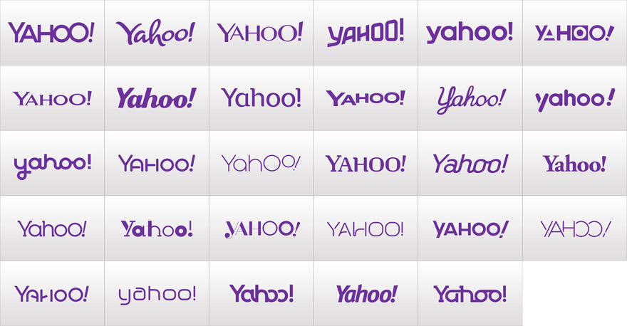
Yahoo! Inc., the web service provider that sadly lost its fame recently tried to gain back its customers in 2013 by rebranding logo. That is, if we can really call this rebranding.
They actually developed a marketing campaign around it, with a new design being revealed every day for a whole month.
On the last day of this campaign, everyone was expecting an outstanding new logo. However, the chosen logo was just a slight change from the old one.
This rebranding campaign was therefore met with great disappointment.
Even though Yahoo!s marketing campaign was very cool, the whole buzz around their new logo did not make much sense, as there was very little change compared to the old logo.
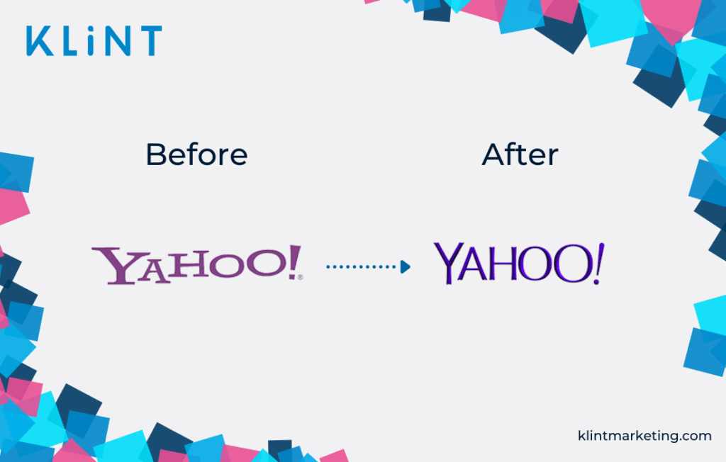
What can we learn from Yahoo! rebranding fail?
When you want to develop a pompous marketing campaign around your new logo, keep in mind that your customers expect a perceivable change from previous logos.
Changing only bits and pieces that are quite unnoticeable will, unfortunately, only lead to disappointment and a bad branding example.
DeviantART
The web platform DeviantART was made for artists to post their work, share it with other artists, and hereby boost their creativity.
However, in 2014, DeviantART felt the need to change its logo.
Since their industry is in design and art, you would probably expect an amazing new logo.
Yet, what they came up with was just an unnecessary slicing of the brand name that made the rebranded logo look unfinished.
Except for the butchered name, all the other elements of the logo were different.
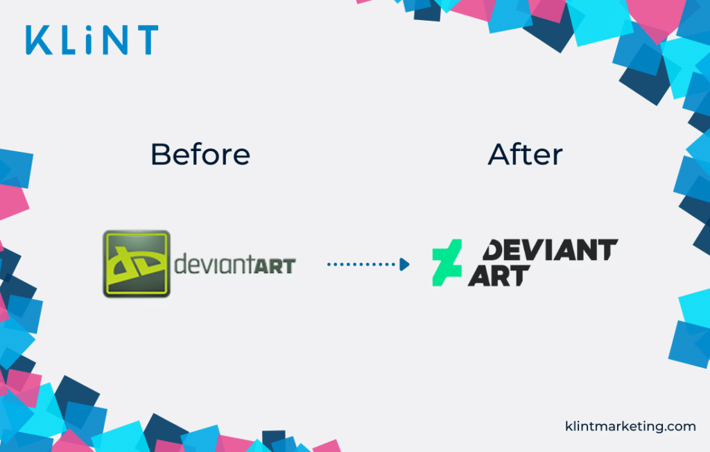
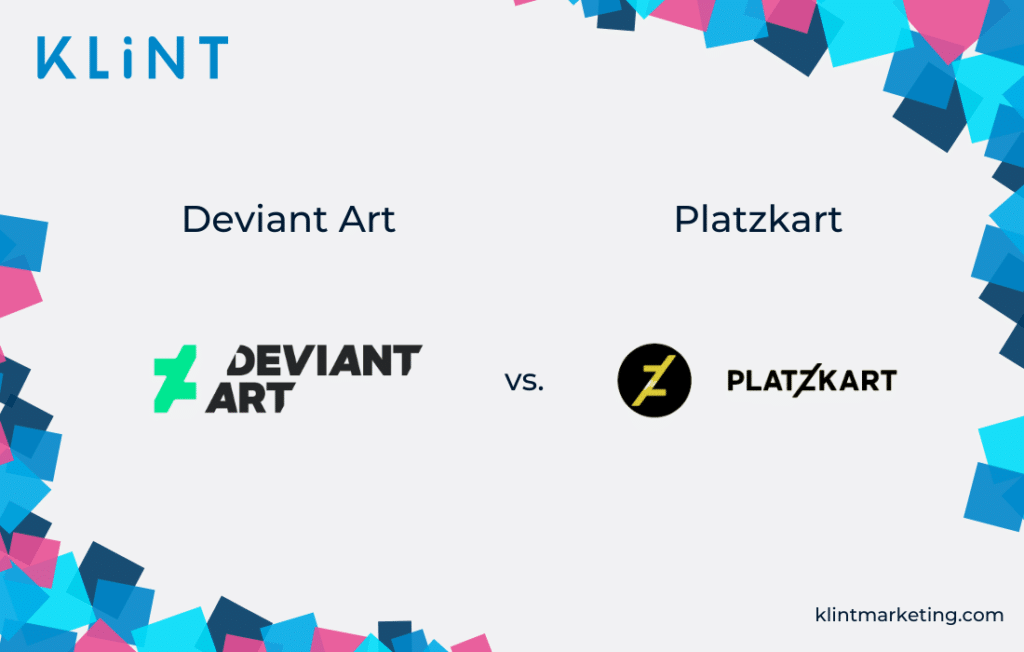
Besides, the new DeviantArt logo fail ended up being weirdly similar to the Russian design company platzkart.ru.
What can we learn Deviant Art’s example of a rebranding nightmare?
Be original. Copying from other designs can result in a disaster.
Remember also that it must be easy to recognize.
Cottbus
Usually, when it comes to the city logo design, there is a classic, heritage-based concept that should be followed.
Interestingly, this was not the case for the rebranded logo of Cottbus, which developed a difficult-to-understand design in 2008 and is an unlucky example of bad branding.
Cottbus’ new logo was a mix of a broad color palette shaped without a distinct form that was met with a lot of disapproval.
In an attempt to be unique and modern, Cottbus managed to completely baffle people by rebranding logo.
Hence, the logo was withdrawn and quickly went back to its old self.
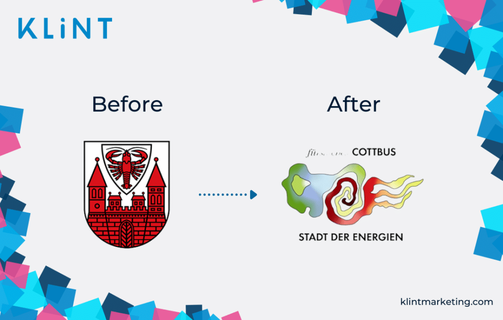
What can we learn from the Cottbus rebrand fail?
A city’s logo usually shows the history and tradition of the city.
When designing a new city logo, its heritage must, therefore, be clearly visible.
Hence, our advice is: never go for something too complicated and far away from tradition when creating a new city logo.
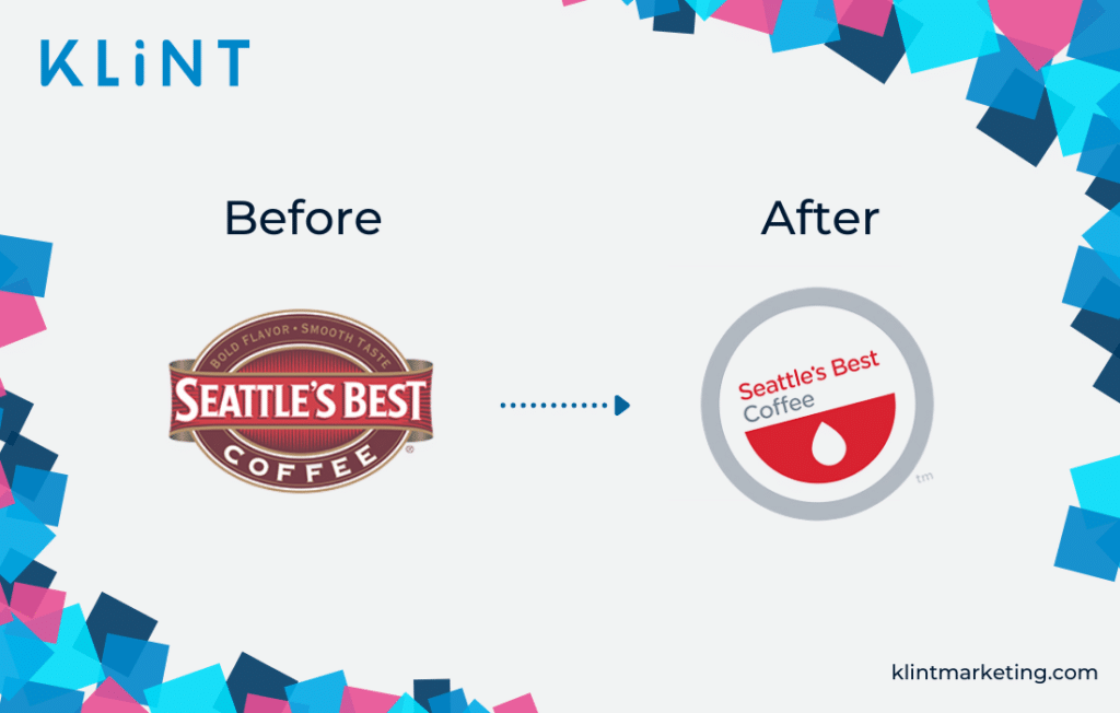
Seattle’s Best Coffee
Seattle’s Best Coffee is the second biggest coffee roaster in the USA, second only to Starbucks (which actually acquired Seattle’s Best Coffee in 2003).
With its rebranding campaign, Seattle’s Best Coffee wanted to give the company a fresh new look. They went for a more minimalistic look, which they thought would be perceived as modern and simple.
However, what Seattle’s Best Coffee did not think of was that, for many people, their new logo would not refer to a coffee company, but rather a blood donation center.
Moreover, the new logo has been described as looking impersonal and resembling a “discount” or “on-sale” sticker.
Not really the best of rebranding examples.
What can we learn from this example of a failed rebranding effort?
As was the case for other rebranding campaigns, always remember to look at your new logo from different perspectives.
Sometimes an attempt to attract a new audience may result in a huge failure, by making people perceive it in a completely different way.
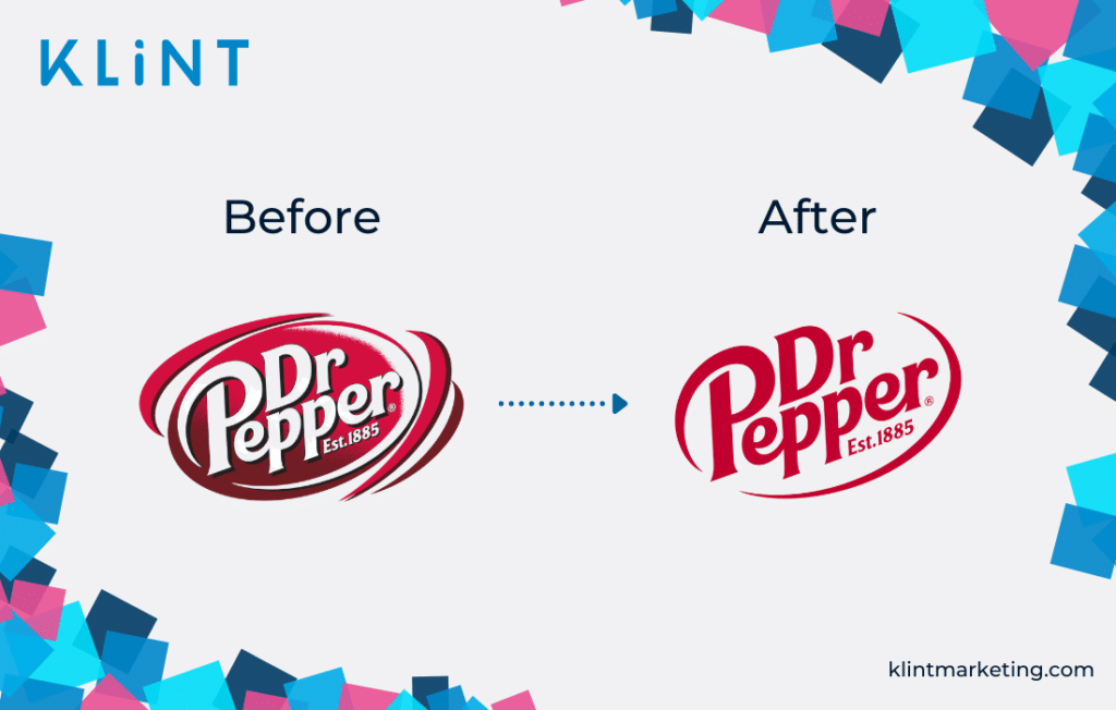
Dr Pepper
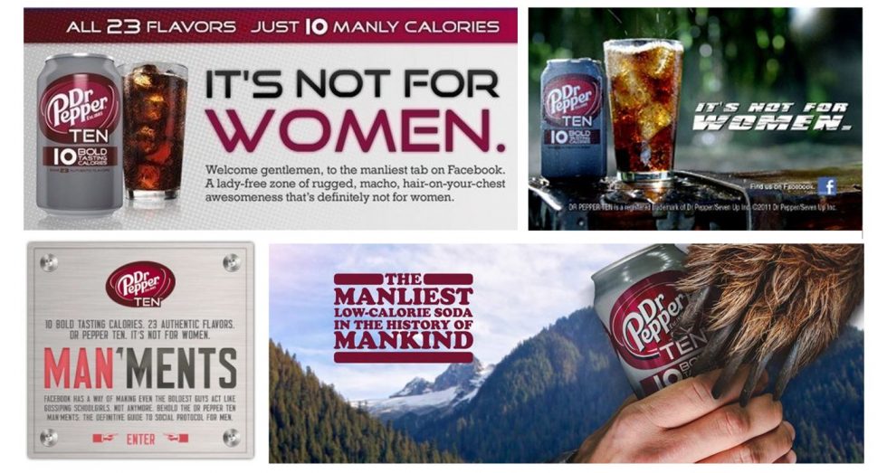
Dr Pepper saw its sales for the diet beverage fall over time. Therefore, they decided on hiring a new marketing department and launching a new campaign to bring the sales back up.
The new campaign was supposed to target only men, the results of which turned out to be quite horrendous.
In the current environment, where equality and diversity are standing strong, this campaign was perceived as sexist, and excluding women.
Moreover, not only has Dr Pepper failed in their campaign, but in their logo design too! They slightly tweaked the old logo to create something new that was almost impossible to perceive. Bad branding moves one after another!
What can be learned from Dr Pepper’s failed rebranding campaign?
Excluding specific people is never a good idea!
Rather, emphasize the target group, without leaving the others out.
And again, don’t change the logo if not totally necessary!
Black & Decker
Black & Decker is a well-known international company that sells power tools.
In 2014, they decided to change the logo. Sadly, this rebranding attempt was perceived with a lot of mixed feelings.
The new logo was now completely orange and a faded version of what it used to be and what people easily recognized.
Even though the logo change wasn’t perceived with sole enthusiasm, the company is still using the not-so-new logo anymore.
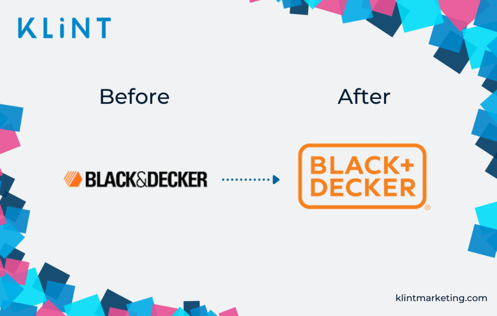
What can be learned from Black & Decker’s example of bad branding?
Iconic and easy-to-recognize logos should remain the same. In case you are really opting for a change, make sure to maintain the important elements.
Changing important parts of the logo has a big chance of resulting in confusion and disapproval among your customers. Ultimately, this can lead to lost sales and decreased ROI.
Therefore, really do question if rebranding logo is truly necessary!
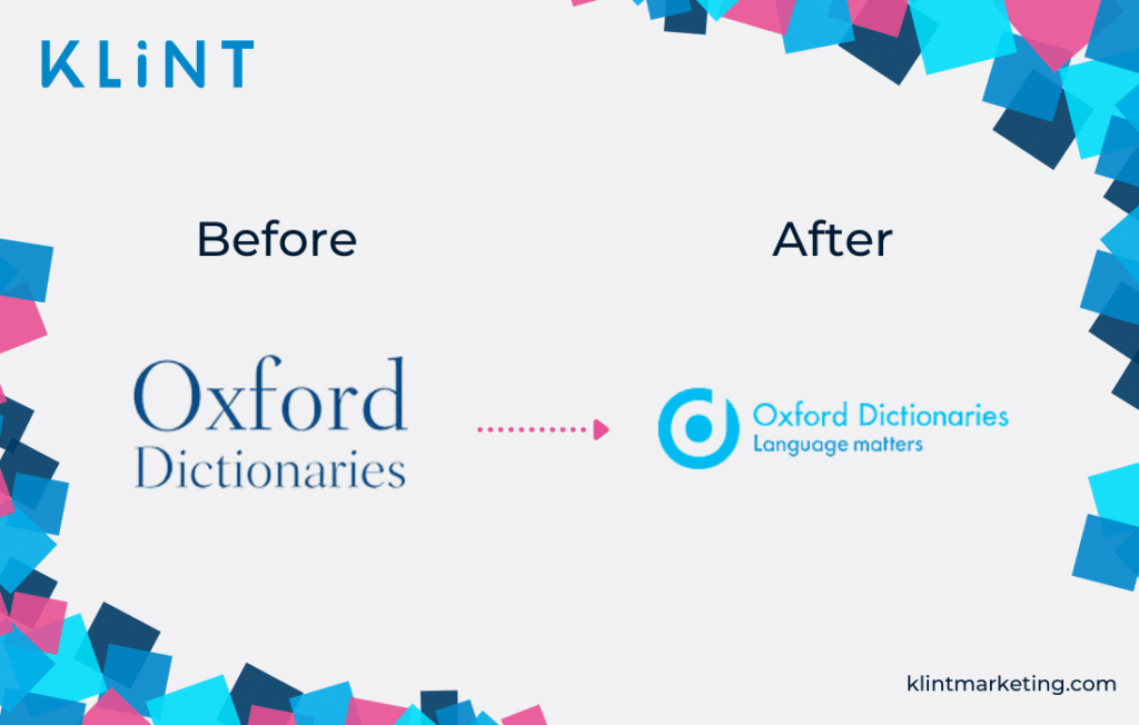
Oxford Dictionaries
Oxford Dictionaries is one of the most renowned dictionary producers around the world.
Its classic blue logo was one of the symbols of the brand. Hence a surprise when they decided to change it back in 2014!
A new modernized version of the logo replaced the old logo that clearly represented the company’s long tradition.
The rebranded logo looked more like a headphone company logo.
Interestingly enough, some of the elements are strangely similar to the Beats by Dre company logo.
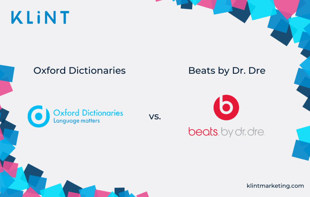
What can we learn from the Oxford Dictionary rebranding failure?
Originality is a must; do not copy from other brands.
Also, if you have it, remember to show your heritage in your logo.
Capital One
If we are talking about the brands that need rebranding, we cannot forget to add Capital one to the list.
Luckily, in 2008, the bank company Capital One made the right decision of trying to give a new look to the logo design.
And it would have been a great idea if the design did not look like an even more outdated version of the standing one.
However, the newly added swoosh with gradient color really does not give a fresh look to a company that bases all of its industry on trust and reputation.
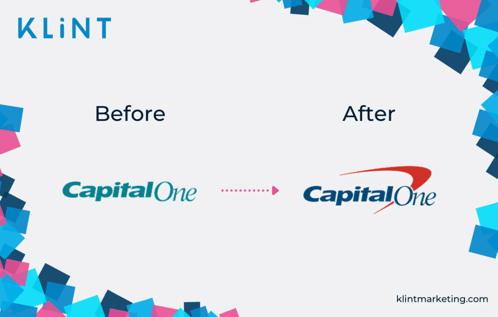
What can we learn from this example of a rebrand fail?
Do not add unnecessary or old-fashioned elements to your new design.
Capital One’s logo is one that really needed rebranding from scratch, yet completely failed to execute and ended in a logo fail!
London Olympics 2012
Every four years Olympic games are held in a different country. For each event, a different logo design is created to celebrate it. In 2012 the Olympic games were hosted in London, UK.
And among a huge number of amazing logos created by other countries, people were expecting the UK to shine. On the contrary, the UK managed to destroy the history of great logos and end up on the list of bad branding examples.
The UK Olympics logo design needs more than one look to be understood and definitely does not look like an Olympic Games logo.
Notably, this logo was described by many in the design world as “the worst Olympic logo since 1924.”
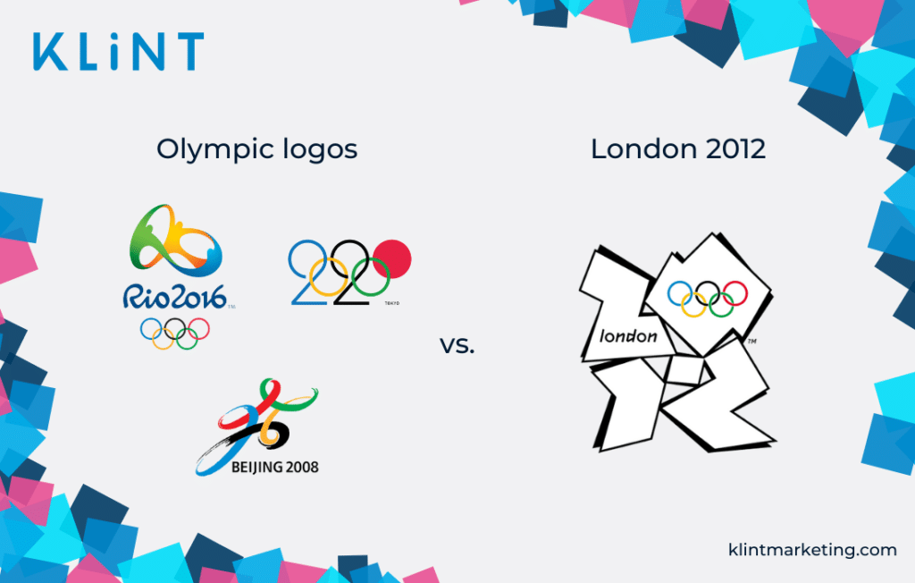
What can we learn from this example of global logo failure?
Although one-of-a-kind and interesting in theory, complicated designs are difficult to understand.
Keep it simple and easy to remember.
Blackwater Worldwide
Remember this?
The private security company Blackwater Worldwide gained a lot of negative coverage after an incident in 2007 in Iraq, where 14 civilians were killed during an operation.
Not being able to erase the bad image surrounding their brand, Blackwater decided to change the name first to Xe Service LLC and later to Academi.
Unfortunately, multiple changes in the company’s name cannot completely restore your reputation nor can they be easily tracked by customers.
Sadly, in spite of all the attempts to recover, the company went defunct in 2014.
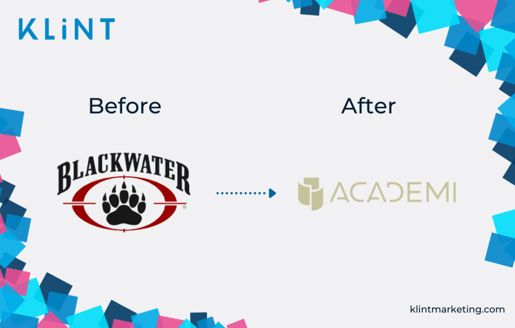
What can we learn from Blackwater’s rebranding example?
As obvious as it may sound, a rebranding campaign may not be sufficient to restore one’s reputation. Therefore, try to restore the reputation first, and then change the name and/or logo.
Unfortunately for Blackwater, their reputation couldn’t be restored no matter the effort they put in.
Xerox
Known since 1994 as “the copier company”, Xerox is an expert in its area. However, it seemed that in 2008 Xerox got tired of being perceived as only a copier company and decided to change their logo to represent other areas of expertise.
Hence, the new design did not focus on the most important part which is the company name itself, but instead, they added a new visual element that has no direct relation to the company identity.
Moreover, the design looked like a mix of different already existing logos.
Xerox failed in both trying to show what else they can serve to their customers and to make this big boom in rebranding.
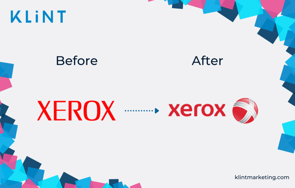
What can we learn from the example of rebranded Xerox?
When you decide to rebrand, always remember which business you are operating in, and what the expected future of it is.
Avoid adding unnecessary elements that have no relation to your brand’s image and values.
JCPenney
JCPenney is a well-known retail company with shops mainly in the USA and Puerto Rico. For the unbeknownst reason, JCPenney decided to change the logo in 2011.
However, this rebranding attempt got met with great criticisms and thus ended up on our list of bad branding examples!
The new logo was criticized for being difficult to read and understand, among other things.
Dare to guess what happened next? The retail chain soon went back to the slightly altered version of its old logo!
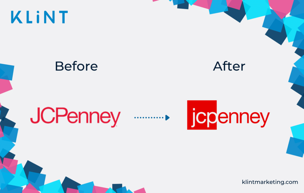
What can we learn from JCPenney’s attempt to rebrand itself?
Make a logo that is easy to understand and to read.
Sometimes a cool design doesn’t necessarily mean a great user experience too!
Overstock.com
In 2011 the US-based online retail company Overstock.com made a major change to its brand by changing its name to O.co.
Borrowing the .co from Colombia, Overstock.com completely lost its company identity.
What was left as a resemblance to the old logo was the O in the red square. Not much to remember a company by.
Therefore, O.co ends up on our list of big companies that failed in their rebranding attempt.
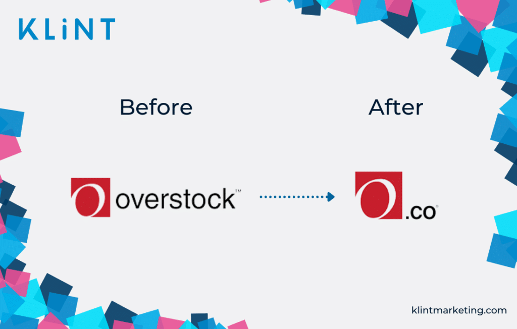
What can we learn from Overstock.com’s logo fail?
Logo designs have to recall the industry of your company and resemble your company’s tradition. Ask yourself whether the new logo will be something your customers will be able to connect to the old one.
Changing the entire name to just one letter is not really the best rebranding attempt.
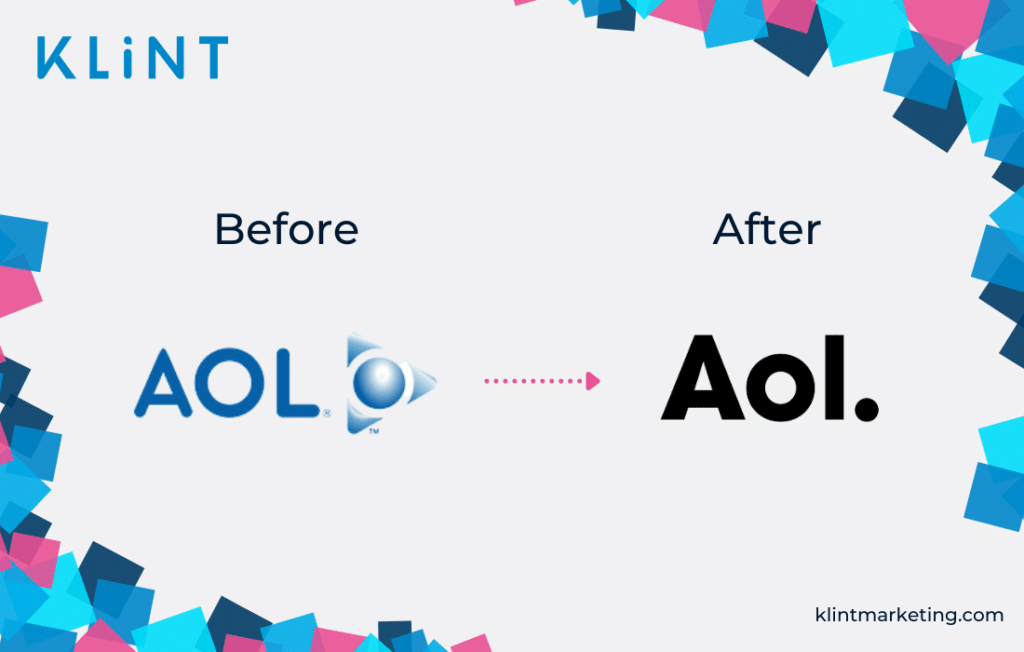
AOL
The US-based web service company AOL changed its name to ‘Aol.’ in 2009.
The company decided to replace the iconic triangle with a simple dot. And although a minor change, in the eyes of their loyal customers it was very noticeable and not received well.
Rebranding logo created nothing but confusion among the customers who had an emotional bond with the old brand logo.
The new color also didn’t resonate that well with them. Overall, AOL’s efforts resulted in a bad branding example not many expected.
Soon after, AOL rebranded again and created a design that much more resembled the old one.
What can we learn from this example of a rebranding gone wrong?
We have mentioned this before, but it is the rebranding lesson number 1! Customers are often emotionally bonded to the brand logo. It is something they recognize the brand by immediately.
Changing it completely can alienate them, so always maintain iconic elements on your logo! Otherwise, you are facing a logo fail!
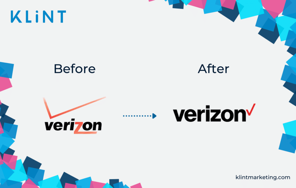
Verizon
The telecommunication company Verizon changed its logo in 2015, in an attempt to take a fresh and original direction.
However, this rebranding campaign just meant rewriting the brand name in a simpler way, with the traditional checkmark moved to the end and displayed and making it slightly smaller.
Nothing else to add, but that is simply boring if you ask us…
What’s more, that little personality and playfulness the old logo had were now completely gone.
Despite being a bad branding example, Verizon decided to stick with its new look to this day.
What can we learn from Verizon as an example of bad rebranding?
Interesting and well-balanced elements can only benefit the logo design. Deciding to remove them can sometimes be a risky move leading to customer dissatisfaction.
Therefore, when simplifying your logo, ensure that it doesn’t become boring.
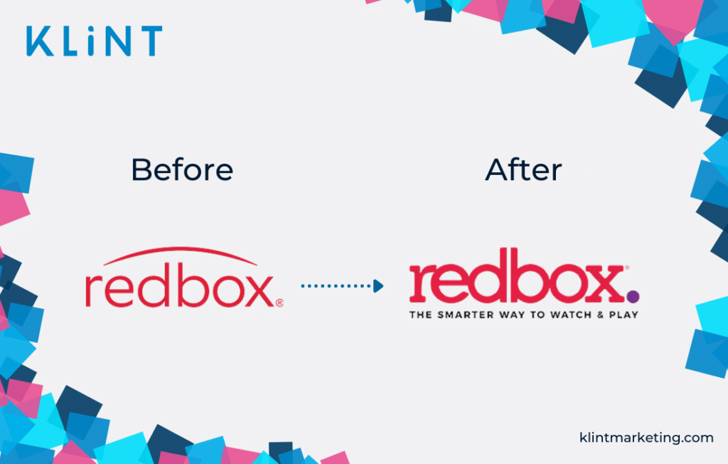
Redbox
The DVD rental company Redbox changed its brand logo in 2017.
The old logo gave the company a nice and silicon valley vibe look. However, the new logo was met with great criticisms.
The new logo was seen as a downgrade, with an element added that people did not get (the purple dot), and the letters ‘db’ too close together making it complex and fuzzy to read.
It was a rebranding failure.
What can we learn from Redbox as a rebranding campaign gone wrong?
Occasionally updating a logo and making it a better and more modernized version of what it used to be can be a good rebranding strategy.
However, it can often lead to a messy design, so be careful to always get a couple of feedback prior to rebranding.
And, in case you do decide on a change, only add and eliminate elements that make sense.
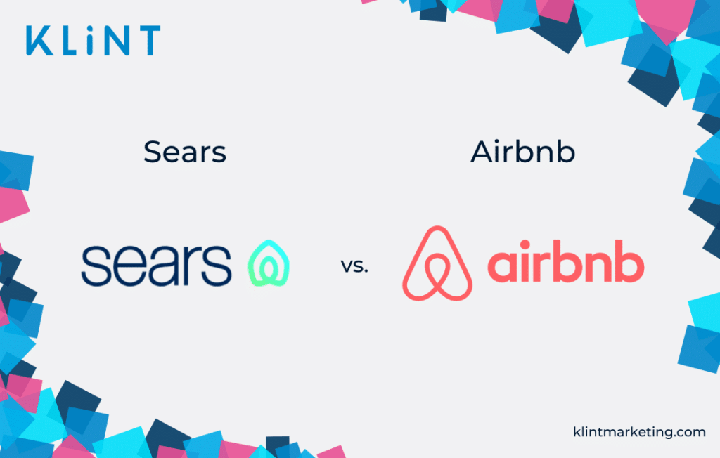
Sears
The retail company Sears decided on changing its logo in 2019, in the hope of boosting its sales. What they did was keeping the original logo and adding an element next to the name.
This new logo did not necessarily display any originality, as the added element closely resembled the Airbnb logo.
Moreover, such an element clearly does not give any hint of the company industry.
Sadly, Sears’ bad branding example only showed a lack of innovation and creativity.
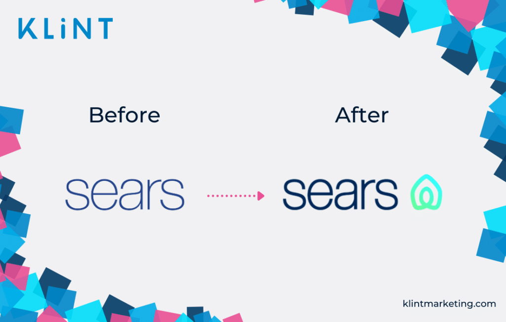
So, instead of creating the whole frenzy around the greatness of its rebranded logo, Sears ended up being a part of Sears vs. Airbnb ‘who wore it better’ competition!
What can we learn from Sears’ rebranding attempt?
We cannot stress it enough: originality is a must. However, no matter how original you are, double-check to make sure that the type of logo you are creating doesn’t already exist.
Conclusion
Some of the main reasons for a company to go through rebranding are internationalization, consolidation of a brand, a bad reputation, or a new CEO.
Whichever is your case, you should pay attention to:
- Not underestimating the emotional bond customers may have with an old brand logo
- Being original in your design
- Ensuring that the new logo shows what industry the company is operating in, and where the company wants to go in the future
- Making the logo easy to understand and read
- Looking at the new design from different perspectives
Following these tips will help you avoid being listed as a bad branding example.
Do you think there are any companies that need rebranding?
Do you want more information or help with a rebrand? Try not to do the same mistakes and contact us at Klint Marketing!


It is just amazing and valuable for all the entrepreneurs who are willing to start a business.
I’ve gone through many of your blog posts, you are doing an outstanding job providing massive amounts of free information to all the entrepreneurs. I really appreciate it.
Thank you