

Data visualization simply refers to the process of showcasing your collected data via a visual medium. Similarly, data visualization tools are software that assists in compiling data and presenting it as graphs, charts, figures, tables, and so on.
Data visualization tools allow audiences to comprehend data with ease through the power of visual communication. This allows an audience to gain insights from data that would not be immediately obvious by simply reading spreadsheets, uncovering insights which make data storytelling visually appealing.
As a result, businesses are leveraging data visualization tools to make more data-driven decisions. Additionally, more and more professionals now rely on these data visualization software to communicate their business insights quickly and accurately.
Not sure you have enough data to analyze? Well, consider that in 2020 each individual generated an estimated 1.7 megabytes of data every second!
You don’t want your audience to have information overload! So utilize these amazing data visualization tools to highlight your data in an engaging and eye-catching format.
But before you select which of these data visualization tools to use, you need to specify your target audience, as you want to match your visualization to your audience…
Table of Contents
How to choose the right data visualization tool?
Choosing the right data visualization designer can be tough. There isn’t a right or wrong tool, as each one has an advantage for a specific use case.
Consider the needs of your business, and how important the following factors are for you: flexibility, analytical functionality, ease-of-use, data connectivity, or technical skill levels of your employees.
To meet these needs, think about how the features of these data visualization tools align with your individual use-case. Features to look out for include:
- Multiple Data Sources: Most (but not all) data visualization software allow you to import data from multiple data sources and view it on the same dashboard.
- Data Transformation: You need to choose the right data visualization tools if you need to perform any custom calculations.
- Built-in Connectors: Make sure that the tool can be connected directly to the data source, which can be either Google analytics or internal SQL database, to automate any data updates.
- Dataset Size: Some software have size limitations, meaning they may not be the best data visualization tools for large corporations.
- Data Sharing: Some free data visualization tools allow you to share data with your audience, but some charge additional costs for views.
- User Interaction: Some tools allow you to moderate the level of interaction your audience has according to their interests.
- Budget: Free data visualization tools are available, but may have functional limitations.
- Scheduled Reports: Some tools update in real-time, producing scheduled reports on your data.
- Mobile-friendly: Most of the data visualization tools include a mobile app, providing access from anywhere, any time.
Prioritizing some of these functionalities should provide clarity in your search for an appropriate data visualization tools, or at least narrow the range of options you may want to consider.
Best data visualization tools list
As previously stated, your choice of data visualization tools will depend on your specific needs. But in many cases, it is advisable to begin by selecting one of the free data visualization tools that offers a slightly more limited scope of functionality, before putting down your hard-earned cash.
You might also want to test out a few of the data visualization tools on this list to see which one you like the most – which is why we’ve included information on their free trials.
So, let’s explore all the data visualization tools available just a click away…
1. CanvasJS Charts

Best For: Complex Analysis types, such as logarithms
Payment Plans:
- Single Developer License: $399
- Team License: $999
- Unlimited Developer License: $1999
Free Trial: YES
Review Score: 4.7/5
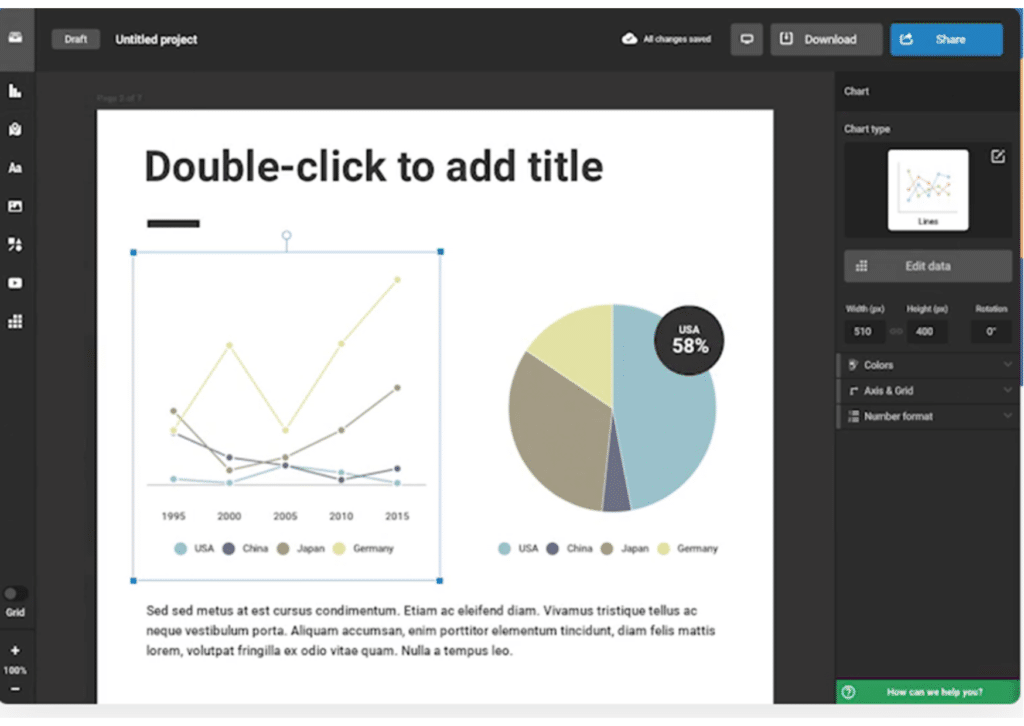
ChartJS is a simple and intuitive JavaScript, perfect for data visualization designers and developers. Apart from being highly responsive and having great performance through every browser, ChartJS also has animated data and amazing transitions.
CanvasJS Charts is one of the highly visual data visualization tools – it allows you to view your data in 8 different ways. You can customize your data visualization or contribute to Chart.js empowerment by telling your perspective since ChartJS is an open project.
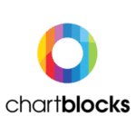
2. ChartBlocks
Best For: Easy-to-use interface – no codification or IT skills required
Payment Plans:
- The Professional: €16.50 per month
- The Elite one: €55 per month
Free Trial: YES
Review Score: 5/5
Chart Blocks is an online chart-building tool that’s easy to use. All you need is to import your data, design and then share them on Social Media. Chart Blocks is one of the data visualization tools that integrates with Facebook and Twitter.
It comes as a customizable tool that offers you many charts and guides for chart creation.
After you create your chart with ChartBlocks, you can both share it on social media platforms, or you can export as a vector graphic and edit it on graphic websites like Illustrator.
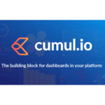
3. Cumul.io
Best For: Multiple language functionality
Payment Plans:
- basic (€830 per month)
- professional (€1560 per month)
- elite (€2285 per month)
Free Trial: YES
Review Score: 4.4/ 5
Cumul.io is one of the best data visualization tools that creates intuitive and perfect dashboards in a minute. It transforms complex data into easy to understand visuals, doing all the hard work for you. Cumul.io will impress your customers, thanks to its interactive interface and easy to use navigation.
Its drag and drop editor creates unique graphics and dashboards. You can customize your dashboard, adding multiple languages and devices. Besides, also your clients can customize their dashboard from a white-label interface.
4. Dashthis
Best For: IT experts can edit your dashboard for you
Payment Plans:
- Individual $33 per month
- Professional $129 per month
- Business $249 per month
- Standard $399per month
- Enterprise $599 per month
Free Trial: YES
Review Score: 4.1/ 5
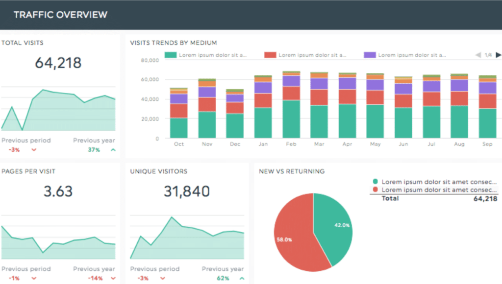
Are you looking for data visualization tools that’s both effective and time-saving? Dashthis is perfect if you need an accessible platform and if you need to save time. You only need to select among the many pre-made templates where you can just add your data.
Dashthis is perfect if you’re in a marketing team, if you’re in a small business, or if you are freelance.
Dashthis is highly visual. You can have all your data in one dashboard, thanks to the 34+ connected integrations. Dashthis also offers easy-to-understand reports. Whether you need a social media report or an e-commerce one, there’s a dashboard for it too.
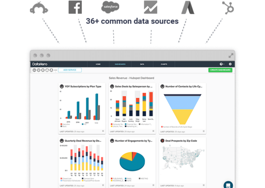
5. DataHero
Best For: Easy Export via PDF
Payment Plans:
- Starter ($49 per month)
- Premium ($79 per month)
- Team ($99 per month)
- Agency (Contact the Team)
Free Trial: YES
Review Score: 4/ 5
With DataHero, insights automation has never been so easy. Your data dashboard will be easy to understand and create for you, thanks to the drag and drop function, which doesn’t require you to be an IT expert.
DataHero is one of the data visualization tools that’s easily shareable. Once you’ve finished your work, you can easily export it via PDF or share a chart and a dashboard with your clients. Besides, DataHero allows you to save time for both drag and drop functions for automatic source refresh.
What’s great about this data visualization software is that you can have all your data in one single dashboard. Connect Google analytics, Facebook Ads, Hubspot, or Salesforce to your DataHero dashboard and see all your significant data in one place.
6. Datapine
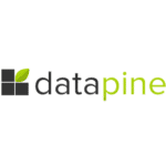
Best For: Highly Responsive – supports every device access
Payment Plans:
- 4 different plans: starting from 249$ (Contact the Team)
Free Trial: YES
Review Score: 4.8 / 5
Planning your decisions has never been so easy. DataPine is a data visualization software that gives you access for BI visualization. Your data are secure with DataPine, and they are easy to understand and are all in one central place.
DataPine is one of the best data visualization tools for developing data-driven workflows and efficient decision-making. With built-in automation options, you can reduce manual tasks to a minimum, and save time on presentations.
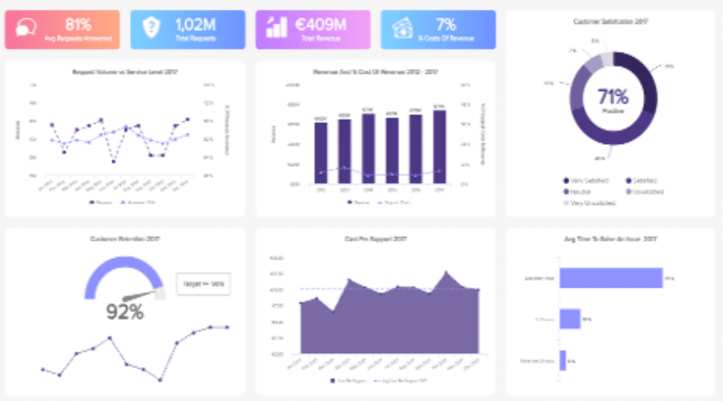
7. DataReprotive

Best For: Schedule & Automate Email Campaigns
Payment Plans:
- 10 users access: $99
- 25 users access: $149
- 50 users access: $199
Free Trial: YES
Review Score: 4.9 /5
DataReportive is a SQL editor, which is one of the data visualization tools with autocomplete and multiple tabs. Once you’ve finished editing, you can share your file whenever and wherever you want. Share it via Slack, export a PDF, or a Google Doc. It’s all up to you.
DataReportive has many functions: alerting, scheduling and embedding are just a few of the many that it conveys. You can also set your security level to the top-setting permissions to reports and folders.
With DataReportive not only you will have access to easy-to-understand insights, but also to professional HTML email reports.
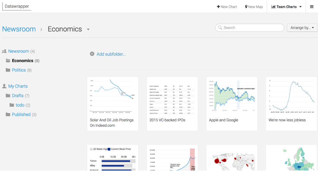
8. Datawrapper
Best For: Team Work
Payment Plans:
- Custom plan: $599 per month
- Enterprise plan: Contact the team
Free Trial: YES
Review Score: 5 /5
With Datawrapper, you can create charts, maps, and tables, according to your necessities. Every element can be customized and made according to your needs. Besides, with the copy-paste function, you won’t need any coding skills.
Once you’ve copied your code or uploaded one CSV document, you can edit it and customize your chart. Then, all you have to do is copy your code and export it as a PNG, SVG, or PDF.
Datawrapper is one of the highly responsive data visualization tools which allows you to easily work in teams, since you can see what your team is creating.
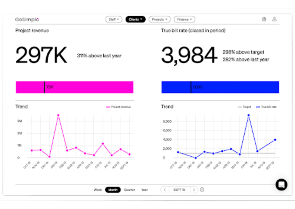
9. GoSimplo
Best For: Business Intelligence Reports
Payment Plans:
- Premium Plan: Coming Soon
Free Trial: YES
Review Score: 4 /5
GoSimplo is one of the best data visualization tools that is designed to visualize the most important performance metrics in your company. Combine data from disjointed systems into a single reporting solution.
GoSimplo builds digital dashboards for C-level executives, which helps them make informed decisions with less hassle. Connect your systems, visualize your key metrics and start acting.
GoSimplo is a one-stop tool for financial and operational data overview. Insights that everyone can access real-time and make decisions with less hassle.
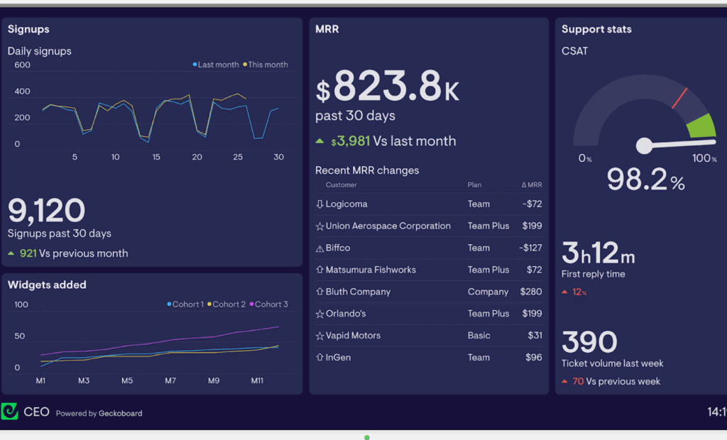
10. Geckoboard
Best For: Share Dashboard in any Platform
Payment Plans:
- Starter plan: $28/month
- Team: $125/month
- Team plus: $219/month
- Enterprise : Contact the Team
Free Trial: YES
Review Score: 4.6 /5
Geckoboard is a template creator, which helps you to share data more compellingly. With this data visualization software, you can easily share your data from spreadsheets or databases.
Geckoboard is one of the best data visualization tools for maximizing your teamwork. With its real-time metrics, your team can correct and improve their activities instantly, course-correcting their work. Besides, with KPIs function, you can share progress and company goals.
Share your dashboard wherever you want with quick links that allow you to share your document on every platform. You can also share your dashboards via Slack or display them on a TV or a monitor during a presentation.
11. Google Charts

Best For: Most popular data visualization tools
Payment Plans:
- FREE
Free Trial: YES
Review Score: 4.6 /5
Google Charts has an easy interface, and data is easy to understand for all, also thanks to the interactive features it comes with.
All dashboards are entirely customizable, and there’s a wide variety of models and charts. Besides, you can connect all your charts into an interactive dashboard to make it all more understandable.
What’s great about Google Charts is that it is one of the free data visualization tools on this list – it’s always free and comes with easy guides to assist you.
12. High Charts

Best For: Advanced Animations
Payment Plans:
- Non-profit organisations: Free
- Commercial use: Contact the Team
Free Trial: YES
Review Score: 4.7 /5
Highcharts allows you to customize everything thanks to JavaScript or CSS. You can see advanced animations by extending or plugging in to Highcharts.
Highcharts is one of the data visualization tools that creates interactive highcharts and maps. A Highcharts’ special feature is the high capability that Javascript has, making easy and effortless interactive charts and timelines.
13. Holistics
Best For: No IT Skills or, complex SQL queries required
Payment Plans:
- Entry : $100/mo
- Standard : $250/mo
- Professional : $500/mo
- Enterprise : contact the team
Free Trial: YES
Review Score: 4.6 /5
Say goodbye to the request queue. With Holistic, you can connect to your SQL database, and everyone can answer their own data questions.
Insights are easy to understand and share. You can send them via email, Slack, or instant messaging. Besides, it’s one of the best data visualization tools that allows you to visualize insights in intuitive dashboards, requiring no particular IT skills.
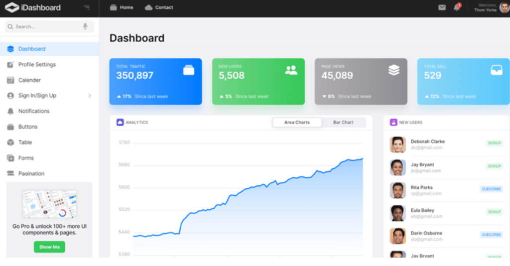
14. iDashboards
Best For: 3D dashboards
Payment Plans: contact the team
Free Trial: YES
Review Score: 4.6 /5
With iDashboard, you can take control of your data wherever you are. You don’t need to be super skilled; you just need to have this data visualization designer.
iDashboard is one of the highly responsive data visualization tools. Whether you’re using your smartphone, tablet, or laptop, the user-experience is highly optimized. You can use every data from 160+ sources.
iDashboard offers you the ultimate 3D dashboard, which are more compelling and eye-catching.
15. Infogram

Best For: Real-time data visualization designer
Payment Plans:
- Basic: free
- Pro: $25/month (billed monthly) or $19/month (billed annually)
- Business: $79/month (billed monthly) or $67/month (billed annually)
- Team: $179/month (billed monthly) or $149/month (billed annually)
- Enterprise: contact Infogram for pricing information
Free Trial: YES
Review Score: 4.5 /5
Infogram is the easiest data visualization software to create compelling and engaging dashboards. Thanks to Infogram’s ready-to-use templates, everything is easy and quick.
You can also customize a dashboard especially for your company, adding logos or images. You can easily collaborate with your team thanks to real-time data visualization. You can even set permissions for your team and track all past versions thanks to the history feature.
It is considered one of the most interactive data visualization tools. You can add all interactive tools you want, such as tabs, clickable legends, or linking.
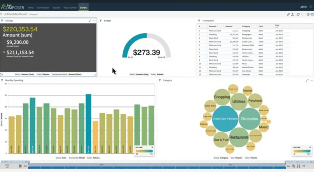
16. Logi Analytics

Best For: Embedded Analytics
Payment Plans: Contact the Team
Free Trial: YES
Review Score: 4.5 /5
Logi is one of the best data visualization tools to easily build your analytics. These analytics are entirely customizable and automated.
Logi is easy to use also for beginners, and you can work with data as they are. Besides, your data is safe with Logi’s security systems.
If you choose Logi you’ll see a 75% reduction of development time, thanks to embedded analytics that are managed by Logi itself.
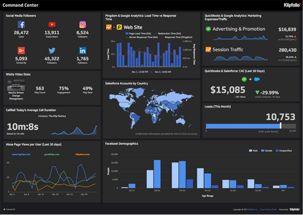
17. Klipfolio
Best For: Social Media Integration
Payment Plans:
- Publish: $49/mo
- Grow: $99/mo
- Team: $199/mo
- Team+: $399
- Partner plans : Contact the team
- Enterprise plans : Contact the team
Free Trial: YES
Review Score: 4.7 /5
Klipfolio helps you transform raw numbers into one compelling dashboard. Use Klipfolio’s fantastic prebuilt themes to express with images what you’re trying to say. Use charts and graphs, bar charts, maps, and much more.
Klipfolio easily integrates with Social Media tools, like Facebook, or with analytic tools. Easily create your dashboard with pre-built themes, and then import them as PDF files.
Klipfolio dashboard is interactive and it allows you to directly interact with your datas. It is the best data visualization tools as you can change and customize all your visualization settings.
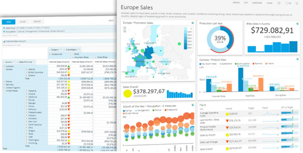
18. Kyubit Business Intelligence
Best For: Embedded BI and Analytics
Payment Plans:
- One: $295 per year
- Standard: $495 per year
- Company one: $895 per year
- Enterprise: $1295 per year
Free Trial: YES
Review Score: 4.3 /5
Kyubit is a user-friendly platform that provides a detailed dashboard, perfect for KPI or Gauge metrics creation.
Kyubit is available as a mobile app, and it can be used with every device, being highly responsive.
It’s one of the data visualization tools that is highly user-friendly, having the drag-and-drop function that helps you save time.
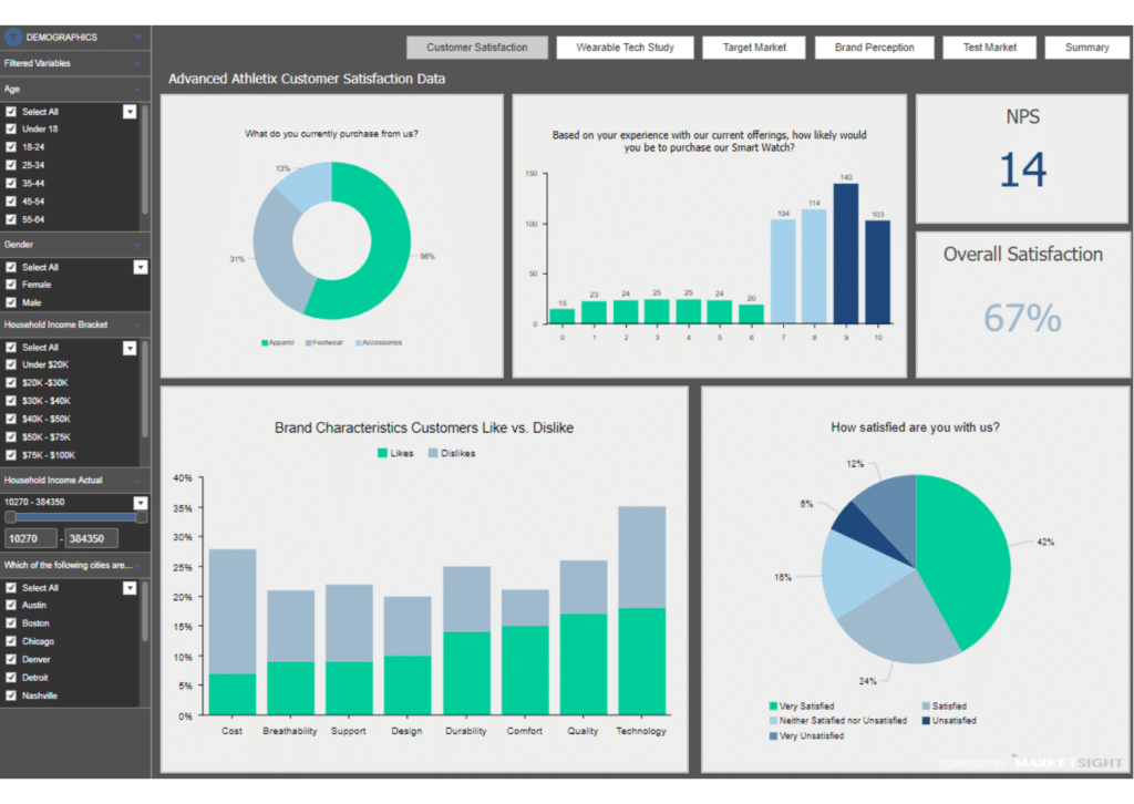
19. MarketSight

Best For: Team Collaboration
Payment Plans:
- Academic: $46/month
- Select: $132 per month
- Plus: $161 per month
- Premium: $180 per month
Free Trial: YES
Review Score: 4.3 /5
MarketSight is one of the intelligent data visualization tools that helps you with analysis, ensuring easy team collaboration. Once your analysis is ready, quickly share it with PowerPoint and Excel.
Dashboards are highly visual and customizable, and the analysis they show is detailed and flexible . With MarketSight API easily analyse or deliver insights.
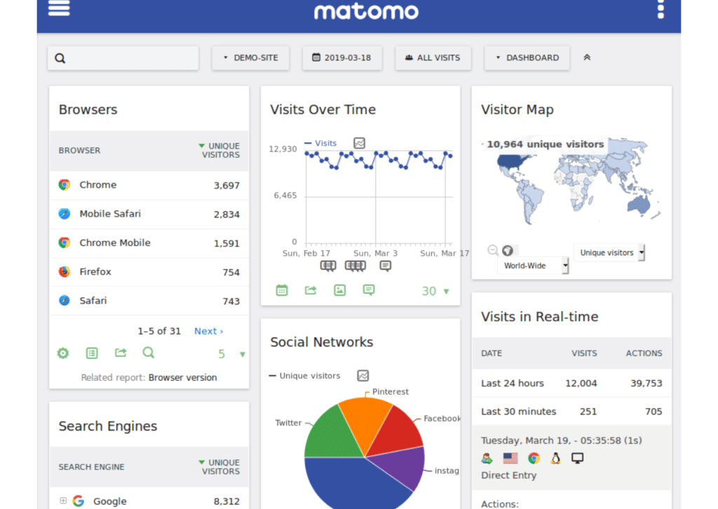
20. Matomo Analytics
Best For: Matomo’s experts support every day
Payment Plans:
- Cloud Matomo: $30
Free Trial: YES
Review Score: 4.8 /5
If you’re looking for an analytic data visualization software similar to Google Analytics, which protects more your customers’ privacy, Matomo is perfect for you.
Using Matomo, your reputation won’t be weakened by privacy losses, such as it will be with Google Ads.
Matomo is one of the safest data visualization tools, where you’re aware of what’s happening to your data. Besides, data storage is unlimited, such as users and websites are.
21. Metabase
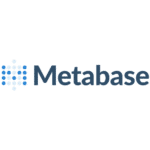
Best For: Scheduled Reports
Payment Plans:
- Starter plan: $85/month
- Growth: $749 per month
- Enterprise: $15K per year
Free Trial: YES
Review Score: 4.6 /5
Metabase is an easy-to-use platform, which offers easy-to-build and explore dashboards. However, if you have more complex questions, SQL and data saivy are there for you.
Variables can be added to create interactive visualization that your users can explore.
Metabase is one of the best data visualization tools as it offers the possibility of setting alerts and scheduled reports to get the right data for the right people at the right time.
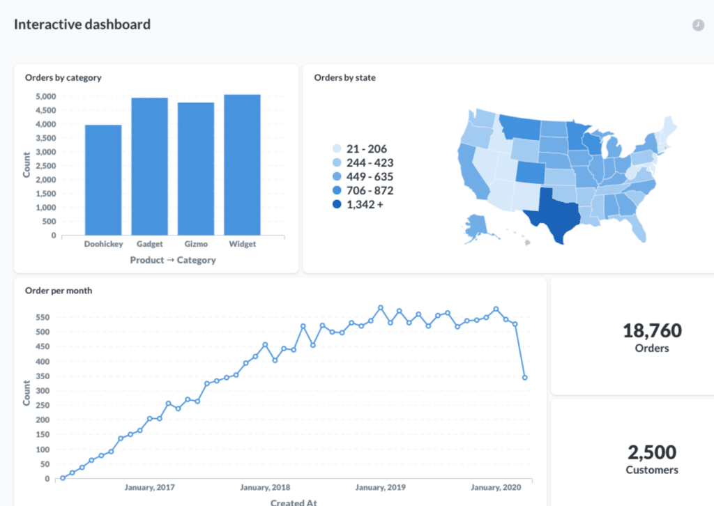
22. Orange

Best For: Designed for Teachers
Payment Plans: Contact the Team
Free Trial: Not Known
Review Score: 4.2 /5
Orange is a highly visual and detailed workflow builder. Make the best of this platform exploring and understanding data analysis and visualization or dining deeper in decision trees.
Forget raw numbers and coding. Orange’s graphic user interface is intuitive and, being interactive and rapid, makes you save time.
Orange is considered one of the best data visualization tools as it is chosen by many teachers and workers in the school field. If you’re part of that field too, why don’t you explore Orange- data visualization designer for teachers.
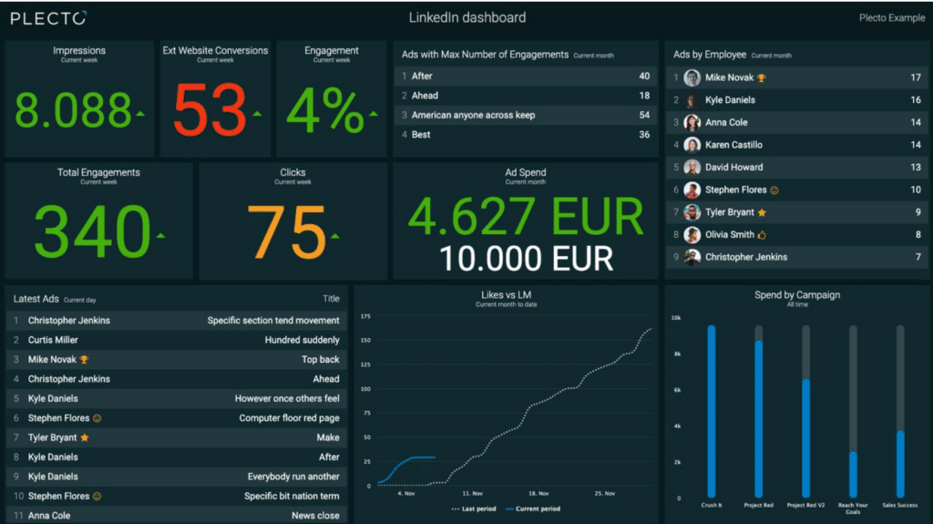
23. Plecto

Best For: Plecto App & adaptability to all device
Payment Plans:
- Medium: €160 per month
- Large: €270 per month
- last plan: contact the company
Free Trial: YES
Review Score: 4.6 /5
Plecto is a dashboard builder that shows real-time KPI to make you course-correct your work. Besides, it’s one of the most adaptable data visualization tools as it adapts to all devices, such as TVs, desktops or mobile devices.
Having your KPI data all under control is a success factor for sure, such as having motivated employees. Have all your data in one dashboard thanks to our 50+ integrations and motivate your employees by acknowledging real-time successes on the dashboard.
24. Plotly
Best For: Cost Friendly (compared to full-stack developers)
Payment Plans:
- Dash Enterprise: $50,000 per year
- On-Premises: Contact the Team
Free Trial: YES
Review Score: 4.7 /5
All you have to do with Plotly is a three steps procedure: build, deploy, and hyper-scale.
It is one of the efficient data visualization tools as users can do this in a couple of hours, not in days. Develop your Dash app, write a few lines of code, deploy it with a single command, and a hyper-scale dash app to an unlimited number of users.
Languages are Julia, Phython and R. You don’t need to write any CSS for pixel-perfect dashboards.
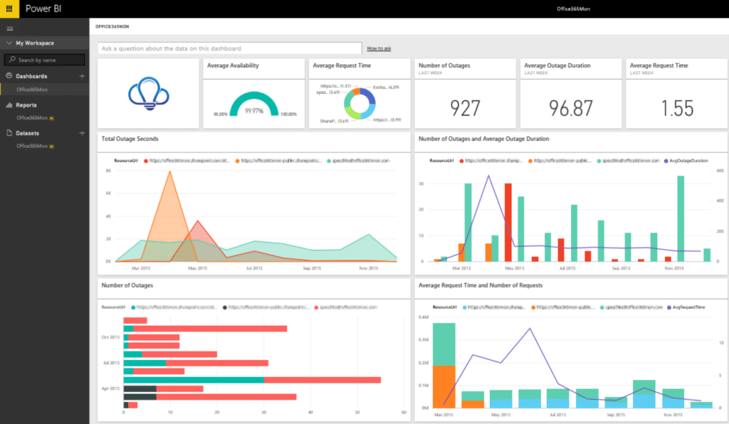
25. Power BI
Best For: Data Encryption
Payment Plans:
- Power BI: €8.40 per month
Free Trial: YES
Review Score: 4.5 /5
Power BI is an analytic platform provided by Windows. It’s one of the data visualization tools that’s perfect both for organizations and individuals.
The platform offers many BI tools for data visualization, such as Excel integration or pre-built and customizable data connectors.
Your data is safe with end-to-end encryption or real-time access monitoring.
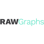
26. RAW Graphs
Best For: Free Platform
Payment Plans: FREE
Free Trial: YES
Review Score: 4.5 /5
RawGraphs is one of the easy-to-use and intuitive data visualization tools, which shows your data in an easy and understandable way.
Copy-paste your data or simply import them from a csv file and then choose among many layouts that better represents your data.
You can also import vector images to your dashboard and enrich it, making your dashboard as more powerful as possible.
27. SAP Lumira
Best For: Real-time Insights
Payment Plans: Contact the Team
Free Trial: YES
Review Score: 4.2 /5
SAP Lumira is an analytical data visualization software that combines self-service eye-catching and interactive dashboards.
SAP Lumira has an intuitive and easy to understand interface. Its dashboards can be seen also via mobile, being one of the highly responsive data visualization tools.
28. SAS Visual Analytics
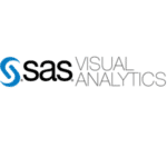
Best For: Predictive analysis
Payment Plans: Contact the Team
Free Trial: YES
Review Score: 4.3 /5
SAS visual analytics shows you easy-to-understand insights and transparent data that will make you know your KPIs. Create quick reports and dashboard that are responsive and interactive.
Make smarter decisions with easy-to-use predictive analytics. No need for manual experimentation.
It is one of the best data visualization tools as you can add a geographical context to your analysis to better analyse a specific opportunity.
29. Sigmajs

Best For: Web Publication
Payment Plans: FREE
Free Trial: YES
Review Score: 4.1/ 5
The JavaScript library is designed for you. Sigma js is perfect for network or Web publication or for network integration in Web application.
Sigma is entirely customizable, having also the function to add elements to your scripts. From beginners to experts, it is one of the perfect data visualization tools that works for all.
Sigma js website provides a tutorial on how to build a graph.
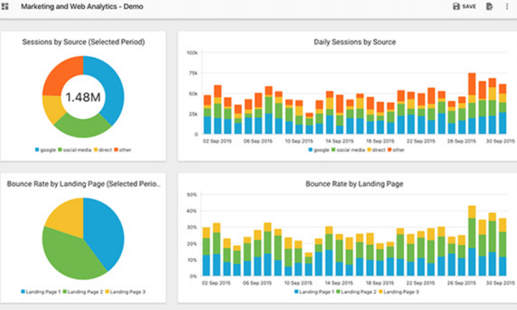
30. Slemma
Best For: 75+ Apps integration
Payment Plans:
- Small Business: $99 per month
- Standard: $199 per month
- Client Reporting: $599 per month
Free Trial: YES
Review Score: 4.4 /5
Slemma is a dashboard and report builder- build templates, charts, or dashboards. It is one of the easiest data visualization tools where you can start from scratch with no coding skills required.
Connect Slemma to many business apps. Connects 75+ Apps, codeless integration and secure connections.
Analyze your dashboards and collaborate with your clients. Automated data refresh, cross-device access and dynamic filtering.
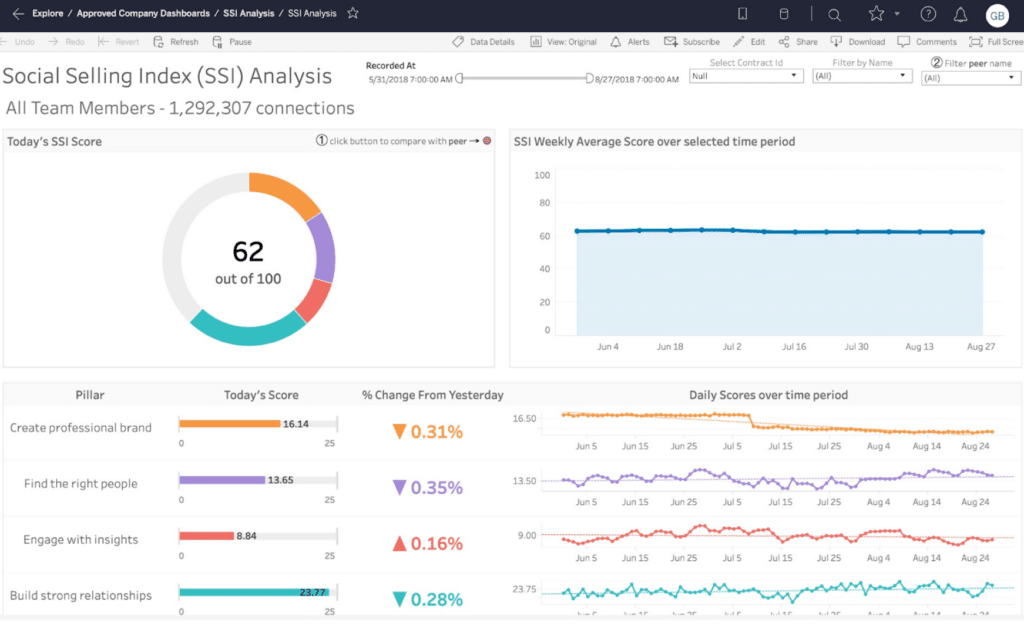
31. Tableau
Best For: AI-driven analytics and predictions in a single platform
Payment Plans:
- One creator plan: $70 per month
- Team plan: $145 per month
- Customizable plan: contact the team
Free Trial: YES
Review Score: 4.4 /5
Tableau is an analytic platform that will help you with data organization and problem-solving. Tableau is easy to use and provides you detailed and limitless data exploration.
Tableau is one of the perfect data visualization tools that works for everyone. Whether you’re an analyst, an executive or an IT, Tableau will be perfect for you.
32. Visme
Best For: Best data visualization designer
Payment Plans:
- Standard : $15 per month
- Business: $29 per month
- Customizable plan: Contact the team
Free Trial: YES
Review Score: 4.5 /5
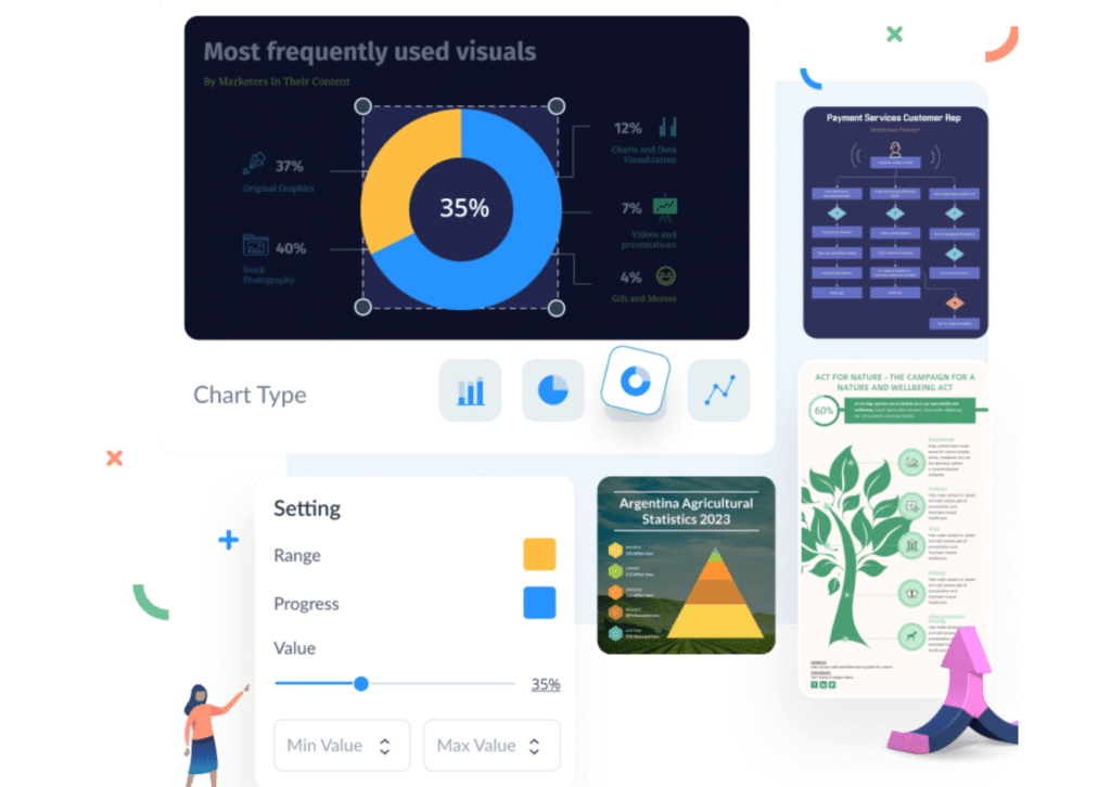
Visme highly visual which makes it one of the best data visualization tools. Visme has ready-to-use presentations, which are perfect if you want to impress your audience. You can choose among many pre-built themes, or you can create them from scratch.
One important thing is the high number of charts and visual elements that strengthen your thesis. Besides, Visme is perfect also for Social Media posts.
Add engaging videos to your presentation and create a compelling and visual story.
33. Whatagraph
Best For: Tracking Campaigns
Payment Plans:
- Professional: €99 per month
- Premium: €239 per month
- Growth: €609 per month
Free Trial: YES
Review Score: 4.4/5
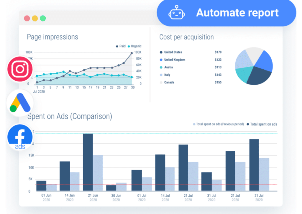
Are you looking for data visualization tools to track your campaign results? Whatagraph monitors your results all at once. Add results from Twitter, Facebook, or Google analytics and have a broad view of your current situation.
Deliver your reports automatically and forget nobody. Apart from saving time, your clients will never be alone and you won’t be unprofessional.
Your reports can be built in a few minutes with Whatagraph. Templates are ready to go and customizable, which means that you can also personalize your template’s style on your client’s one.
34. Zoho Analytics
Best For: Automate Data Alerts
Payment Plans:
- Basic: €24 per month
- Standard : €48 per month
- Premium: €115 per month
- Enterprise : €445 per month
Free Trial: YES
Review Score: 4.3/5
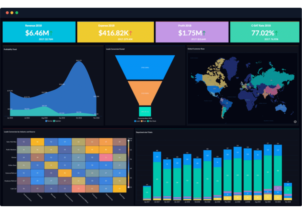
Zoho Analytics is one of the best data visualization tools for BI analysis. Zoho analyses and transforms tons of raw data in compelling and easy-to-understand dashboards.
Online collaboration is easy with Zoho Analytics. Share reports, add comments, or hold conversations. Besides, you can also set automatic data alerts for anomalies.
Get data from many sources and blend them together to create the best analytics ever.
Conclusion
You must have realized by now how useful these tools can be for your business. Data visualization software is a must for any brands’ content marketing.
You can start making efficient data-driven strategies by leveraging any of the free data visualization tools listed above.
Or, you can upgrade your plan to any data visualization designer based on your business requirements.
Get your audience hooked with your visual content and highlight significant insights.
We have provided you with the ultimate list of the best data visualization tools– the choice is yours now!


0 Comments