
What is color theory? How to use color theory in marketing? Why do marketers choose specific colors for their brands? What are the best colors companies should go for for their brand?
Do you have more questions? Don’t worry! This article will provide you with all the necessary knowledge on how to effectively use colors for your brand strategy!
According to studies, colors can affect our minds and change our brain waves! It’s no accident that most famous brands have chosen specific colors for their logos. Moreover, colors are able to trigger our emotions and our brains create associations because of them.
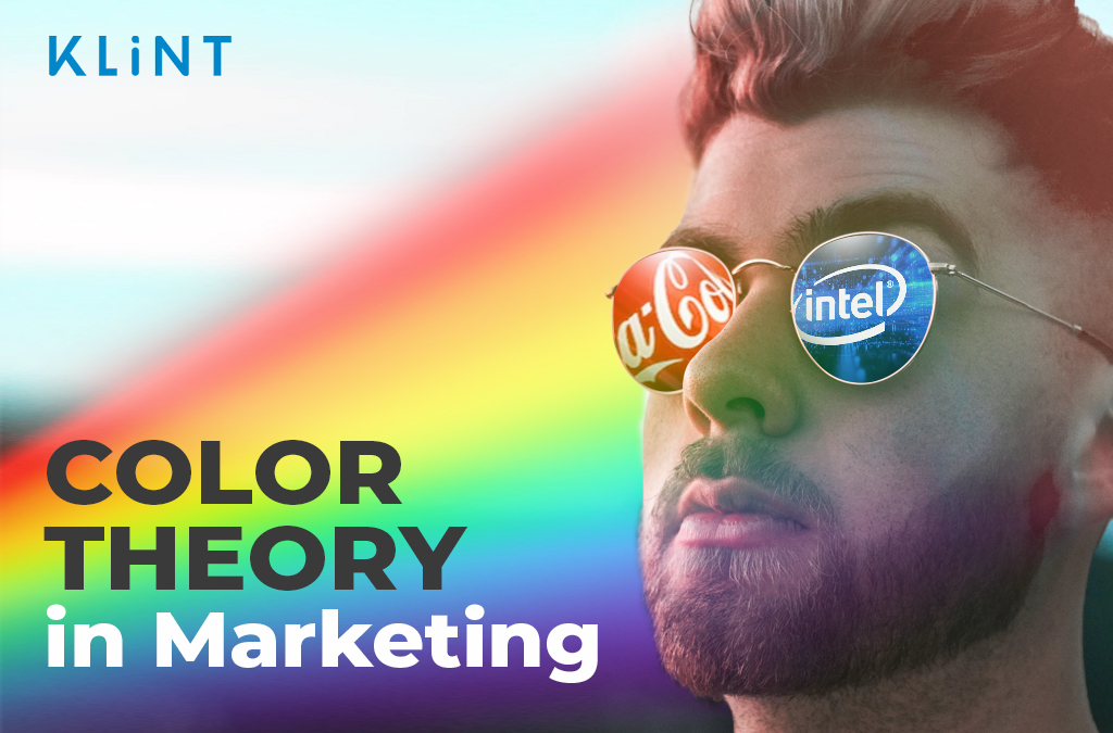
Let’s give you an example. So, when we think of McDonald’s or Coca-Cola some of the first things that pop into our mind are probably their yellow and red logos, right?
Choosing appropriate colors communicates your brand’s identity to new customers. Furthermore, mismatching colors with your brand values is likely to be a major turn-off. This post will help you understand how color theory, color psychology, and persuasion work in marketing, and what the go-to colors are when making a decision on brand identity.
Let’s start coloring!
Table of Contents
What is Color Theory?
Color theory is a collection of rules and patterns used by designers to connect with consumers through visually attractive color schemes.
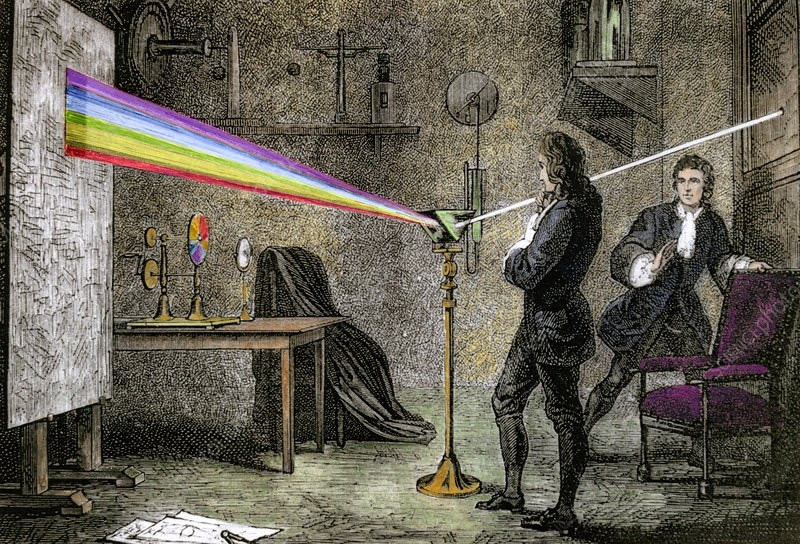
Historically, the person who first mentioned the theory of colors was Aristotle, who believed all colors came from black and white and represented water, earth, fire, and air.
However, the person accountable for the original color wheel in 1666 is none other than Sir Isaac Newton.
Although, most likely, neither Newton nor Aristotle thought much about how colors impact consumers’ purchasing decisions or what consequences they could have on brand recognition, the two set the stage for the further development of color theory and how it affects human psychology and behavior.
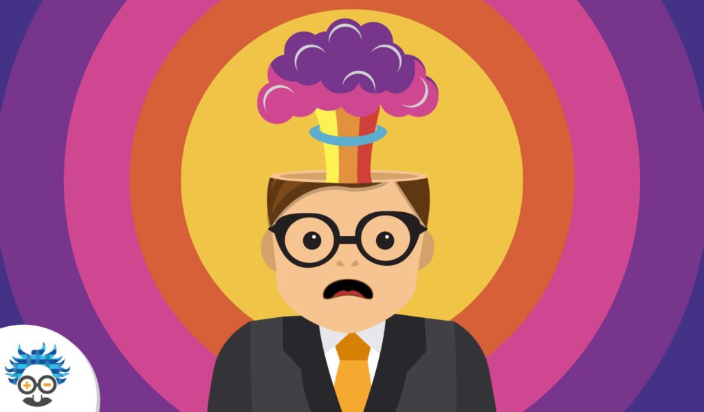
Who would have ever imagined that colors had anything to do with psychology?! Yet, scientists have analyzed the relationship linking the two and found some striking facts!
The findings showed that 90% of our decisions are made completely based on colors! Which proves the influence colors have on human behavior.
Color psychology explores how various colors affect people’s thoughts, actions, and behaviour.
The psychology of color in marketing is concerned with the ways in which colors affect consumers’ brand perception. And whether or not they convince customers to choose particular products.
The effective use of colors in marketing can improve brand recognition by up to 80%.
This research plays an important role when developing marketing strategies, starting a new company, or deciding to rebrand!
Why is successful branding always based on color theory?
First of all, choosing the right color for your brand should be a sound, informed choice rather than a choice of individual preference.
Color theory is critical in marketing and branding. Consider this – color is the first thing consumers see and associate with your brand. That is why, finding the best colors for your marketing is the first step to success.
Brand colors carry a message to your consumers, so they should help describe your brand without using any words.
The correct color palette increases your brand recognition and helps stand out from the competition.
Finally, since colors can excite emotions and affect our mood, determining the right color for your brand will leave a lasting impression on consumers. And will lead them to buy into your brand, both psychologically and financially.
How do Colors in Marketing Influence People?
Colors can indubitably evoke emotions and influence our actions.
A study by the Institute for Color Research found that consumers subconsciously need only 90 seconds to make a purchase decision! Moreover, that decision is affected by product color in 65-90% of cases! Isn’t that insane?
Due to the ways different color theory can affect customers, brands should carefully pick the colors that reflect their values. Picking the colors that match your brand’s personality can lead to benefits such as a boost in sales and increased conversion rates.

In marketing and sales, specific color combinations evoke particular feelings among consumers, and these can be both positive and negative:
- White, blue, and green – TRUST
- Blue, green, and black – SECURITY
- Yellow, red, and white – SPEED
- Yellow, orange, and brown – CHEAP
- Black, grey, and red – FEAR
Analysis of customer behavior also showed that warmer colors, like red and yellow, appeal to impulsive purchasers due to a sense of urgency.
On the contrary, cool colors, like blue and white, are more likely to appeal to people shopping on a budget, who are likely to think more about their purchases.
However, using cool colors for expensive products is also a good strategy since these color combinations associate with customers’ feelings of trust and conservatism when it comes to spending money.
Research showed that blue is by far the most popular color among customers (33%), both male and female. No wonder why so many brands decide to go with blue color palette when designing new outfits.
How Color Theory Affects the Brain
Since close to 85% of consumers claim that color is the main reason for making a purchase, businesses need to understand their brand’s personality and positioning. So use this to determine their brands’ color scheme.
Every form of communication with consumers should aim at pointing to or reinforcing brand identity. This communication extends to:
- Visual communication – color, font, layout
- Messaging – tone of voice, language, formatting, etc.
Therefore, choosing the right color can have long-lasting benefits for a brand, but what exactly does each color do to our psyche and perception? Let’s find out…
Red color psychology
Positive features: power, energy, fearlessness, strength, excitement
Negative features: danger, warning, pain, anger
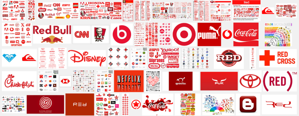
If you are looking to grab someone’s attention, red is the right color. The color red can easily reduce analytical thinking and urge consumers to make rash decisions.
Red color urges people to take action and make decisions fast. It’s no coincidence that call-to-action buttons on web pages are almost always red.
So what does red color mean? Red can be a smart choice for companies creating conversion or sales-driven campaigns due to the urgency and action it evokes in people.
However, red can not only grab consumers’ attention, it can also as easily scare them away. You should be very careful when using it! But luckily there is a way to soften the outcomes the red color can cause. In order to make it less aggressive try to combine red with contrasted colors – in this way you will create an amicable marketing message.
Companies that work with impulse purchases have seen successful sales by using red in industries such as e-commerce, retail, food and beverage companies, etc.
As colors have a symbolic meaning in many countries, brands should also be careful how they incorporate color theory in different regions. The color red has the following interpretations:
- Asia: weddings, fortune, happiness
- Africa: death and mourning
- Western countries: love, passion, excitement, danger
Orange color psychology
Positive features: confidence, innovation, warmth, creativity, friendliness
Negative features: ignorance, immaturity, frustration
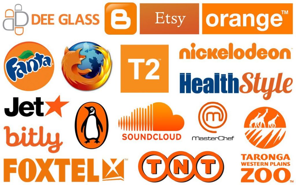
Brands that use orange as their main color usually come off as playful, friendly, and creative. Orange color often symbolizes excitement, warmth, and happiness.
Unlike red, orange can be used more calmly. However, as it is in between red and yellow, it can still create contrast and draw attention to marketing messages.
Orange color can add fun, and due to its warmth is often used by food companies and companies selling kids products.
Despite all the brightness, orange color can be harsh to the eye. Therefore, brands should try to balance it out using neutral colors such as dark blue – an entertaining yet reliable combination, or black – powerful and playful one.
When choosing orange color, brands should be aware that different countries have a different perception of this color:
- Middle East: mourning
- Asia: courage, happiness, health
- Western countries: fall, warmth, harvest
Yellow color psychology
Positive features: optimism, creativity, happiness, intellect
Negative features: irrationality, anxiety, fear, caution
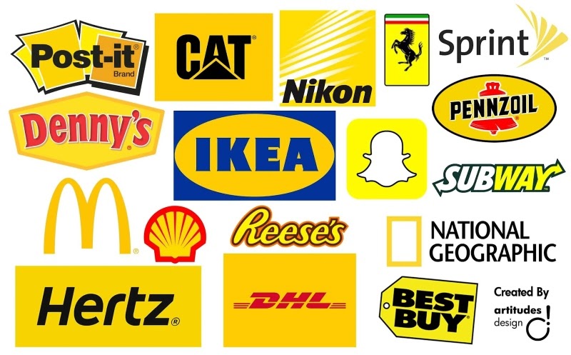
Everyone’s first association with yellow is the sun. Yellow color usually symbolizes happiness, optimism, and positive feelings.
Using yellow color in your brand design can awaken positive feelings, and adding the color to your website can attract them due to its approachability and optimism.
Furthermore, yellow is the color that also means summer, youthfulness, and an easy lifestyle. However, using too much yellow on the brand logos and websites can lead to discomfort and anxiety. Therefore, brands should be careful with not to overuse it.
What’s more, the research has shown that the yellow color makes babies cry! So be careful next time you need to come up with a product color that will contain yellow.
The countries’ association with yellow is as follows:
- Africa: gold, wealth, success
- Asia: power, prosperity, luck
- Western countries: hospitality, warmth, summer
Green color psychology
Positive features: health, freshness, nature, hope
Negative features: envy, sickness, boredom
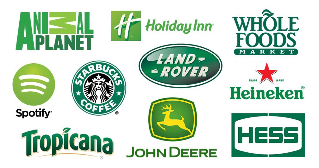
For those looking to present a brand as growing, prosperous, and stable, green is a great choice.
According to the color theory, green color symbolizes spring, nature, and freshness. It is a color that is most pleasant and natural to the human eye. Green stands in the middle of the color palette – a synonym for balance – creating a perfect, soothing fit for brand colors.
Companies often use different shades of green to relax consumers and raise awareness of the environment since green evokes harmonious feelings and calms down people, making them more likely to be decisive.
Green has a very similar symbolism around the world. However, there are certain distinctions between regions:
- Western cultures: spring, freshness, greed, immaturity, money, and Christmas
- Asia: new beginnings, fertility, health, prosperity
- South America: death
Turquoise color psychology
Positive features: communication, calmness, healing, inspiration
Negative features: unreliability, boastfulness, aloofness

Almost all of us wondered about “what color is turquoise” at least once in a lifetime. Here you not only going to see the color, but also will be introduced to the psychology and meanings that stand behind the turquoise color. Turquoise color stands between the stable blue and fresh green on the color theory spectrum. And it symbolizes transformation.
Turquoise brings clear communication as well as provoking constructive and positive thinking. Some psychologists assure that it can help to increase energy and self-expression.
It is an expressive color which serves as a helping hand to communication agencies, computer technology, and education institutions.
Turquoise has a long history among nations and has different symbolics around the world:
- Native America: protection, life, power, luck
- The Middle East and the Mediterranean: purity, heaven
- Asia: wisdom, heart-openness, spirituality
Blue color psychology
Positive features: loyalty, dependability, trust, security, logic
Negative features: coldness, emotionlessness, unfriendliness, unappetizing

The most popular color among famous brands is Blue! And used by 33% of companies worldwide. No matter the shadow, both light blue and dark blue colors symbolize security, stability, and trust.
Blue is timeless and ever-present color that brings associations with the sky and the ocean. Moreover, it evokes feelings of stability, peacefulness, calmness, and trustworthiness.
Since presence of blue color is so common, it is regarded as traditional, conservative, and non-threatening, which is why many brands use it as their main color.
The brands that often use blue include banks, healthcare institutions, high-tech, and cleaning-product companies.
Blue can also come off as cold and unappealing though, so brands should pay attention to how it might affect their brand recognition.
Most countries have opposing associations with the color blue, for example:
- Western countries: melancholy, calm, soothing, authoritative, and trustworthy
- Middle East: safety, protection, spirituality
- Latin America: hope, health, wealth
- Asia: love, joy, femininity
Purple color psychology
Positive features: luxury, wisdom, wealth, sophistication
Negative features: decadence, moodiness, extravagance
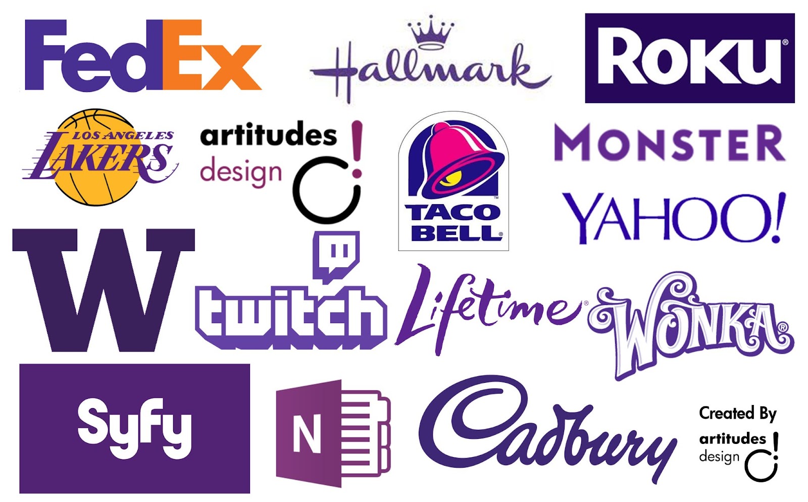
If you were wondering what color can make your brand look luxurious, expensive, and royal, the answer is purple! This connection appeared to its back then rareness. And even today, purple symbolizes wealth, wisdom, spirituality, and mystery.
Purple color is the least visible in nature. That is why, most people consider it special and quite often relate it to time, the cosmos, and space.
However, if your target audience are low-income consumers, purple’s association with expense could be potentially harmful to your brand. This highlights the individuality of color choice in best reflecting the brand value and the message it sends to consumers.
Using purple as an accent color makes a perfect balance and a combination of purple with pink or yellow is often the right path to a successful brand awareness strategy.
The industries that often opt for purple in branding are educational institutions and chocolate industries.
Although generally considered a color of luxury and wealth, purple has different meanings on different continents:
- North America: honor, courage, bravery
- Europe: death, grieving, royalty
- Africa: prosperity, wealth
- Asia: divinity, immortality, romance
Pink color psychology
Positive features: imagination, passion, creativity, innovation
Negative features: nonconformity, impulsiveness, outrageousness
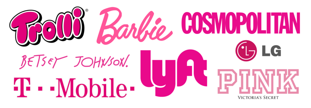
We would guess that everybody’s first thought upon mentioning pink would be femininity. Despite pink color’s association with feminity, pink can also symbolize balance, harmony, and love.
Pink also symbolizes playfulness, compassion, and sometimes immaturity.
In color theory it reflects support and kindness, however, it can also appear bold, which will make brands stand out from the crowd. Due to its boldness, pink color can seem outrageous or shocking.
Pink color is not the most popular color among brands, but those who use it are usually women’s stores, baby and toy stores, and dessert shops.
Globally known as a color of women and girls, pink still has different interpretations among cultures:
- Western cultures: love, caring, romance, giving birth to a baby girl
- Asia: trust, manliness, good health
- Africa: mildness
- Latin America: architecture
Brown color psychology
Positive features: seriousness, earthiness, reliability, authenticity
Negative features: humorlessness, unsophisticated, sadness, dirtiness
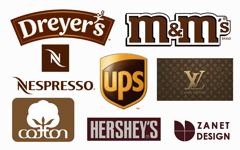
Brown is one of the most widespread colors in nature and it brings us associations with wood, earth, and leather. Due to its relatability with natural elements, brown color symbolizes sturdiness and reliability.
Brown color is most suitable for companies that are more old-fashioned, rugged, and give out the earthy vibe. If you decide to position your brand around these characteristics, brown will undoubtedly match your brand message.
You can easily find brown color palette in brands that deal with food, chocolate, natural products, agriculture, and transportation.
Although brown creates a feeling of support, safety, and comfort, occasionally, it can stand for cheapness, depression, and inactivity. So better check the color palette and all the shades before settling on a specific color.
Here is what brown symbolizes among the cultures:
- Western cultures: earthiness, health, barrenness
- Africa: funerals
- Asia: close to earth, industrious, fertile
Black color psychology
Positive features: elegance, sophistication, power, authority
Negative features: coldness, oppression, evil, mourning
The symbol of elegance, luxury, and power – black is a color most spread in the retail world. Many people may ask, whether black is a color. The answer is definitely ‘Yes’!
Black represents brands that are modern, sophisticated, and mysterious. Black color symbolizes seriousness and strength, so if these are the traits you are looking for in your marketing strategy, black color – your perfect choice.
This hue is timeless, a stark contrast to white, and is always in style.
It can highlight the luxurious elements of your brand and make your products appear expensive.
Brands that use black mainly include luxury brands and IT companies.
Worldwide, black symbolizes various things:
- Western cultures: mourning, grief, sophistication, formality
- Asia: sadness, fortune,
- Africa: spirituality, maturity, mourning
- Latin America: masculinity, death
Grey color psychology
Positive features: timelessness, reliability, balance, strength
Negative features: depression, lack of energy, dampness
Grey is a blend of black and white and thus stands for balance, neutrality, maturity, and seriousness.
Many famous brands have chosen grey as their main color due to its modern, classy, and practical feel. It is a hue that stands for professionalism, dignity, stability, and conservatism.
Grey is a perfect color for calming down more powerful colors used by a brand since it’s neither too dark nor too light. It also helps lighter colors pop up in the design.
On the contrary, too much grey can lead to the feeling of nothingness and dullness. Plus, it can evoke the feeling of aging and depression.
Sectors that often opt for grey color include IT, finance, transportation, and equipment.
Associations with grey color around the world:
- Western cultures: security, reliability, maturity, boredom, old age
- Asia: humbleness, unassumingness
- Africa: ash, cleansing, healing
White color psychology
Positive features: cleanness, purity, clarity, freshness, simplicity
Negative features: sterility, isolation, coldness, emptiness

As opposed to the absorbent black, white color is the one that reflects light. White is a symbol of virtue, cleanliness, purity, and safety.
In color theory it resembles simplicity, peace, and sincerity.
Brands that use white in their marketing strategy can come off as creative as they are starting with a clean slate. And have the freedom to create something fresh and new. White color can convey ease of use and simplicity.
White is a great setting for the darker colors since it creates a stark contrast and helps other colors be more visible and discernible.
This hue often serves for headers, logos, and backgrounds. However, too much white can seem cold and too sterile, so make sure to combine it with other colors from the color wheel!
White can have quite opposing meanings around the world, both bad and good:
- Western cultures: purity, peace, weddings, sterility
- Asia: brightness, fulfillment, mourning
- Africa: peace, protection
- Middle East: purity, mourning, holiness
Is color theory an effective marketing tool?
Color theory comprises many distinct aspects. It demonstrates how people interpret colors as well as how colors contrast and complement each other. Color theory further includes the concepts, reactions, and emotions that colors convey.
But there’s more to laying out your visual identity than picking your color(s). The basis of color theory is Newton’s color wheel. A color wheel is a useful tool for designers that need to pick colors that are harmonious.
The color wheel is commonly classified according to color schemes. Choosing a color scheme for your brand can make or break your brand recognition.
Therefore, marketers and designers should understand the specifics of color theory, which are:
- Achromatic
- Monochromatic
- Complementary
- Analogous
- Triadic
- Tetrad
Achromatic colors
There are three colors, or more specifically shades, which we call achromatic: white, grey, and black. The designs made combining these colors known as colorless.
Choosing a combination of these colors implies that your brand is serious, formal, strong, and simplistic in nature.
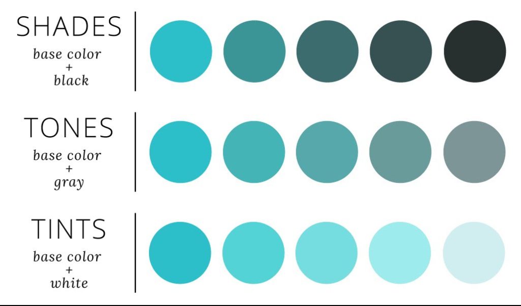
Monochromatic colors
Monochromatic color schemes consist of one color only, but designers often use black, white, and grey to produce more contrast in these designs, creating depth.
Additionally, implementing complementary colors can lower the intensity of the primary hue.
A monochromatic color scheme allows brands to create a harmonious look which accentuates content. And helps consumers associate the colors with the brand more easily.
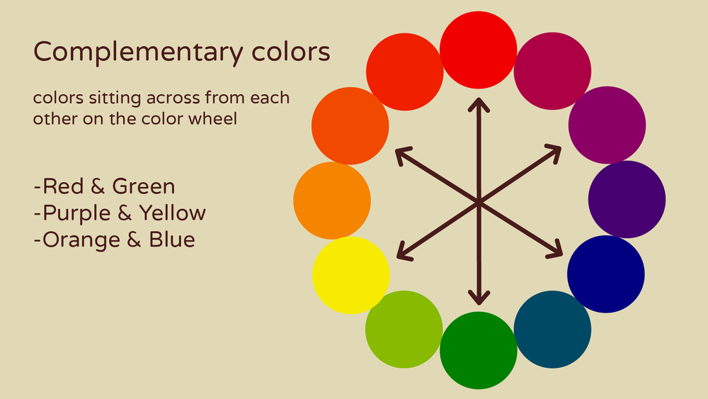
Complementary colors
Complementary colors are the colors on the wheel that are opposite (e.g.red-green, blue-yellow, etc.). Their main characteristic is that they are highly contrasting and thus make designs stand out with high contrast.
Therefore, selecting one hue and occasionally adding its complementary color in the design would be a go-to way of creating an eye-catching design.
Complementary colors allow brands to stand out with contrasting color combinations, and create a more dramatic look that is visually stimulating.
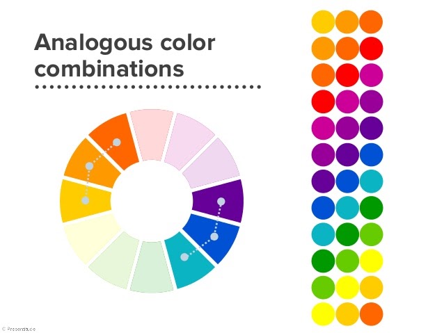
Analogous colors
All the colors you see on the color wheel that are next to one another are analogous color combinations.
These color combinations create peaceful and tranquil designs, which you can often find in the natural world.
Wellness brands, companies selling toiletries, and even finance companies may opt for the analogous colors and signify their brand is secure, calm, and reassuring.
The tip when creating designs using this scheme is to apply the primary color and choose its first color-wheel neighbors as highlights. Perfectly, the highlights would consist of one secondary and one tertiary color.
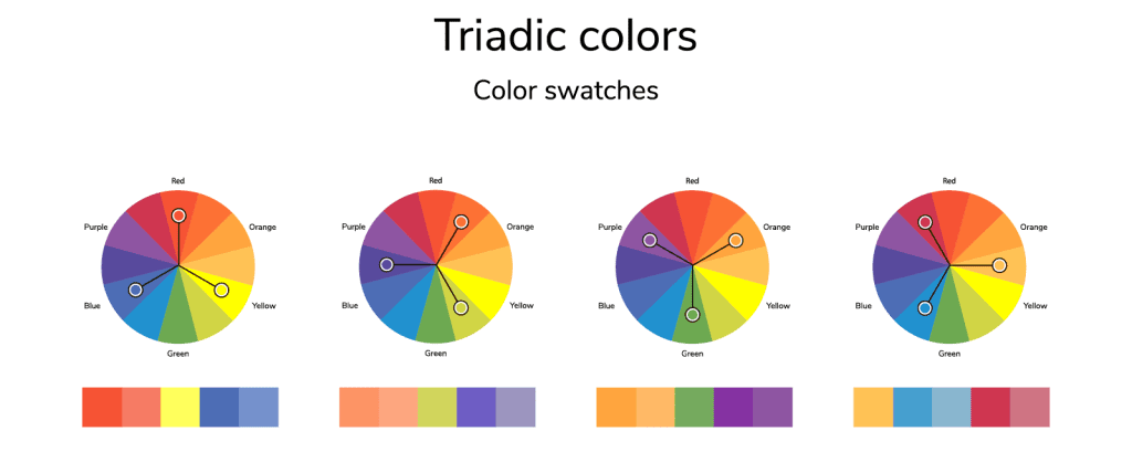
Triadic colors
Triadic color schemes are derived by applying triangular templates on the color wheel.
These designs are vibrant, lively, and playful. Hence, it is necessary to carefully balance the color combination to avoid overwhelming.
Brands targeting younger consumers, kids’ products, amusement parks, etc., aren’t shy to use the triadic color scheme and reflect their brand in these jolly color combinations.
Triadic colors are a safe choice for beginners, and first logo and brand designs since they provide a stark contrast. However, in a way that doesn’t disturb the peace.
The best solution would be to use one color as a foundation and the other two as highlights.
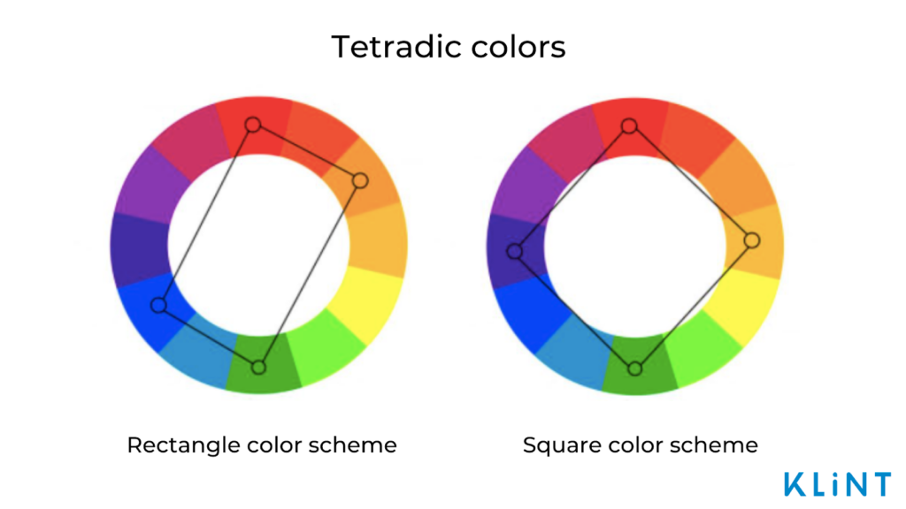
Tetradic colors
Tetradic color schemes use opposing colors on the color wheel. However, instead of a triangle, the tetradic scheme uses a rectangle or a square.
The designs are made using four different hues and some combinations include blue – orange – yellow – purple or red – green – blue – orange, etc.
In color theory, tetradic colors are the most complex to combine, and are a suitable option for rebranding or leveling up companies’ designs.
Now that we have covered the essentials of color theory and some rules when deciding on colors, we need to dive a bit deeper.
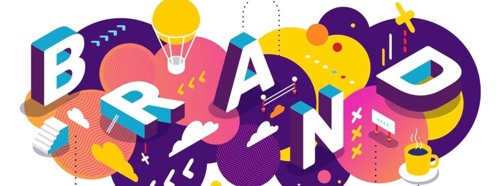
For successful branding, determining the right brand colors will depend on many factors. They are brand personality, customer impression, and emotional response among others.
How to choose the right color for your brand?
When choosing the right color for the brand, companies shouldn’t just focus on their favorite hue.
Various aspects should be considered in order to create a color design. That will appeal to the consumers and help with brand recognition.
Define your brand’s personality with color theory
Brand identity and values
In order to appeal to customers, each brand should have an identity that stands out. Deciding on your brand identity will help you choose the right colors for it, thanks to color psychology.
One good tip for defining your brand identity, what its values and messages will be, is to write down a list of all the traits you want your brand to have. After that, refer to the color wheel to see which colors match your description the best!

Check color meanings
Besides the feelings that color can evoke in consumers, colors should also be analyzed through the scope of industries and their use of color in marketing.
Certain colors are preferred by specific industries! And, therefore, are more related to certain types of products. High-tech and IT industries will use more blue, whereas fashion and cosmetics industries will opt for pink and red.
Accordingly, you can narrow down the color spectrum by deciding what your brand will work with and researching the most popular colors in the given industry.
Find inspiration
Once you have decided what your brand personality is and what your primary color will be, analyze your competitors’ color palettes.
This allows you to understand what works, and helps you find a way to differentiate your brand from your competitors.
Besides using competitors’ as inspiration, you can opt for various design programs to inspire you in creating different color combinations.

Color theory analysis of customers’ nature and behavior
Biology
Natural association with colors is a feature all people have in common. Certain colors present in nature have similar symbolism among nations: green – nature; blue – sky, yellow – sun.
Our biology can have an influence on color preference and the emotions colors evoke in people since historically people have associated colors like dark blue and yellow with night and sunrise.
Therefore, the former is related to feelings of calmness and the latter to arousal and excitement.
Gender
Gender stereotypes can influence what colors people will more likely be attracted to since they will choose ones they have been taught to associate with their gender.
Generally, females are prone to liking pink and other warmer tones, whereas males prefer blue and cooler hues.
Culture
Color theory is also heavily dependent on cultural aspects. Depending on the culture in which people leave they are likely to be attracted to different colors.
White in the Western culture will be associated with cleanliness and purity, whereas in Asian cultures it is associated with death and mourning.
Context
Different contexts and situations can cause different associations with different colors. For example, when talking about transportation, some people may associate red with stopping since the stop sign is red and the red light means stop.
However, some other context may suggest that red is a color of love or urgency.

Famous brands and their logo color analysis
Indeed, many companies make use of color theory in their marketing campaigns, as well as their brand logo’s. Looking for a job in marketing? Try here.
Some companies excel in their branding strategies and have created powerful color combinations for their brands.
These successful branding methods pay off, and most people associate certain colors with certain brands, within a certain industry. Therefore, Coca-Cola will always cause associations with red, Starbucks with green, Best Buy with yellow.
But, how did these brands succeed in making such long-lasting associations with customers and what do their colors tell consumers about them? Finally, what emotions and moods do they evoke?
Let’s take a look at some legendary logos and try to analyze them!
Coca-Cola
Colors: red and white
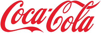
The famous Coca-Cola logo only contains two colors – red and white – and one logotype. It is known by billions of people around the world, which can be attributed to their consistency in color and design.
Color theory portrays them as youthful and sincere, yet full of energy and love. And that’s what their customers relate to!
Did you know that Santa Claus wouldn’t have his red and white colors if it weren’t for Coca-Cola?
They used their fantastic branding skills way back in the 1930s and created a commercial with Santa after which he decided to keep on wearing his famous red and white suit!
Thus, Coca-Cola changed Christmas forever!
Pepsi
Colors: blue, white, red
Coca-Cola’s biggest competitor, Pepsi has gone through slight logo adaptations throughout its history.
However, Pepsi has always remained loyal to its signature colors: blue, red, and white. These colors symbolize the American flag, but also the brand’s core values.
The blue color symbolizes the freshness of the beverage. What’s more, since blue is the dominant color of the brand, it positions Pepsi as the antithesis of Coca-Cola.
Red gives the logo contrast and evokes a feeling of urgency and energy. Finally, white serves to highlight the contrast between red and blue.
The white swirling line can also symbolize a smiling face – which Pepsi’s customers certainly put on upon opening a cool can of this refreshing beverage.
Apple
Color: black, grey, white
Did you know that the famous Apple logo wasn’t always monochromatic? In fact, the first apple had rainbow colors!
However, after the company went through some difficulties and changes, they decided that their new look will be as we know it today. Today, the Apple logo can be seen mainly in black and grey-silver, and sometimes white.
This change in coloring suggests that the company has matured and modernized. What’s more, the neutral colors suggest that the company provides good quality and clarity.
Their black and white designs stand for the sophisticated and simplistic look of their products.
Amazon
Colors: black, orange

“The most customer centered company of the world,” Amazon has gone through several logo changes in the past. Their current logo consists of two colors: black and orange.
The black colors suggest elegance, dominance, and power, with the orange one shows the company as youthful, fun, and happy.
Furthermore, the orange arrow going from A to Z suggests to customers that they can find anything they wish for on their platform, and its smile shape promises them an easy and enjoyable user experience.
Their cheerful design undoubtedly attracts a lot of customers to their website using color theory!
McDonald’s
Colors: red, yellow, white
What is the first thing you think of when you hear McDonald’s? Perhaps their legendary crispy fries popping out from a red and yellow bag? Maybe we should order a takeaway right now!
This urge to get McDonald’s products doesn’t come only from the amazing taste of their food but from an excellently executed branding strategy.
McDonald’s has wisely used red colors for their globally recognized logo to stimulate people and spark customers’ appetites, by creating the urge for quickly delivered and indescribably tasty goods.
Their yellow letter M represents happiness and friendliness, promising people a memorable time in their restaurants.
What’s more, yellow is the most visible color in daylight, so whoever is passing by McDonald’s will not miss it!
Colors: blue, white
Who would have assumed that behind Facebook’s iconic blue logo stands a medical condition? Apparently, Mark Zuckerberg is color-blind and has trouble discerning between all the colors except for blue!
Hence, the choice of color for Facebook! However, the color stuck for a deeper reason.
Blue is calming, assuring, and inspires confidence. It is a high-tech color and shows professionalism and a strong identity.
The white letters on Facebook’s logo contrast blue well and add a sense of purity, youthfulness, and freshness.
Their logo abounds in enthusiasm and promises that users will enjoy their platform!
Ikea
Colors: blue, yellow
Can you guess where IKEA comes from? If not, take a second look!
In case you have trouble remembering, the correct answer is Sweden! IKEA cleverly used Swedish national colors for its brand and forever connected themselves to their home country.
Nonetheless, their choice of colors doesn’t only stem from their country of origin. In the color wheel, blue and yellow are opposite, contrasting colors that create a memorable combination, making it easy for people to relate a logo to a brand instantly.
In IKEA’s case, color theory implies that blue shows that they are trustworthy, open, and reliable. Yellow creates the feeling of youthfulness and happiness and stands for IKEA’s creative and imaginative side.
Starbucks
Colors: green, white
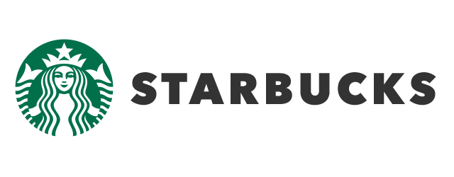
We would assume that nobody ever resisted a cup of Starbucks’s aromatic coffee. And even if you did, you certainly know that there is a coffee shop with a unique green logo, right?
Starbucks cannot be separated from their white siren on a green background. A synonym for comfort, enjoyable atmosphere, and good coffee, Starbucks have carefully built their brand to attract millions of customers.
By choosing the green and white color scheme, Starbucks have shown a connection to nature and its protection. What’s more, green suggests the company is friendly and provides customers with a calm and relaxed environment.
The white represents the company’s cleanliness, freshness, and clarity.
Nike
Colors: black (orange, red, yellow, green)
One of the most famous sports brands around the world, Nike have prided themselves on a simple yet extremely successful brand design.
Nike’s famous swoosh sign in black or orange is all you need to see to immediately recognize the brand.
The company has changed their logo colors throughout the years, however, they stuck the most with black and orange versions.
Black is a synonym for elegance, sophistication, and classiness – everything that Nike is communicating about their products and wants to be famous for.
Their newest orange version suggests that Nike is an innovative, friendly, and confident company, always ready to surprise their customers with new unique designs!
Rolex
Colors: gold, green
The symbol of excellence and exclusivity – Rolex has definitely managed to connect their logo design with the luxuriousness of their products.
The golden crown on top of green letters has become a world-known sign of prestige and wealth. However, not every part of their logo was created solely for triggering the feelings of prestige and luxury in customers.
Rolex’s golden crown symbolizes the precious materials their products are made of, while the green stands for wealth and money as well as sophistication and class.
UPS
Colors: brown, yellow
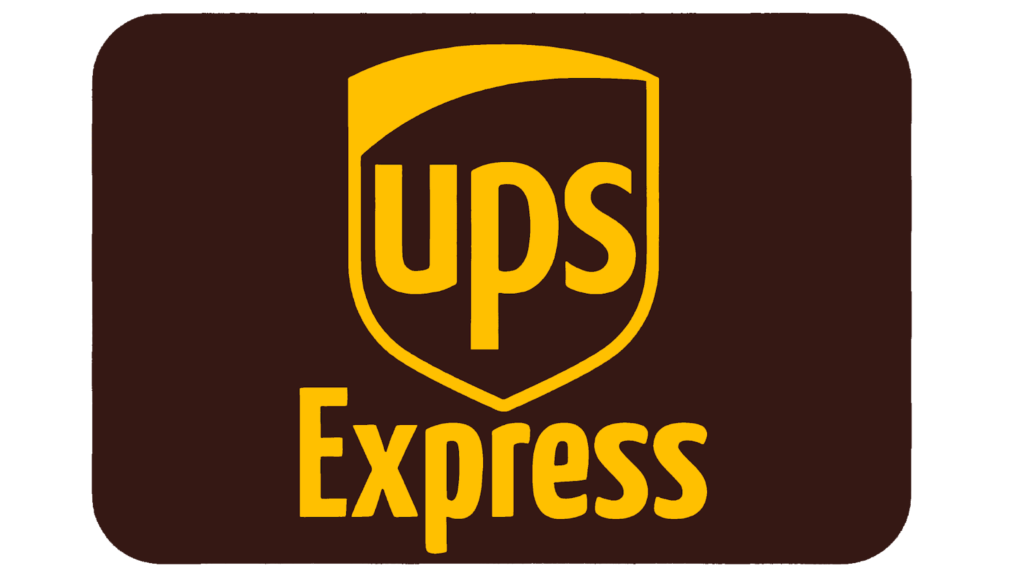
“What can brown do for you?” If you haven’t heard this slogan before, we believe that after reading this you’ll never forget it again.
UPS is a parcel delivery service that has become recognized for its unusual logo color combination. While most companies opt for green and blue for their logo designs, UPS boldly chose yellow and brown – and made the right call!
The company has become famous for their colors (which they even incorporated in their slogan). The dark brown color reflects class and professionalism, while the yellow expresses the company’s confidence.
UPS hit the jackpot with this color combination! Not only is it unique and memorable but it also stands out from the competition!
MasterCard
Colors: red, orange, yellow
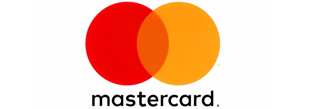
In the sea of blue logos, some sometimes bring a pop of color! Although most of the finance companies choose blue as their logo color, MasterCard decided to go in a different direction.
Their simplistic design is recognized worldwide and comprises two circles, red and yellow, meeting in the middle to create a nice orange hue.
MasterCard’s modern logo reflects their progressiveness, passion, and energy.
The red circle stands for their power and vitality, while the yellow circle represents happiness and success. The orange part serves as a link that connects MasterCard’s values.
PayPal
Colors: dark and light blue
PayPal is an online money transfer service that was founded back in 1999! And has since had a signature blue logo design. Although the logo has altered throughout the years, the company stayed loyal to their blue shades.
Today’s design is modern, simple, and easily recognizable. The company uses three different shades of blue, a dark and light blue that create the darkest shade with the overlapped letters.
Different blue shades show PayPal’s users that the company is reliable, safe, and a place where their money transfers will be secured.
The lighter shade suggests that they are open, communicative, and trustworthy. Color theory and design also help PayPal stand out from the competitors.
YouTube
Colors: black, red, white

Whoever enjoys watching videos, we know what the first (and probably the only stop is). It’s YouTube!
YouTube has succeeded in creating a logo design that urges people to click on one of their videos and get drawn into the world of endless possibilities.
The platform knows what a good call-to-action is and they were not shy to use it in their logo design. A red square with a white play button in the middle invites people to click instantly!
Their choice of colors is also not an accident. Red is attractive, shows urgency, and is eye-catching – therefore, the users are easily attracted to it and want to learn more.
YouTube’s color combination describes the brand as optimistic, passionate, elegant, and pure! All in one we would say!
Lego
Colors: red, yellow, black, white
Besides the inscrutable pain we have all experienced once or twice from stepping on a Lego block, we also remember the brand for its colorful and striking logo.
Lego have boldly used a four-color combination for their otherwise simple logo design.
The company has smartly chosen the colors that will appeal to the youngest customers, who dream of owning a Lego set they can build different structures from.
The red and yellow color combination is easy to spot. Plus, it is attractive, cheerful, and playful. The bolded white letters look solid, however, are still friendly and funny.
And although each color was carefully chosen to attract new customers, the whole combination stands as a legacy to the first four colors of Lego blocks invented in 1932!
Conclusion
Ready to start designing your brand logo? What color will you use to attract new customers?
Hopefully, our color theory tutorial has helped you to learn a lot! And now you understand how colors affect mood and emotions, which have a stronger impact on the human brain.
Color psychology can be extremely helpful in taking a different angle on how to use colors in business effectively depending on the industry and core brand values.
Choosing the right color for a brand logo can improve customer conversion and brand recognition.
Therefore, check out how successful companies have designed their logos using color theory. Draw inspiration from them! And start creating a design that will strongly represent your brand and improve your brand awareness and success!


0 Comments