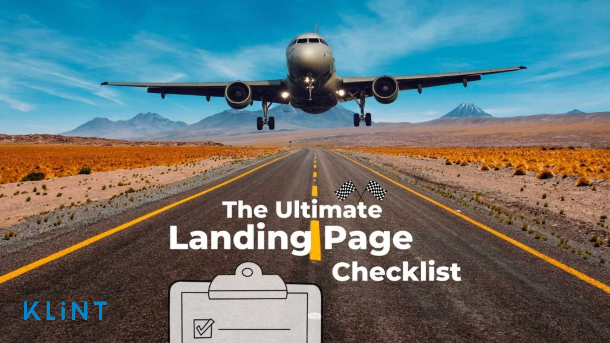

What is a landing page? Why do marketers need landing pages for successful search engine marketing (SEM)? How to create a landing page using landing page optimization tools?
In case you are looking for the answers to these questions and more, you are in the right place!
Our landing page checklist will outline all the landing page elements needed for a dedicated page built for marketing and advertising campaigns.
This landing page checklist is regularly updated and works in 2021.
First, let’s nail the basics!
Table of Contents
What is a landing page?
As its name already suggests, a landing page is a page on which customers land when they click on your advertisement.
Therefore, a landing page will be created solely for marketing campaign purposes.
One of the purposes of landing pages is to act as CTAs (call-to-action), which will improve conversion rates.
A landing page is any webpage that converts traffic into into potential leads, customers, or paying users.
Think of the landing page as a conversion engine that will bring in new leads and improve sales.
Instead of redirecting your website users to your homepage, use a landing page that will immediately offer a product or service to a visitor and create an overall better user experience – which will ultimately increase chances for sales and conversion (and improved ROI).
Why do marketers use landing pages?
Marketers understand the importance of landing pages well and are not shy to use them abundantly.
A well-designed and purposeful landing page can bring many benefits to companies – one of the greatest being the secured success of marketing campaigns!
What’s more, online marketers use landing pages to do the following:
- Test messaging
- Build brand awareness
- Convert visitors into the marketing funnel via a giveaway or free offer
- Collect data and build insight into consumer behavior and needs
- Generate leads at the top of the funnel
- Improve SEO ranking
- Drive sales
According to Hubspot, companies with around 40 landing pages saw 12 times more leads compared to those that only had 1-5.
Thus, you need to make sure you have a range of landing pages and you’re always testing them. In addition, you can utilize some of the fantastic landing page optimization tools to ensure your landing pages have smooth sailing!
Do you want to download our free landing page checklist? Go to: Landing Page Optimization Checklist 2021
Landing Page vs Homepage
People often confuse landing pages with a homepage. But the goal of the two is very different.
A homepage is an overview of the business and products and services it offers.
A landing page is designed to cater to a specific action you want a user to take. It is a marketing channel that helps put across the company’s short-term goal.
It either offers free trials for the company’s main product or provides giveaways like ebooks, coupons, etc.
Let’s take a look at some key differences between landing pages and homepages.
Key differences between a Landing Page and a Homepage
Although sometimes hard to differentiated, landing pages and homepages have some clear distinctions. First and foremost, their purpose. However, there are other differences that should be taken into consideration.
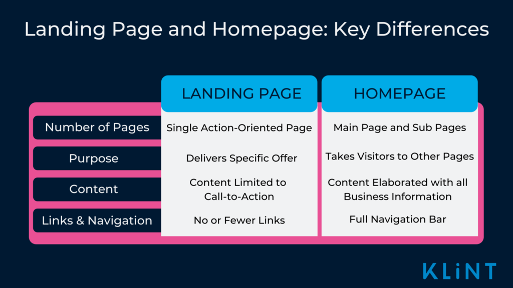
A landing page has a single action-oriented page catering to a singular marketing campaign. On the contrary, a homepage has the main page and subpages that take you to other parts of the company website.
When it comes to the purpose of the pages the landing page provides information about a particular offer or trial, while a homepage contains plenty of information such as products and services offered by the company.
The landing page content is limited and based on a specific product or offer. A homepage has more elaborate content regarding company history, teams, and others.
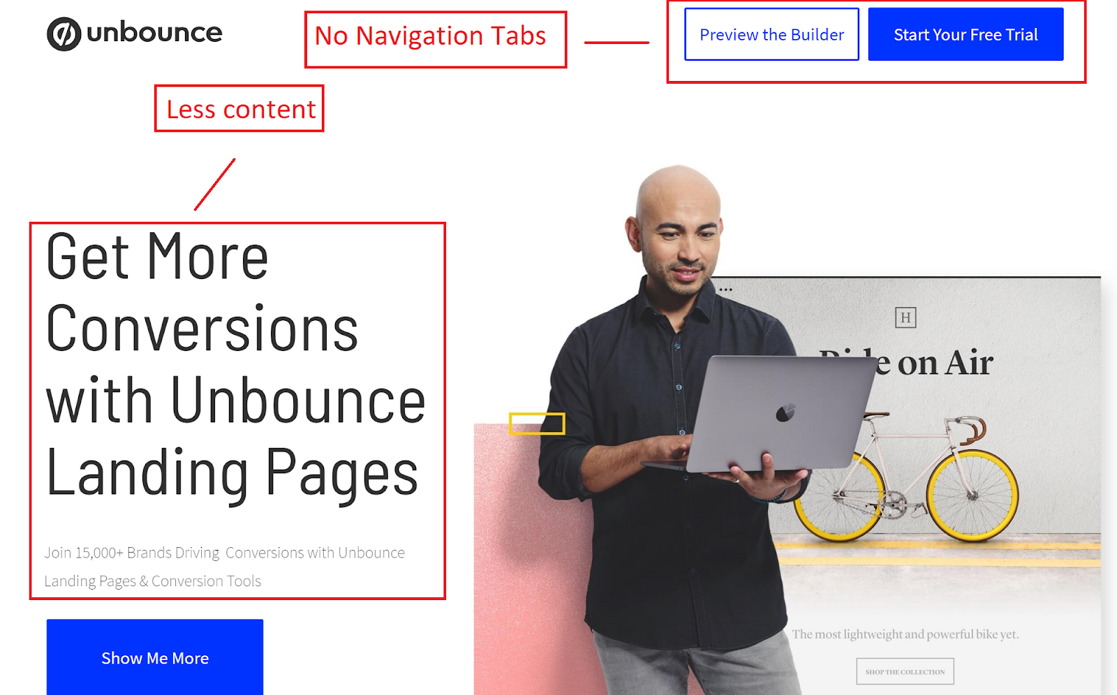
Wix’s landing page and homepage are great examples to illustrate the differences between these two types of pages.
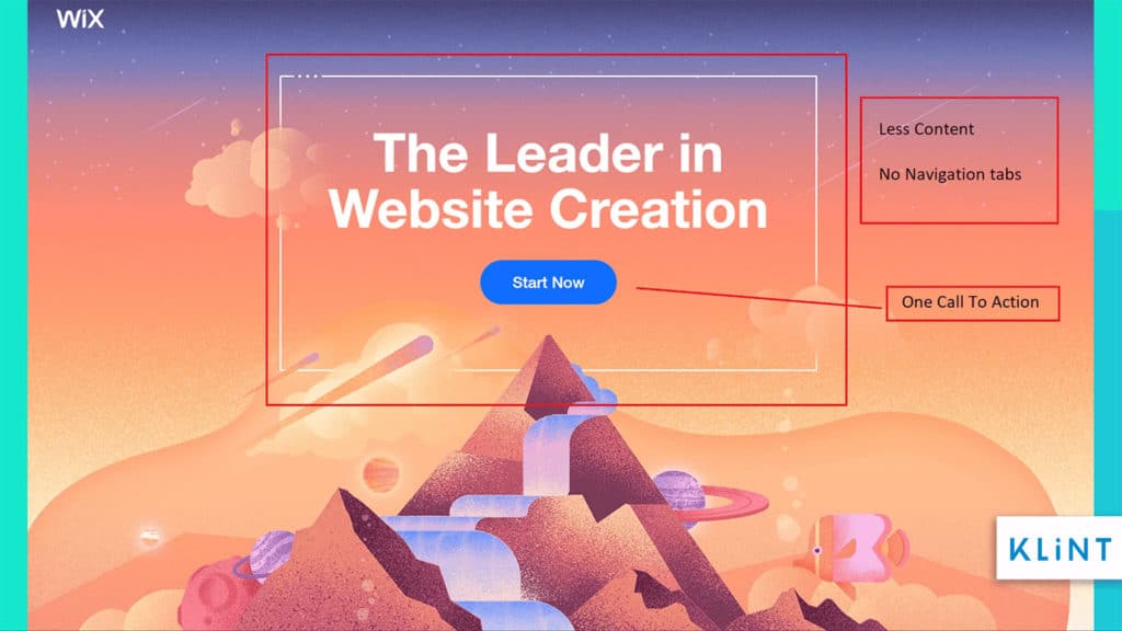
The Wix landing page does not have the navigation bar and less content compared to its homepage.
A landing page ideally comes with no links or fewer links to the main website. While a typical homepage comes with site links at the bottom, the navigation bar on top, and multiple call-to-action buttons.
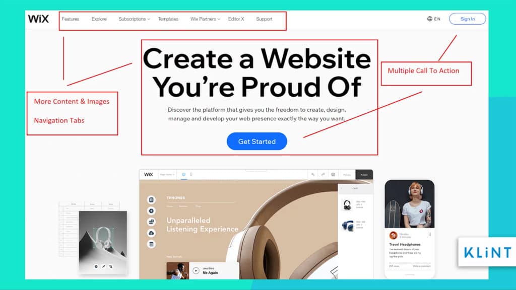
The homepage of the company Wix has a navigation bar that takes you to other pages such as about and services. The homepage has a very general overall view of what the company does.
Types of Landing Pages
In order for a landing page to achieve its purpose, which is customer conversion, a clear goal of the marketing campaign needs to be set. The four main types of landing pages used for digital marketing are:
- Microsites
- Lead generation page
- Click-through landing page
- Viral landing page
It’s good to make sure we understand it.
Let’s have a closer look at the landing page examples for each type.
Microsites landing page example
Microsites are independent pages promoting a single campaign, promotion, or event. The key difference between Microsites and other landing pages is that they don’t usually contribute to sales.
They are used to inform customers about a new product, offer, or work to support a bigger marketing campaign. They have a separate entity from the company’s website.
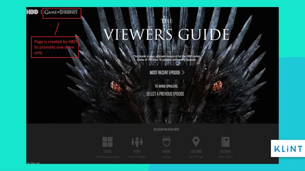
HBO’s Game of Thrones landing page is a good example of a microsite. The page is created by HBO to promote the show and it does not offer any sales. Such optimization method is used widely by other companies to promote specific content.
Lead generation landing page example
The main purpose of the lead generation page is to use content to convert the cold traffic into leads and collect consumer data. It can be done by offering a free trial, free content, email newsletter, whitepaper, etc.
The goal of this landing page type is to encourage visitors to provide their contact information. The information can then be used to track the visitors and to contact them for sale.
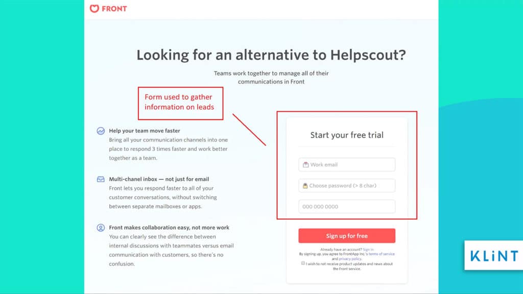
The landing page example above provides content about the services the company is providing. It also asks for visitors to give their work email in order to follow up with them later to ensure sales.
Click-through landing page example
A click-through landing page is the most common landing page used by businesses. The purpose of the click-through page is to deliver a unique value proposition to the visitor before moving them deeper into the company’s sales funnel.
This type of landing page encourages users to click on a different section of the company website to ensure purchase along the way.
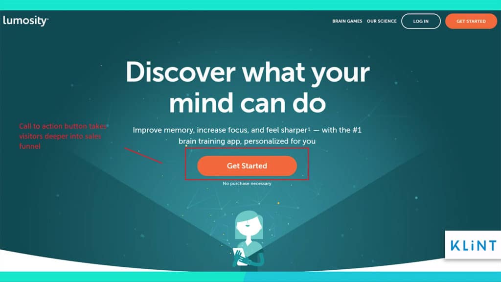
The landing page example above has a simple structure and gives a brief idea about the offer before giving visitors an option to move closer towards the offer using `Get Started` call to action.
Viral landing page example
A viral landing page helps promote a product with word-of-mouth marketing through social networks. The purpose of this page is not only to get visitors to sign up but also to share it with friends and family through social media.
Below is a chart that describes how a viral landing page works:
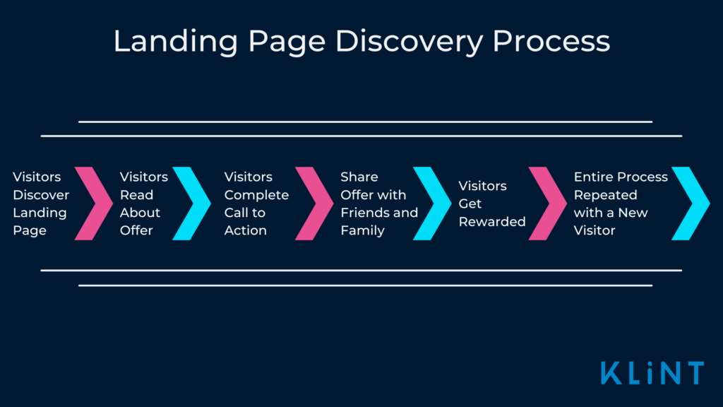
How can marketers use viral landing pages?
In the example below, we can see how the page is used to create viral buzz around a product in order to raise brand awareness.
This is done subtly by using the company logo in the background to make sure visitors know which brand is behind the product.
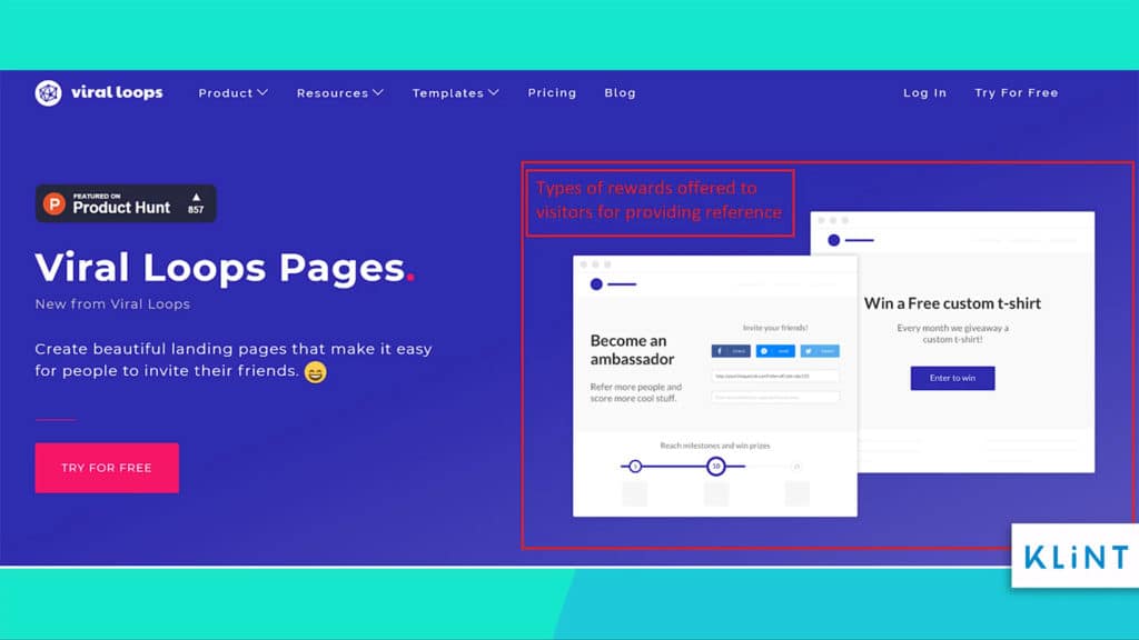
The image above shows the kind of viral landing pages that can be created. Visitors are rewarded in different ways for referring to friends and family.
Do I need a Landing Page Checklist?
In short, YES. You need a landing page checklist.
The more methods you have in your arsenal, the better you get at converting visitors.
For that reason, every company wants to know the useful landing page optimization tools to create the most lucrative landing page for their products.
However, to do so you need to get acquainted with the characteristics of a converting landing page.
A clever idea for this is to follow a reliable guide that will make sure you are on the right track.
Our landing page checklist below will help you to create the best landing page for your marketing campaign.
Landing page optimization tools
As we clarified, landing pages are an important part of online marketing. Marketers spend a lot of money and resources to create landing pages that generate leads and improve conversions.
This is where landing page optimization tools come in handy.
CRO (Conversion Rate Optimization) tools help measure the performance of the landing page and optimize it to ensure a higher conversion rate. It helps determine which element makes your landing page the most successful and helps determine which aspects of your page need improvement.
According to Venturebeat, companies that used CRO tools saw a 223% improvement in ROI.
To start with this landing page checklist, we are providing you with a list of landing page optimization tools. Each of them in one way or another can help you tackle the problems in a speedy manner
Best landing page optimization tools
Intuition HQ

Intuition is a knowledge solution company that provides users with a tool that shows how many clicks were generated and where they come from.
What’s more, it is offering creative digital solutions for content optimization, multiple workshops, and flexibility.
Optimizely
Optimizely is one of many landing page optimization tools that provides A/B testing and multivariate testing tools, website personalization, and feature toggle capabilities.
Trusted by over 9000 brands around the world, Optimizely unlocks digital potential of every company and helps in increasing CTA clicks, homepage and landing pages.
Interested prospects can choose between their two programs: Optimizely Web Experimentation and Optimizely Full Stack.
Landerapp
Free to use landing page builder, Lander offers a great variety of landing page templates across all industries. It offers drag and drop features which makes it user-friendly and ideal for beginners.
Besides landing page optimization, this tool also offers features such as A/B testing and integrations.
Today, Landerhas over 1.5 million users and is trusted by over 3000 brands.
HubSpot’s Website Grader
A free tool that grades your website in seconds. After that, it shows how you can improve the website. Ideal for PPC-driven traffic.
With Website Grader, users can test their website performance, SEO, mobile design, and privacy and security. The tool also offers free advice on how to improve your website
Pingdom website speed test
As the name implies, Pingdom analyzes the load speed of your website. It conducts a research of your website and determines the possible issue for the slow upload speed.
Pingdom operates 24/7 and can do a single page analysis as well.
Afterward, you are offered instructions on how to improve it.
UsabilityGeek
Among many features, UsabilityGeek tool is great for collecting data.
In addition to this, UsabilityGeek is a sound choice for people looking to measure the usability of their products.
This tool helps customers with structuring their websites and maximizing conversion rates. It can also help with app usability and design.
CrazyEgg
A tool that allows you to go into the specifics within the landing page.
CrazyEgg offers a variety of visual reports such as heat maps, eye tracking functions, etc.
This way you can understand better where your visitors are coming from, where they are navigating to or get stuck.
ContentSquare
Contentsquare is a tool that defines your visitors’ behavior by the use of meaningful insights and visualizations.
With Contentsquare customers can identify the opportunities for their websites’ innovation and growth and detect and minimize issues such as visitor bouncing.
The tool also allows users to detect whether their web page design positively or negatively affects the goals of their website.
Unbounce
Another landing page builder with a drag and drop function, Unbounce allows you to create custom landing pages without any coding skills required.
With Unbounce, users can more easily convert more leads and sales.
They offer over 100 different customizable landing page templates, which customers can use to create a page according to their marketing goals and needs.
Launchrock
The main purpose of Launchrock platform is to create “coming soon” landing pages.
Launchrock also helps users acquire early customers and reveals the secret to a steady and successful customer acquisition.
This platform is a good choice for those in need of a website page builder.
Hello Bar
Hello Bar is a thin, informative bar that is glued at the top of the page. It gives users an option to add an attractive call-to-action that decreases the chances of website abandonment.
It also helps users to convert visitors into customers and is a useful tool for announcing sales and discounts.
Browsershots

Different browsers display pages differently. If your page looks like a horrible mess, it will affect your potential conversions. That being said, Browsershots tool allows you to see how your page looks on different browsers.
By submitting the website URL to the Browsershots platform the users get multiple screenshots of their websites on different platforms and an analysis of the website browser’s compatibility.
Related article: 80+ Powerful Backlinks that actually work!
30 point checklist for Powerful Landing pages
The contents of a landing page need to be unique, attention-grabbing and conversion-centric.
A landing page needs to be crafted in a way that every visitor understands your key message, engages with your offer, and ultimately takes action.
Additionally, the content needs to be short, skimmable, and to the point. Our landing page checklist will help you write the kind of content that can convert visitors to customers. However, don’t forget to use the landing optimization tools for the best results!
1. Compelling Headlines
The title of the landing page needs to be catchy, compelling and relevant to the theme/ad depicted on the landing page.
It should be concise, click-worthy, and descriptive to give a clear idea about the page to the users and grab their attention. Make sure to keep it simple and no more than 10-20 words for the maximum impact.
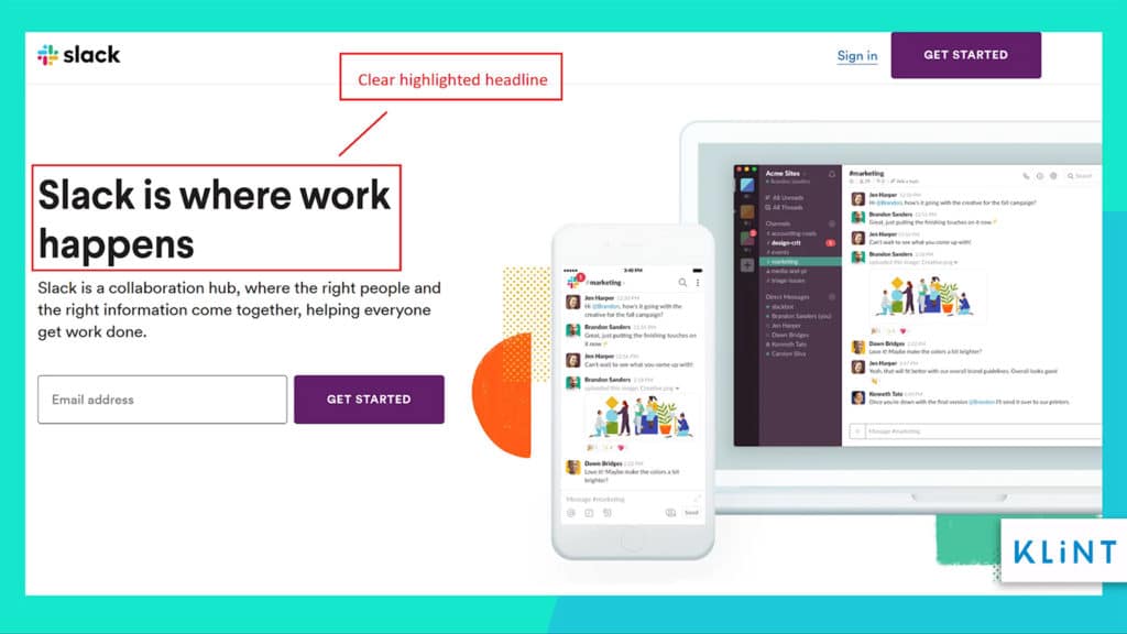
In the landing page example above, Slack gives a strong and highlighted headline to their page. The message is short, precise and eye-catching.
2. Subheadings and bullet points
Header tags are used to distinguish between headings and subheadings from the rest of the content.
Subheadings and bullet points make the landing page content easier to scan through. This helps improve the readability and also declutters the page to make it more streamlined and attractive.
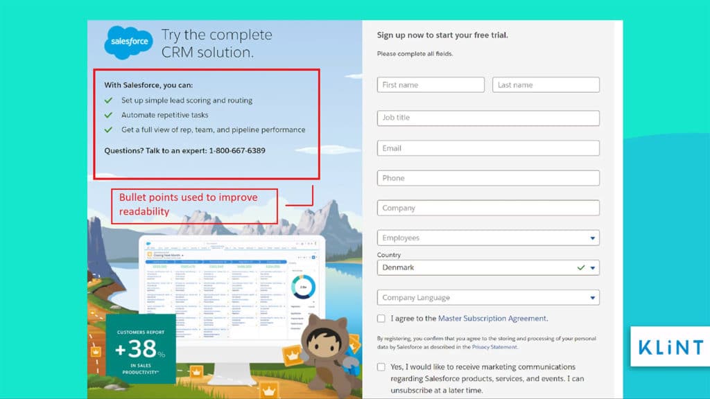
In the Salesforce landing page example above, the company has mentioned the features using bullet points. The content on the page is clean and skimmable.
3. Keep the text short and concise
Keep sentences short on your landing page instead of using lengthy blocks of sentences. This makes it easier for the customers to scan through and understand what you offer and how it will benefit them.
Write text that gets right to the point. Too much explanatory text on your landing page can easily make the customer weary and bury the actual deal you offer.
Specific words help visitors get reassured that your offer will benefit them. Use emotional yet powerful and urgent words to put across your message.
Simple words instead of complicated jargons help convince customers to convert and using certain words might spark interest. Find 101 marketing power words to improve your landing page conversions.
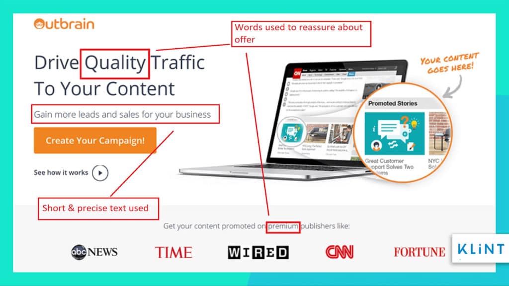
In the Outbrain landing page example, the use of words like quality and premium helps customers build an image of the brand and its products.
Landing page SEO Checklist 2021
Search Engine Optimization (SEO) is a way to make your landing page rank higher on search engines. It is a process of editing elements on your page to appeal to search engines and have high chances of your page popping up whenever someone types in a relevant query.
Optimizing your landing page will help bring more traffic and visitors. This could ultimately lead to more conversion rates.
Our checklist has the best and easiest SEO practices that can help your page perform well in search engine results and ensure more traffic to your site.
4. Use of Keywords
Make sure to place your keywords in headlines, URLs, subheadings, meta descriptions, header tags, and main content where it’s suitable.
Keywords of your landing page content should be added in the most natural and seamless way possible. They are super important as these words help rank your page higher on search engines.
Some of the best practices for optimizing your page with keywords include:
- Finding the keywords and alternative keywords that will help improve search results.
- Using keywords in the domain name. This will help to direct people towards your site.
- Using these keywords in the image description (alternate text).
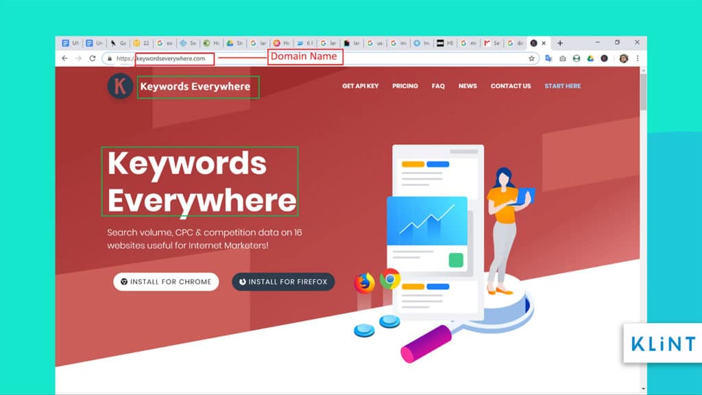
Keywords Everywhere are just one of the many tools available to find keywords to help optimize your landing page.
In case you want to learn more about the keywords, make sure to check out the Ahrefs’ Guide to help you do keyword research for SEO that will help you find the right keywords to generate more traffic to your landing page.
5. Meta Title and Meta description
The meta title should be descriptive and tell what searchers can expect from the page. The title impacts the click-through rate (CTR) and also affects the ranking of your landing page.
The length of the title should ideally be around 50-60 symbols.
Begin the title with your keywords and try to use numbered lists as they improve click-through rates.
Meta descriptions are codes that are read by the search engines. It is a short description or snippet of your page that can be seen underneath the title in SERPs (Search Engine Result Page).
Snippet helps searchers get an idea of what the page is all about. And helps them decide whether they want to click on the page or not.
Descriptions are critical to ensure a higher click-through rate and help your landing page stand out in SERPs. A meta description should ideally be unique and include CTA, content, and keywords from the landing page.
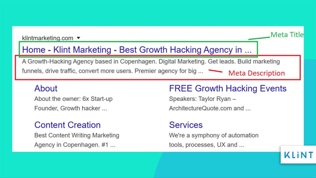
The image above is an example of how the meta title and meta description are displayed whenever a visitor is searching for a company and its landing page.
6. Customize the URL (Easy & SEO-friendly URL)
Customizing the landing page to your own domain helps boost ranking. This way your landing page will also gain some of the SEO value your domain has earned over time.
Important things to remember when creating an effective and SEO-friendly URL:
- Keep it short with around 50 to 60 characters.
- Make it simple and do not use too many special characters.
- Match your URL to the content on the page.
- Implement keywords from your content in the URL.
- Use a slash in order to separate phrases.
- Use similar words in the meta title and your URL.
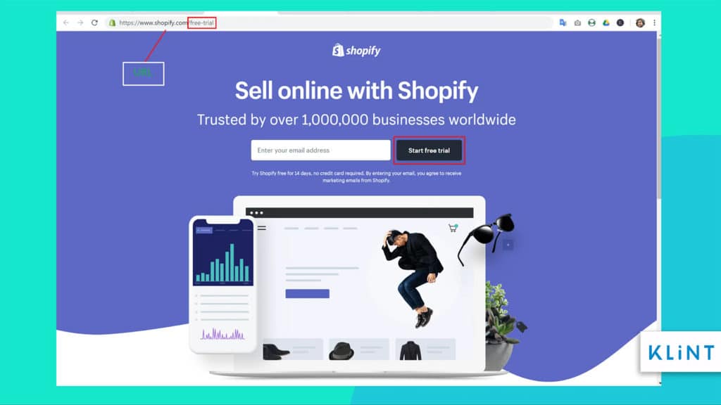
The Shopify landing page example is perfect for an SEO-friendly URL. It has 34 characters, includes keywords from the page and no unnecessary special characters.
7. Alt Text (Alternative Text)
Adding alternative text to the image is a simple way to improve the SEO ranking for your landing page. Alt text is a word or phrase that describes details of the image and what it represents.
This text needs to be unique and should contain your keywords.
Main benefits of using alt text are:
- Search engines do not understand images and alt text makes them readable. Make sure you use your keywords in the alt text. That helps bring more traffic to the landing page.
- Alt-text is helpful when the image breaks as it helps readers identify what the image is about.
- The alternative text is extremely beneficial to people with visual impairment, as the pictures can be described via text to speech.
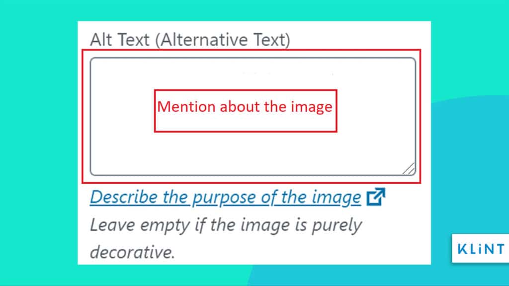
The image above depicts how to update the alternative text to describe a specific image.
Landing page marketing goal checklist 2021
The whole idea behind creating a landing page is to lead your visitors to perform one single action. And every aspect of the page is prepared to work around a specific marketing campaign.
Working on one single marketing goal will keep customers from any kind of distractions that could prevent conversion.
8. Single Conversion Goal
The main purpose of a landing page is to attract and engage the target audience that leads to conversion. Any landing page needs to have a single goal to make this happen and focus all the efforts towards it.
Remember that landing pages are used for a specific marketing campaign. Therefore, it is important to stick to a single conversion goal.
The example above shows call to action buttons used on landing pages.
Providing more than one action can confuse visitors and may harm your conversions, as it gives a rather spammy look. According to Wishpond, companies giving multiple offers received 266% fewer leads compared to companies with single offer pages.
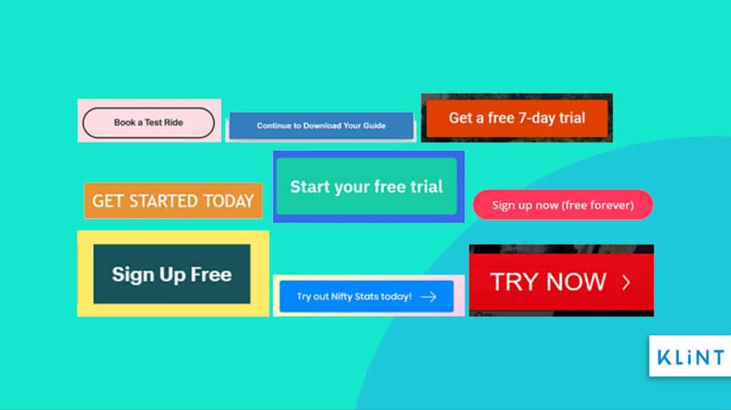
9. Effective call-to-action button
Call-to-action is a marketing action designed to provoke an immediate response from customers. It is a clear and concise command used within a marketing strategy to take action.
The checklist would be incomplete without this feature.
Call-to-action helps persuade prospective customers to take the next step in the sales funnel. A clear call-to-action is one of the most important aspects to ensure a high converting landing page.
A few things to keep in mind though while creating an effective CTA are:
- Action Words – It should have an action word along with an implied sense of urgency. Some of the most common words and phrases used in the call to action are “Register”, “Call”, “Sign up”, “Buy”, “Follow”, “Download”, “Free trial for 14 days”, etc.
- Placement – It is also important to display the call to action button in a strategic place. It should be above the fold and easy to find.
- Presentation – The CTA button should be eye-catching to ensure more visitors click the button. Therefore, its colour should be different from the background to make sure it pops out.
- Length – The ideal length of a call to action is short with no more than 5 to 7 words.
Study shows that CTA with a strong personalized message is responsible for increasing conversion rates by over 202% compared to basic CTA.
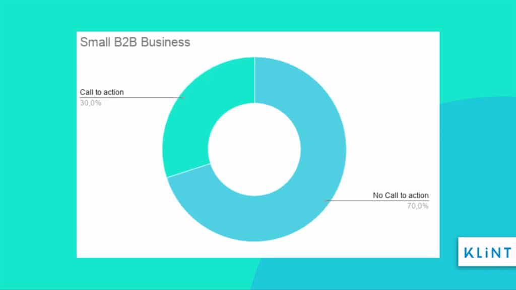
Despite this as per DISM, a staggering 70% small B2B business does not even have a call to action. Every type of business needs to use CTA to optimize its conversion rates.
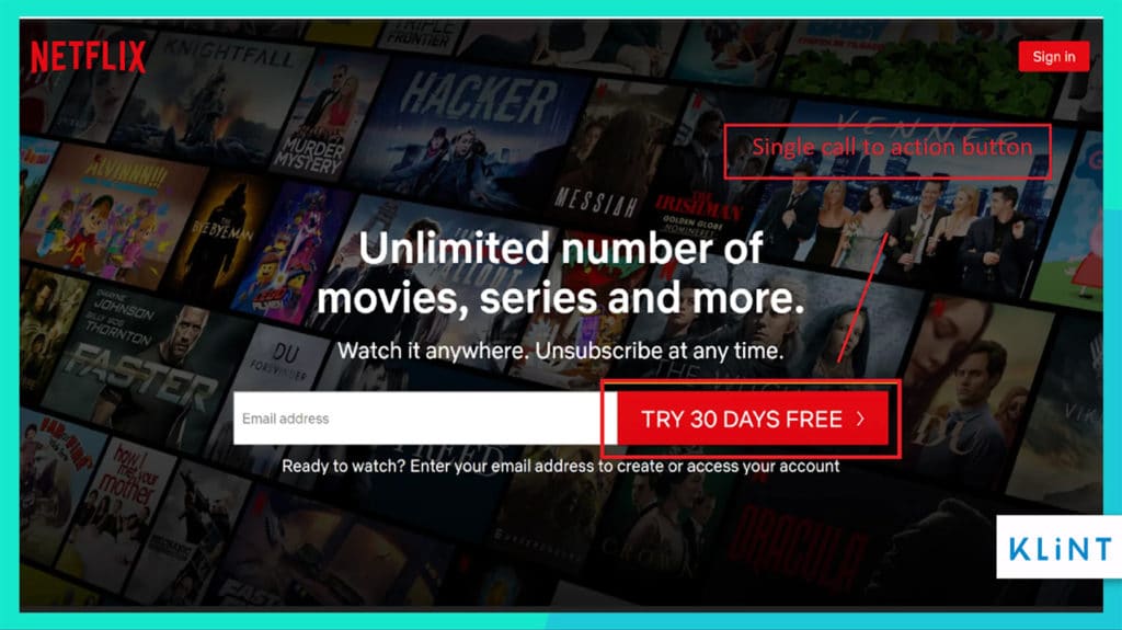
Netflix landing page example has used the color red on a black background to highlight its CTA. The CTA button gives a clear text on the offer that the company is giving to its new customers.
Let’s continue the landing page checklist with another vital piece.
10. Conversion Form
Conversion forms are used to collect information about people coming on your landing page. These forms help to follow up with leads and understand more about them in terms of their consumer behavior, demographics, sales funnel journey, etc.
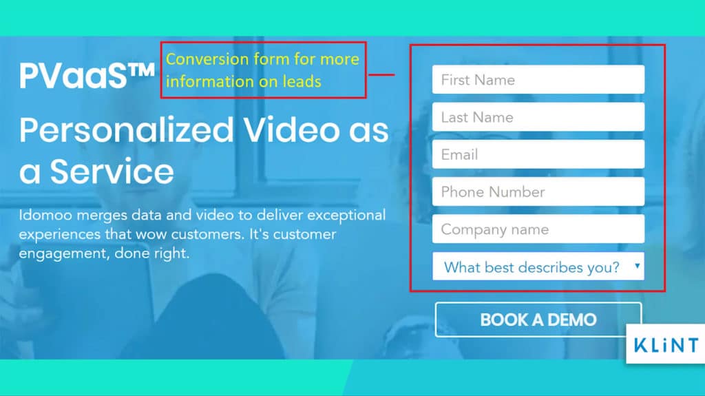
One of the lead generation landing page examples we have has a conversion form with six form fields. This form is used to gather more information about visitors.
The whole purpose of investing in a landing page will go to waste if visitors are in any way intimidated by the form and decide to abandon the page.
Below are ways in which marketers can ensure that visitors would fill out:
- Placement of the form – The time consumers engage with a webpage is just above the fold so keeping the form at that position leads to more conversions. The rule is to first give some idea about your offer to the visitors and then try to engage them.
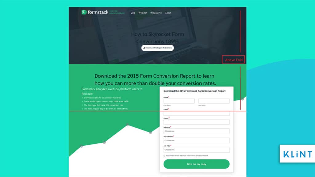
In the landing page example above, the form starts just as the above fold is ending. This way visitors can gather information about the offer and then move to fill the form.
- The Number of fields – Generally, marketers feel fewer form fields might have a higher rate of conversion. But as recent research conducted by Formstack showed, an average of 11 fields leads to a conversion rate of 17%.
11 fields offer plenty of valuable information about visitors. However, while creating these many fields keep in mind to ask relevant questions.
- Use optional fields – Using optional fields helps visitors know they are not forced to provide some information. The general rule is to offer 2 out of 5 fields as optional.
- Multi-step forms – In some cases, multi-step forms have also led to higher conversions. Some companies use the short form for any kind of secondary conversion and long-form for primary conversions.
Splitting your form into various steps proves to be less intimidating to your visitors. It asks for general information in the beginning and moves on to more sensitive information like the mobile number at a later stage.
Companies like GetResponse and ActiveCampaign use multi-step forms to gather information from their customers.
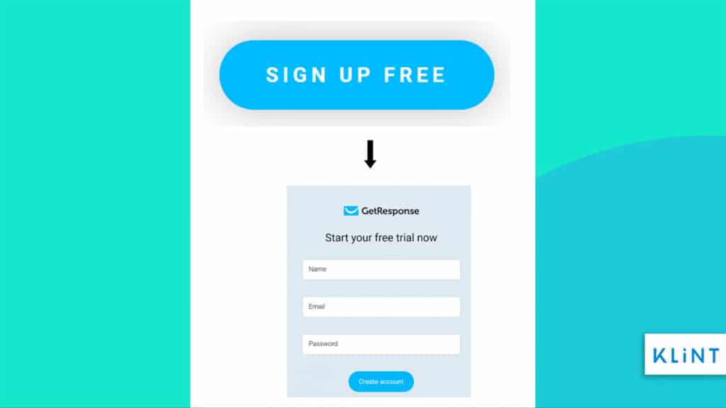
The landing page example of GetResponse has multi-step forms that start simple with fewer form fields and goes on to increase the number of fields.
Visual Appeal Checklist 2021
The design of a landing page is vital to help significantly increase leads and conversions. Businesses need to create landing pages with a powerful visual appeal. That significantly improves the landing page’s marketing.
Companies should implement images and videos to do that. The visuals need to strike a chord with visitors on an emotional level and give them an idea of what your offer is.
11. Image Optimization
An image can be used to engage and influence the target audience to make the purchase. Using high-quality and high-resolution images makes it easier to understand the product and improve the overall SERP rankings.
Some tips for successful image optimization include:
- Use images of your actual product – Showing your product in use will help audiences know more about what you are offering and how it will help them. Using actual photos is beneficial because it helps connect with the audience and builds trust leading to conversions.
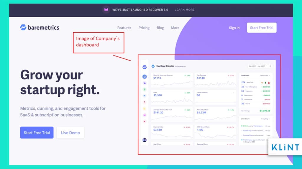
In the image above, Baremterics has used the image of their dashboard on the landing page. This gives an idea to visitors about the services the company offers.
- Use pictures of people – Images of people on the landing page will help trigger emotions and help in conversions. We as people are drawn to the images of other people which further affects our emotions.
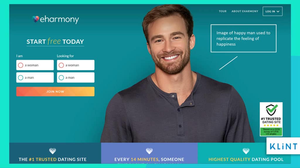
The image above is a classic example of images used by dating websites. The landing page uses images of various individuals both men and women smiling to create the feeling of happiness and wanting to invest time to find someone.
- Use colors that strike the right emotion – Different types of colors affect our emotions and actions differently. Find out what kind of emotion you want your target audiences to feel and use colors that help evoke that.
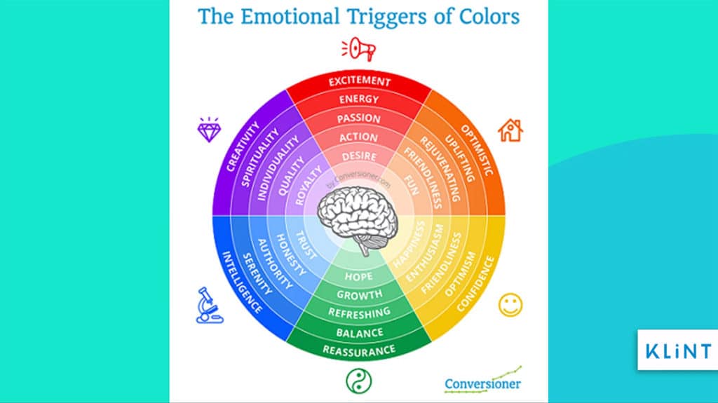
The image above shows how our brain reacts to different colors. For example, orange is more fun and upbeat while green gives us a sense of peace and hope.
- Add Alt Tags – Adding alt tags to the images can help describe the image and its connection to the content. They appear if an image fails to upload properly. Alt tags help Google create a link between your landing page and ad to further bump the quality score.
12. Video Optimization
Videos are considered to be a preferred medium to engage visitors and improve the time spent on your landing page. To achieve the best results, here is a list of the most important tips and tricks to include when optimizing videos:
- Use Gifs – Gifs are videos as well, but they re not as resource-demanding as video. Gifs are interactive and most time short and snackable to keep users for few seconds longer on your landing page.
The landing page gif above shows video in the background
- Product Video – Companies use videos on their page to keep audiences engaged and at the same time explain how their products work. It is also a great way to deliver large amounts of information in a short period of time.
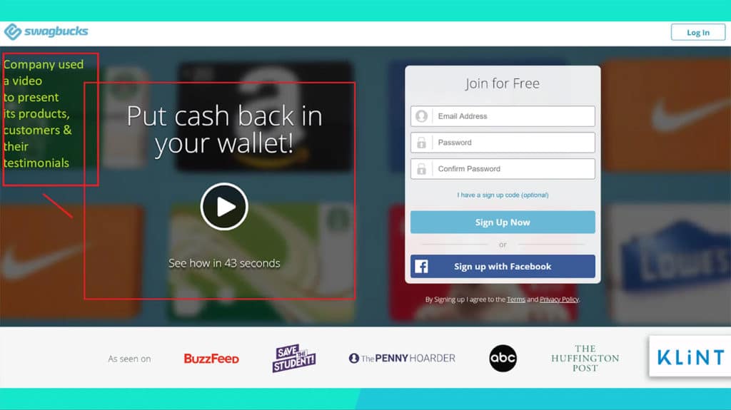
Swagbucks landing page video showcases its customers, their testimonials, the number of members, brands they collaborate with and how it works on a mobile app. It is a 43-second motion graphic video that is very well put together. Overall, it contributes greatly to the clean landing page looks.
- Video Above the Fold – Video can be in the form of motion graphics, moving illustrations or others. It can be placed in the background or left or right side of the landing page. The only rule here is it needs to be placed above the fold.
Above the fold (as shown in the image below) means the top part of any page. It is the first thing any visitor will see when they click on the landing page.
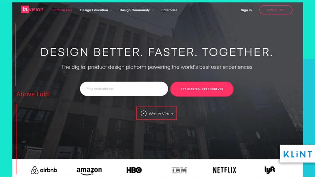
Invision`s landing page video plays subtly in the background while the visitor goes through the page. They also give an option of “Watch Video” in case audiences want to play it on another page.
Benefits of having a video on your landing page
Video campaigns help improve conversion rates. As a case study by Eye View showed, using videos on a landing page can improve conversion by 80 to 86%. Make sure that your video is of the right length, contains your call to action, and placed in the right place on the landing page.
People consume more information via videos. Videos have become extremely popular in recent times. Therefore, using videos on landing pages can really help attract new customers.
Videos help keep people on your page for a longer period of time. This gives the companies extra time to explain their offers to visitors.
The video should have a concise and engaging title and a proper description using keywords. In addition to this, video can be of different kinds including testimonial videos, explainer videos, or video backgrounds.
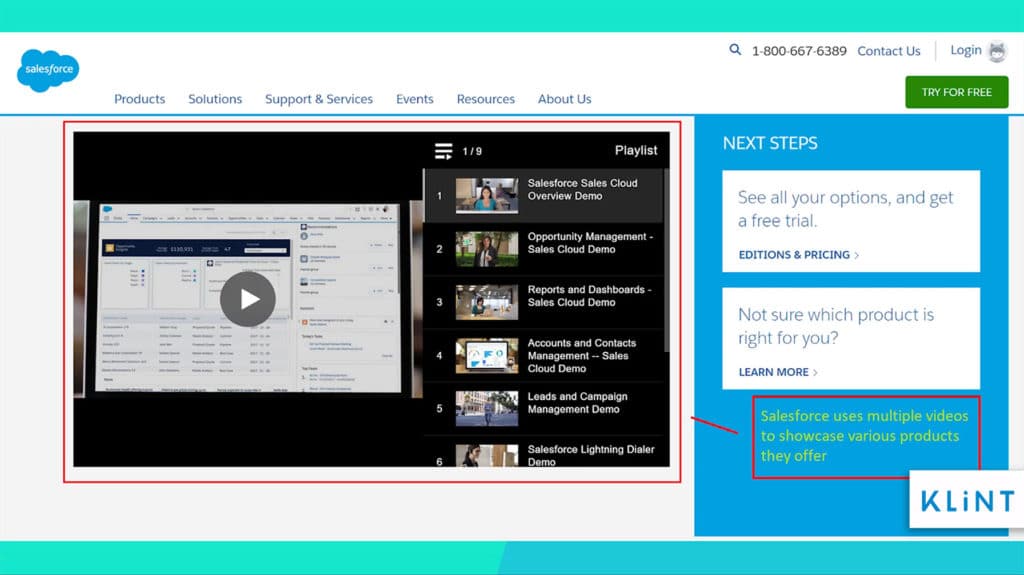
For example, Salesforce provides multiple videos on their landing page. Each video is 2 minutes long giving a demo of Salesforce Sales Cloud and other services the company offers.
Landing page checklist for Video
Some of the things to keep in mind when creating videos for your landing pages are listed below:
- High Quality of the video
- Make sure the size of the video does not slow down the landing page
- Keep it short (around 1 to 2 minutes)
- Create videos customized and relevant to the content
- Use call-to-action within the video
- Do not rely only on video
- Re-use the same video to optimize money and time spent
- Gifs are also a good substitute for videos
- Avoid autoplay
13. Typography
The visuals of a landing page have a major impact on customers who decide to stay on. And typography is the main part of the visual appeal of the landing page.
The first thing that visitors do after they open a web page is scan the entire page, how information is presented, text and length of lines, among other things.
All these things affect the readability of your page as well as how much time the consumers will spend on it.
The landing page checklist for typography includes the following features:
- Fonts (size, colour, and type)
- Line (length, width, and breaks)
- Kerning (white space between individual letters or characters)
- Tracking (letter-spacing)
- Typeface
Some examples of different typography styles:
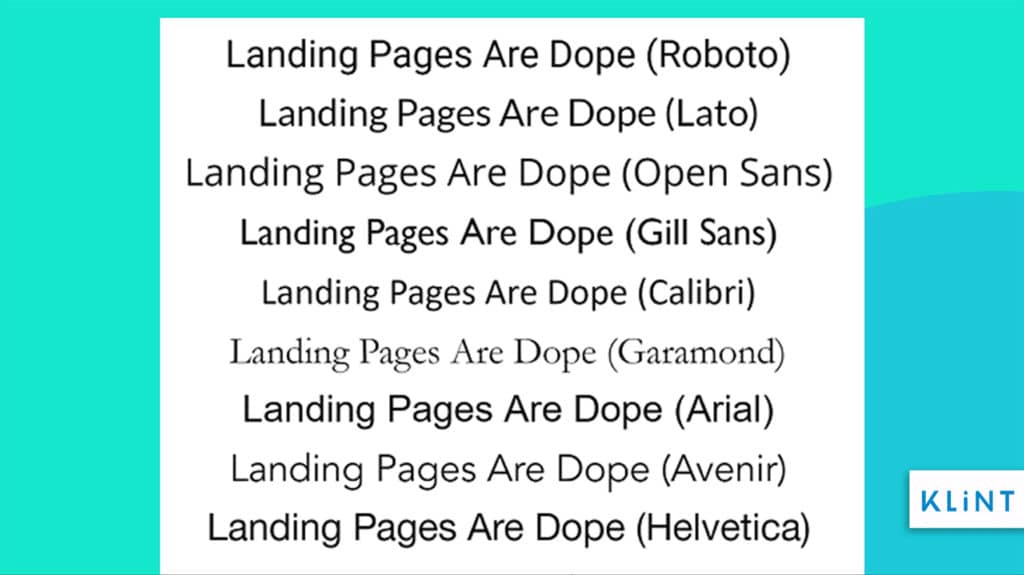
The image above depicts the most commonly used typefaces by marketers for landing pages.
Here is another example of how different font types change how sentences get displayed:
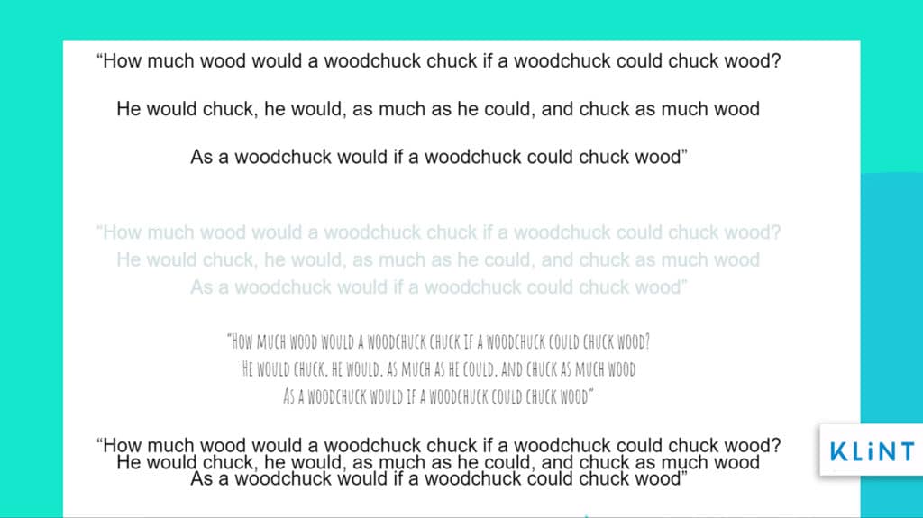
The example above illustrates different ways to write content on a landing page. The first one is the clear winner as it is the easiest to read. It has the right kind of color, font size, tracking, and kerning.
The fonts used on a landing page should be professional, elegant, and readable even on a low-resolution screen. Avoid using fancy typefaces as it negatively affects the readability of text on your page.
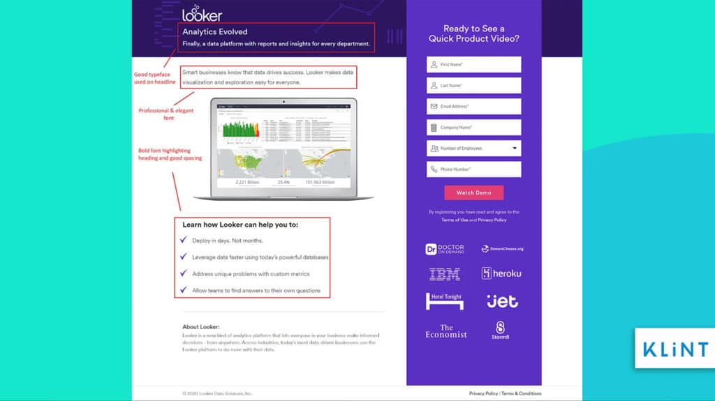
The example of the Looker landing page above has fonts pleasing to look at. There is plenty of whitespace between individual characters. Its typography makes it easy to read the information.
Layout Checklist 2021
The layout is the way everything is placed on a page. It is the arrangement of text, images, call to action, testimonials, and form on your landing page.
The layout of the page is very important as it determines the way visitors would view it.
14. Long-form Landing Page
When a customer visits your landing page you need to ensure that all their questions are answered. And to do so you need to create a long-form landing page that provides all the necessary details about your offer.
Marketers have recently realized that long-form landing pages might provide more compelling content to ensure conversions. As per Unbounce, a long-form landing page leads to a 52% increase in sales.
Long-form pages can especially come in handy when the product is pricey, complicated to understand or has a lower awareness rate.
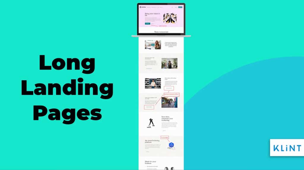
Mailchimp has a long-form landing page that elaborates about the company. It consists of call-to-action, detail about product & services offered by the company. It also has customer testimonials & social media buttons.
15. Minimalistic Layout
In the case of landing pages, less is actually more. Keeping things minimal will help audiences focus more on the important information which will lead to conversion.
A simple landing page is also easier to create, takes less time and money to build. A landing page with a minimalistic approach is a lot easier to navigate and takes less time to load.
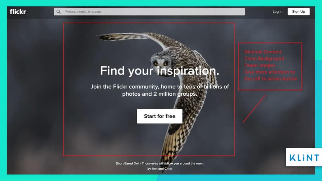
The landing page example by Flickr is clean and uncluttered. It does not have too much content and the layout is squeaky clean. It has all of its focus on call-to-action which could lead to higher conversions.
16. Contrasting Colors and Clean Landing pages
Using contrasting colors and a clean background can help create an engaging landing page. Keeping ample white space improves readability for your landing page content.
Try using contrasting colors in order to make sure that the call to action stands out. Different colors evoke different kinds of emotions.
A simple background and vivid colors and formats help earn satisfied customers and improve conversions. The research by HelpScout finds that colors have a different impact on consumers and their perception of brands.
Landing Page by Skrill uses purple color. The page just like the color represents richness and creativity for a company dealing in money.
The most common colors and their significance in branding include:
- Red: generates excitement, energy and creates urgency
- Yellow: associated with optimism and brings happiness and hope
- Blue: calming color that is often associated with professionalism & sense of security
- Purple: It is meant to reflect creativity, richness, and luxury
- Green: It is the color of money. It resembles good health, wealth and prosperity
- Orange: It is aggressive and helps draw attention and could be good to use for a call-to-action button
- Black: It is used for things that are sleek and powerful
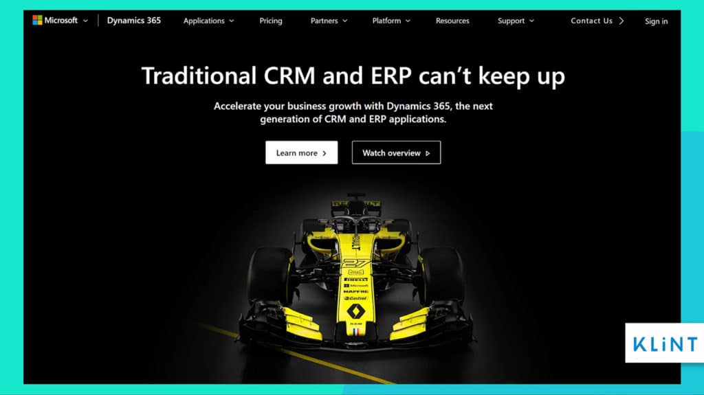
Microsoft landing page example above has a black theme and it has a yellow race car. The color and image make the page elegant and exciting to look at.
17. Avoid unnecessary distractions
Avoid a huge chunk of text or too many colors as they can be distracting. Too much landing page content can result in a bad user experience.
Keep an eye on long forms, too many clickable links, huge variety of text and colors can shift focus from more important things such as call-to-action.
Providing too much information on your landing page could confuse visitors, create a spammy look and would increase the bounce rate.
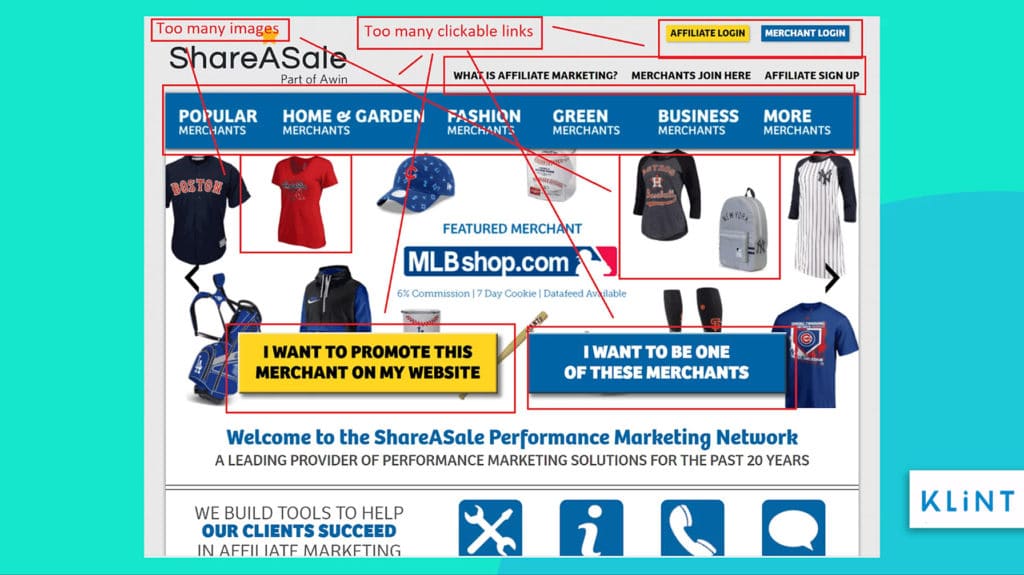
The landing page above has way too much information and too many clickable links which could easily make visitors anxious and make them leave the page prematurely.
It is important not to include any website navigation on the landing page. This will ensure that the potential leads do not get tempted to visit other parts of your website but focus on the selling point of the page.
18. Landing page checklist for white space optimization
White space is all the space left blank or empty between texts, graphics, and elements on your landing page. It does not necessarily have to be white, it can be any color.
Some of the most important benefits of white space on a landing page include:
- Enhancing readability
- Helping highlight more important elements of landing page
- Giving a feel of a more clean and elegant landing page
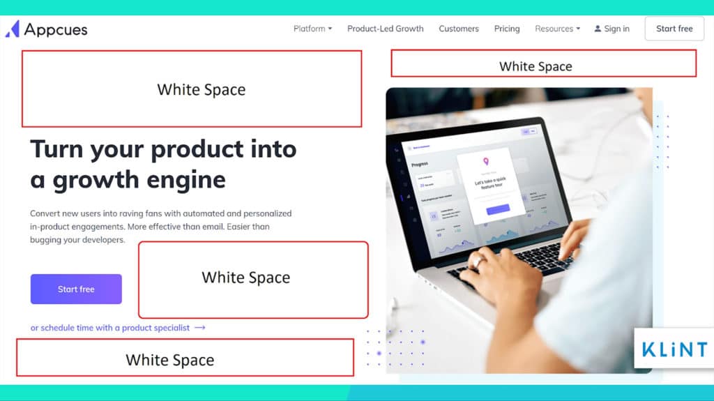
Appcues’ landing page example has plenty of white spaces between text, images, and call to action. This makes the page clean, elegant, and easy to read.
19. Fewer or No navigation options
Navigation links or menus are clickable links that take visitors into various parts of your website.
Too many navigation links on the landing page create a distraction for potential customers that are about to convert.
However, no navigation options leave users at the dead-end unable to browse other parts of your website. Having fewer navigation options could prevent distraction while still leaving some options for users to browse the rest of the site.
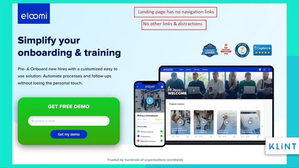
The landing page above is a great example of a page with no navigation links or tab to distract the audience from the real marketing goal.
20. Thank-you Page
A thank-you page helps continue the conversation with a new lead. It makes your customers feel appreciated and want to do more business with your brand. It is also crucial for conversion.
If a user reaches the thank-you page, it means the user has completed the task you wanted them to.
The Thank-you page is the page customers are redirected to after they opt for making a purchase or subscribing to your newsletter. You can use the thank you page to promote your brand further.
Than-you pages offer many benefits that can help you:
- Thank your customers in a unique way. Use phrases such as You’re awesome! Instead of a plain old thank you.
- Use the page to extent engagement by conducting a survey, offering a discount, or asking for a social share.
- Use the page to inform your customer of what is next. Give specification details on how and when the offer will be delivered.
- Send an Auto-responder email.
- Provide exciting images to appeal to your visitors’ sense of anticipation.
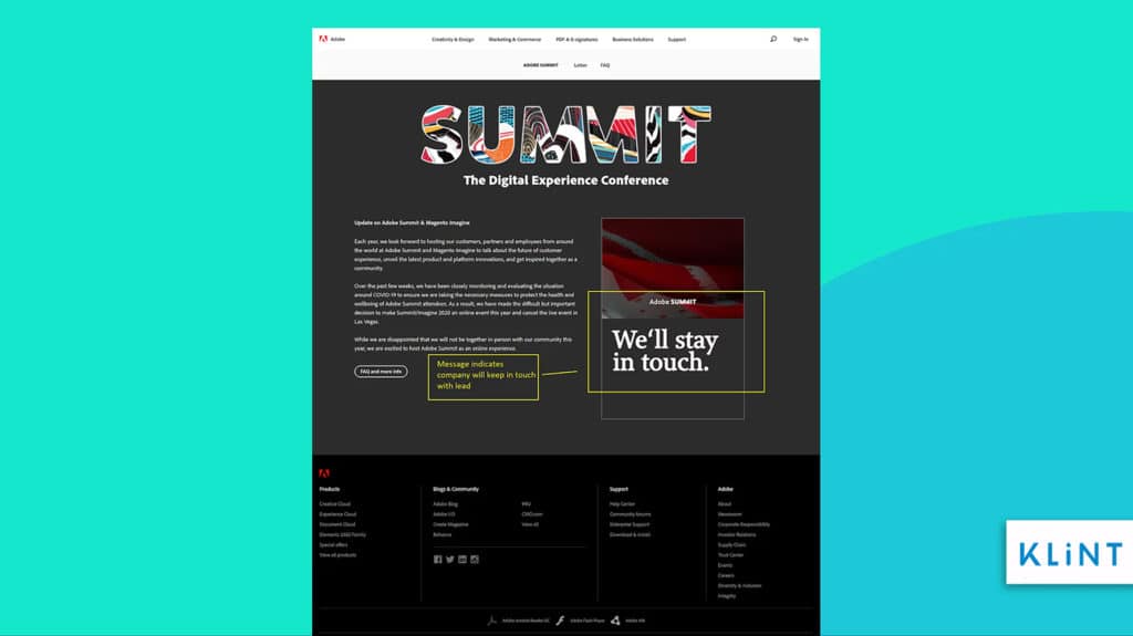
In the image above Adobe is letting visitors who signed up that they will get in touch.
Landing page checklist for user experience
Usability needs to be the top priority for companies creating their landing page to improve conversions.
Good user experience will ensure that the visitors stay on the page longer and persuade them to complete a specific action.
Loading speed, live chats, and mobile-friendly landing pages are a few things that will help elevate user experience and lead to conversion.
21. Loading Speed
Landing page can have all the best features but it will still not lead to more conversions if its loading speed is not up to the mark.
Slower loading speeds will lead to audiences abandoning your site and thus, loss of potential business.
If the landing page loads faster this could mean high conversion rates and sales revenue. It’s known to be a ranking factor for SERP.
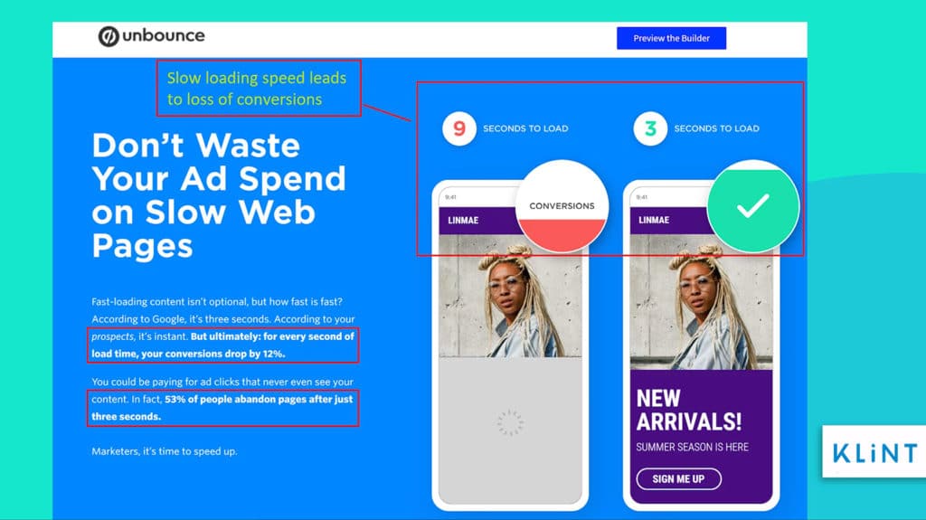
According to the Unbounce image above, you lose 53% of visitors if a landing page takes more than 2.5 seconds to load and even a 1-second delay in loading can lead to a 12% fall in conversions.
If your landing page speed is well-optimized to ensure the conversion, all the other things don’t matter. Using landing page optimization tools can ensure good optimization not only regarding speed, but the whole landing page.
Steps to ensure fast loading speed include:
- Compress images to reduce their size.
- Remove bulky plugins and widgets from your landing page.
- Use fewer HTTP Requests as more requests mean longer loading time.
- Try and use system fonts instead of fancy customized fonts.
- Do not have too many elements on your landing page. Keep it simple.
22. Mobile landing page optimization checklist
The landing page needs to be mobile-friendly because of the high rise in mobile usage.
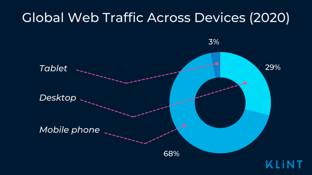
In 2020, 68% of web traffic worldwide was generated via mobile phones compared to 63.3% in 2019.
Therefore, having an underperforming mobile landing page would seriously harm the conversion rates for business.
Customizing your landing page for mobile devices will surely help drive up sales.
The layout, design, and content of a landing page have to be changed to be viewed on handheld devices.
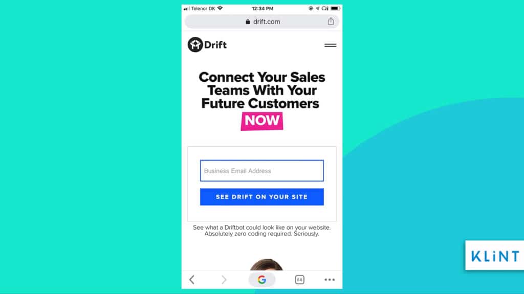
Above is Drift`s mobile-friendly landing page that provides important details such as the call to action above the fold and it is simple containing only relevant information.
The landing page checklist for mobile-friendliness includes:
- Keeping the design simple
- Providing relevant information (using bullet points and short sentences)
- Keeping the interesting content above the fold
- Call-to-action can be more creative such as place a call, send a text message or download the app
- Ensuring that the page loads at a high speed to avoid bounce rates (Use tools such as Test My Site by Google to find out how mobile-friendly your landing page is)
23. Live chat
Conversational landing pages help improve conversion rates.
Live chat agents or chatbots provide support to online customers and ensure more leads.
A chat-now button can help create a connection with your customer and make them lean towards you. Live chat sessions help move potential customers towards the bottom of the sales funnel.
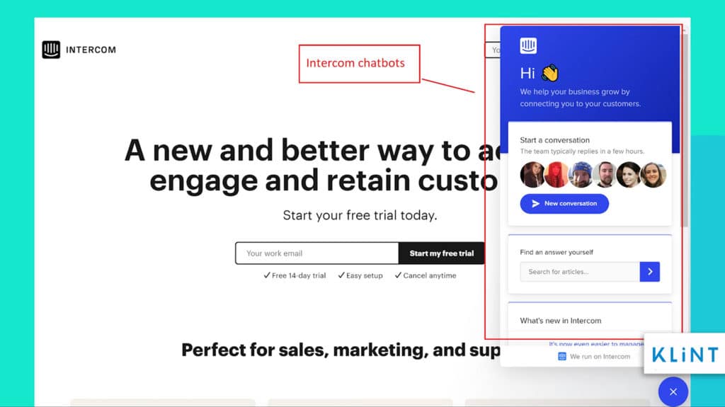
The landing page of Intercom has live chat that is there to help customers in case of any kind of queries as soon as the issue arises.
Live chat on the landing page helps to:
- Improve user experience and customer support
- Increase sales
- Generate more leads
Landing page checklist for trustworthiness
A company does not have too much time to create trust in their brand and product.
They have roughly 5 seconds to ensure that the visitor trusts their brand enough to invest in the product.
So, it is extremely important to use these few seconds to not only communicate your message but also create a trust factor with your potential customers.
Customers feel vulnerable giving their personal information such as email, contact number, address, etc. Strategically placed trust badges, testimonials, and reviews help create a sense of security in the mind of the audiences.
“Earn trust, earn trust, earn trust. Then you can worry about the rest.”
SETH GODIN
24. Trust Icons
Trust symbols or icons help build credibility and trust among viewers. A trusted icon tells the visitor that the website is legitimate.
According to research conducted by a senior journalist at CMO, one major reason people abandon pages is the concern about payment safety.
Displaying these badges on your landing page can help to build trust and ensure improved conversions.
These symbols make your brand and website legitimate and indicate that it is safe to do business with you.
Even third-party certifications can also be used to provide customers with a safe way to buy online.
Besides the badges on your site, make sure your company is also recognized on other sites. For Example, Klint Marketing has recently been awarded one of the Top Digital Marketing Companies Of 2020 by DesignRush.com.
The image above displays some of the most popular and most trusted security icons used by brands around the globe.
25. Logos
Putting the company logo and linking it to your main homepage will garner trust and familiarity.
Logos can distinguish a fake landing page from a genuine one.
Therefore, the customers will not hesitate to provide their personal information such as email.
Similarly, using logos of existing clients and partners or affiliates indicates established relationships.
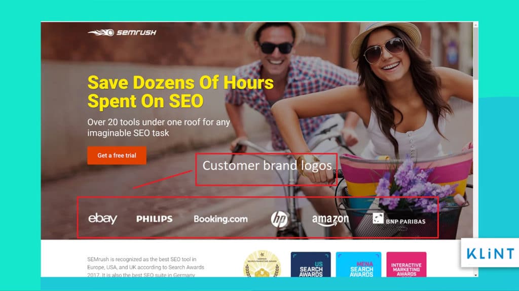
On the landing page above SEMrush has added its own logo and that of its customers. This could instantly help build trust in the company and the product they are offering.
26. Social Media Proof
In this day and age, people like posting their latest purchase or share a resource on social media.
Social media links on the landing page can help increase brand visibility and boost its credibility.
Add only the most important and essential social media links to avoid clutter.
Social media sharing buttons on the landing pages make it easier to share content across numerous platforms and generate more leads.
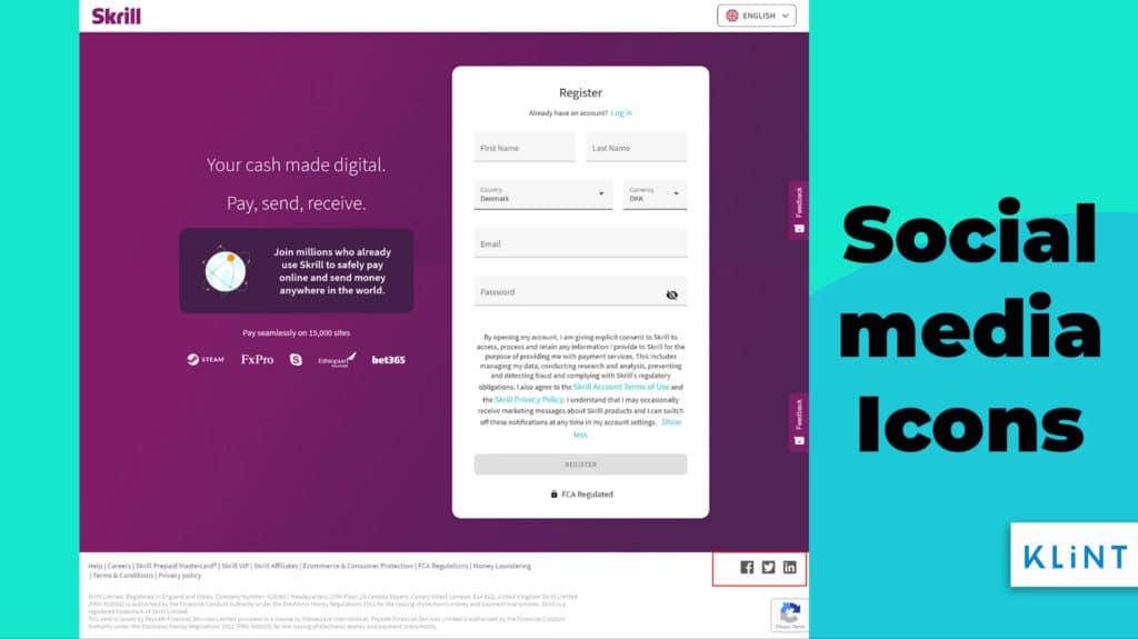
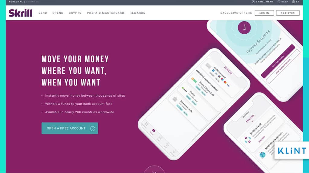
Landing Page Example, Image by Skrill
27. Customer Testimonials
Customer testimonials can help improve trustworthiness amongst the new customers.
Providing testimonials from your existing clients helps convert site visitors to paying customers.
The study conducted by Search Engine Land found that 88% of customers said that they trust testimonials and reviews just like a recommendation from family or friends.
Also, 85% of customers said they read around 10 reviews before trusting the brand and business.
Despite this only 37% landing pages of top landing pages use testimonials.
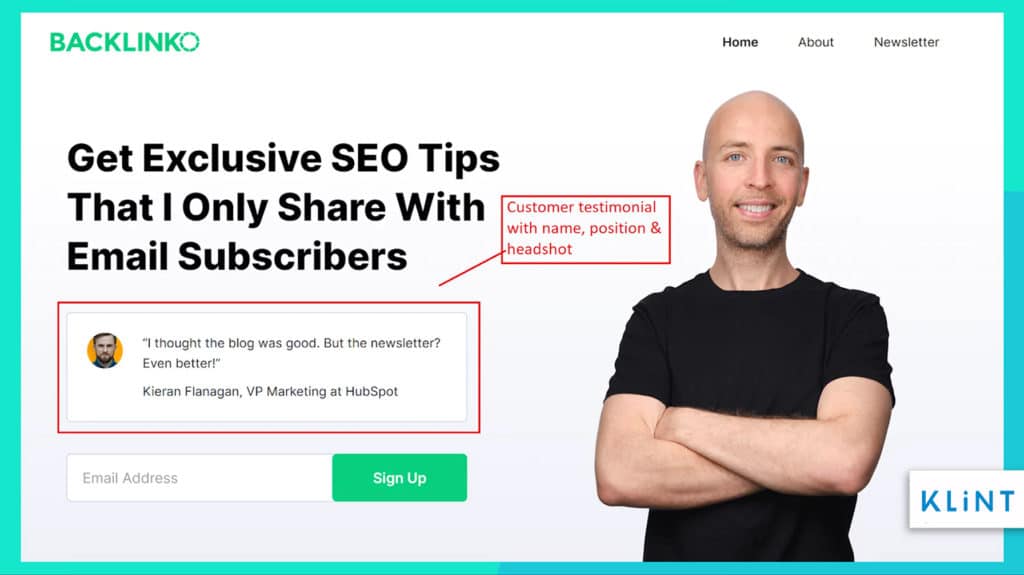
Including some snippets of full client testimonials, along with their full names and headshots, can be used as a testimonial for the landing page.
In addition, placing these quotes or videos properly on the landing page ensures more impact on potential customers.
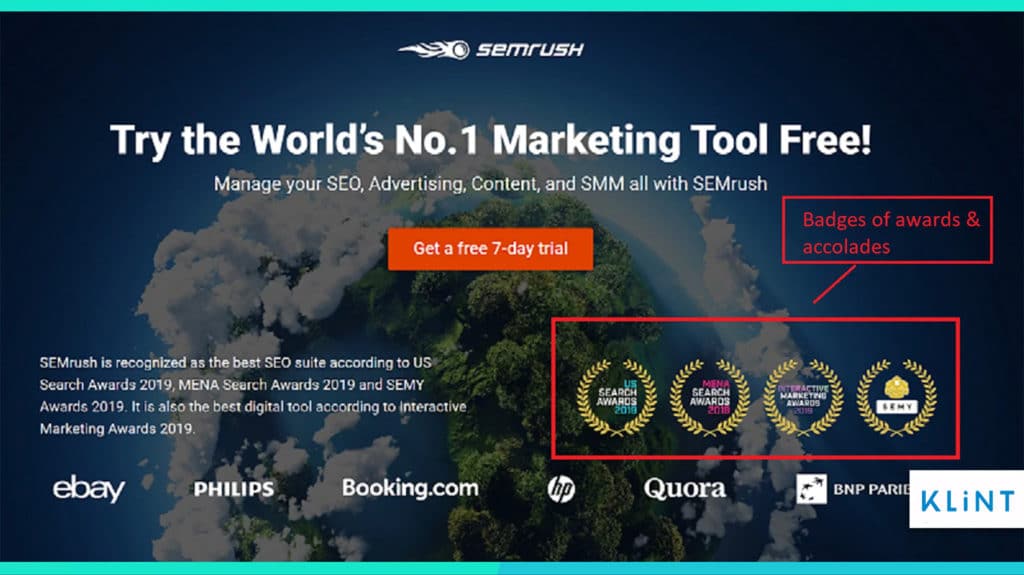
The landing page of SemRush shows awards and accolades they received for their product and services. These badges help create trust in your company and services.
There are different types of testimonials you can use on your landing page, and here are some ideas to get you started:
- Video
- Twitter cards
- Quote testimonials
- Awards
- Reviews with ratings
28. Add privacy link
Adding a privacy link to the landing page makes your company credible, trustworthy and reliable.
This allows people to sign up without fearing how their information will be used by the company.
Another option to show privacy policy is to create a pop-up.
Can click on “I Agree” pop up to get more information and decide whether they want to sign-up or not.
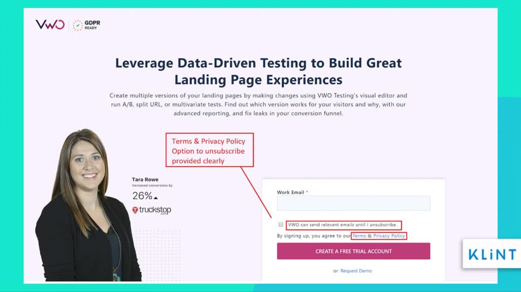
The example above is the landing page of VWO which provides its terms and policies along with an option to unsubscribe clearly. Give a sense of trust and security to visitors that they can withdraw their details whenever they like.
The privacy policy provides the following information to the customers:
- The information website is collecting
- How long they will store the information and how safe is your information
- Is your information been given to any third-party associates or marketers
- Options to delete the information whenever the customer wants to
GDPR (General Data Protection Regulation) was introduced in Europe to ensure that people have complete control over their personal information and data security. Business needs to make sure that the landing pages work within GDPR compliance guidelines.
29. A/B testing for landing page
A/B testing for landing pages involves comparing two versions of a page to find out which one will perform better.
Conducting an A/B test on landing page headline, layout, form field, and others will help maximize conversion.
Landing page A/B testing finds out which version helps gather more clicks, reduce bounce rates and better conversion.
Despite the fact that A/B testing is simple and effective, still, merely 44% of companies use split testing tools when it should have been 100%.
Some A/B test examples include:
- A/B Test for Call-To-Action button
- A/B Test for customer testimonials and trust icons
- A/B Test for images and colors
- A/B Test for Headlines and subject lines
- A/B Test for Input fields
30. Heatmap Tracking
Heatmap is a software that uses a warm-to-cool color spectrum to analyze which part of the page visitors are most interested in.
With heatmap, you can visualize complex behavioral data and it can help you understand it in a glance.
A heatmap displays visitors’ activity on a particular website.
Every heatmap shows how the majority of your users behave every time they visit your page. This helps to identify what works and what does not work on your landing page.
There are different types of heatmaps that help answer issues such as what happens when people navigate the landing page.
Landing page heatmap examples include:
- Click tracking heatmaps – It helps find out where visitors clicked on your landing page. Colored patches help indicate user engagement such as images, clicks on links, and buttons. This helps to optimize the call to action and other parts of the landing page.
- Scroll heatmaps – This heatmap helps indicate which part of your landing page your visitors were before bouncing. It tells what works better for your company a long-form or a short-form page.
- Move Heatmaps – This type of heatmap observes the movement of the mouse to specific areas. It tracks the mouse movement of visitors on different parts of the landing page and generates a visual representation.
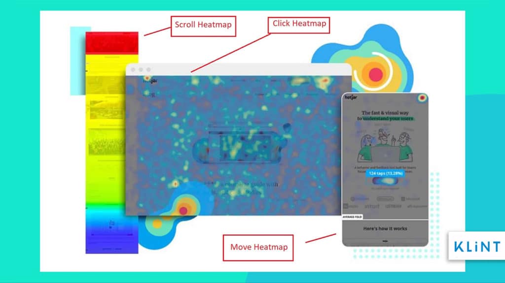
The image taken from HotJar shows three types of heatmaps scroll, click and move maps (from left to right) that can be used to collect data on your landing page.
Take a look at this related article: 50 AI Marketing Tools For Growth-Hacking and Digital Marketing
Build more Landing pages
You don’t have to include everything. However, the more points from the landing page checklist you will implement, the better!
Landing pages have a high rate of success bringing in more leads, improving conversions, and ensuring higher sales. Therefore, investing in a landing page seems the right thing to do for online marketers.
Don’t forget that landing page optimization tools can also help you get the most out of the landing pages including increased conversion rates, improved SEO, and more!
Our ultimate landing page checklist can help you create the most lucrative landing page for your marketing campaign. Create numerous versions of landing pages and test them to find what works best for your business.
Also, let us know how it worked out for you!

The information given in this article is great. thank you for sharing with us.